Category Archives: Ink Reviews

Strong Enough for a Man; pH Balanced for a Fountain Pen?

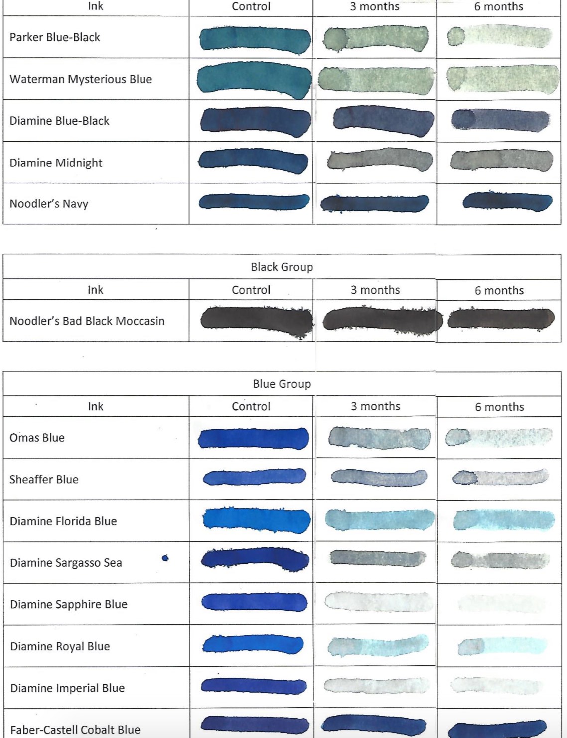
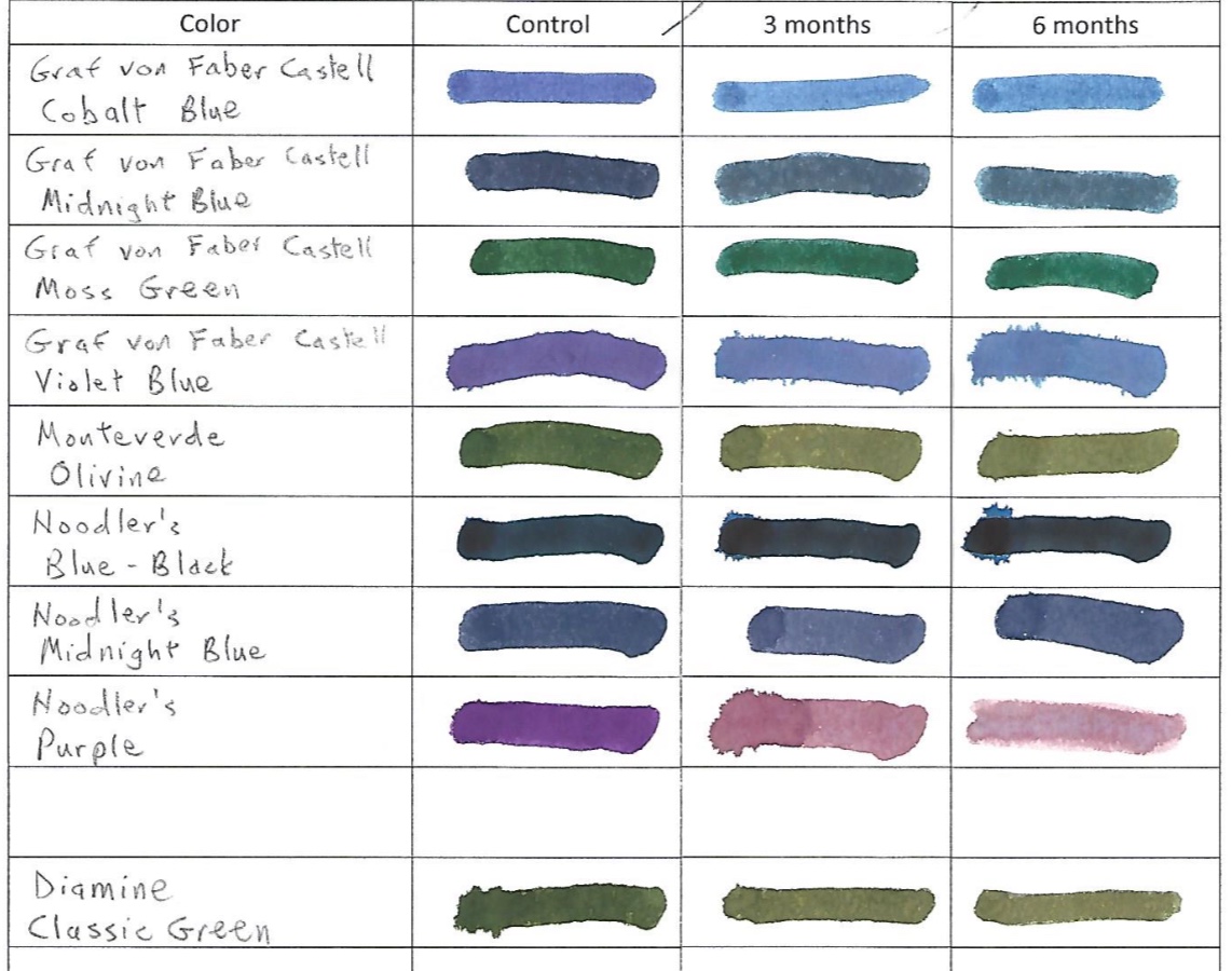
One of the many great aspects of marrying a scientist is the gadgetry. Intrigued by my ink-fast tests  with UV light, Dawn decided to get a professional pH meter to test our ink for corrosiveness. If you remember basic chemistry from high school…which I barely do…you will remember that we have acid on one side of a scale and base/alkali on the other. The scale ranges from 0 to 14. 7 is neutral like distilled water. The further you move away from 7 in either direction is more corrosive. The 0 side is acid and the 14 side is base/alkali.

You would think that all inks are hovering around a 7 to be safe in your pen and on paper. We certainly did.

Holy cats! We were wrong.

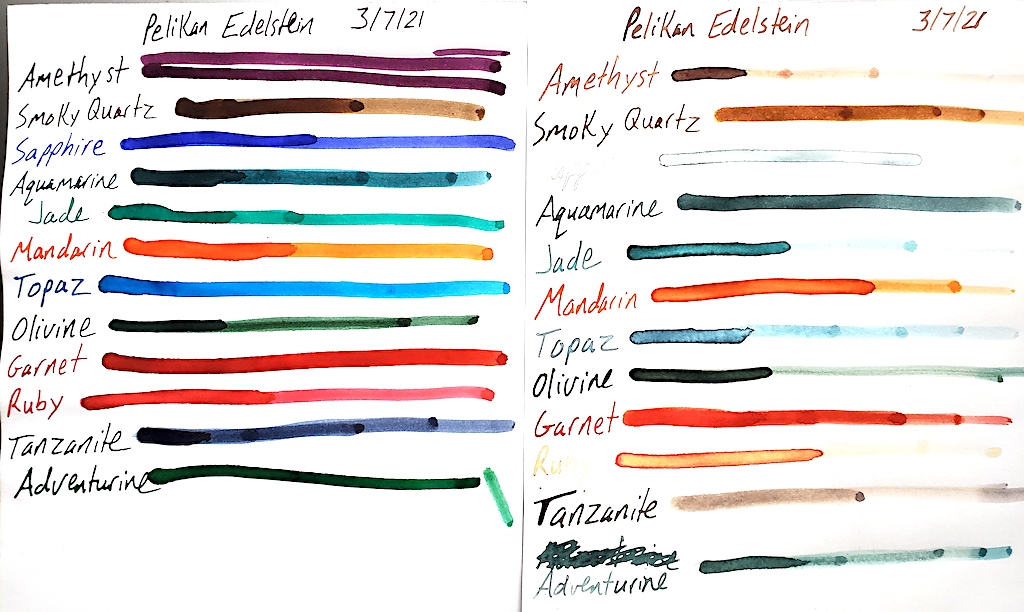
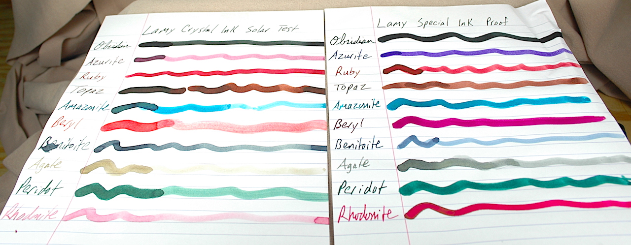
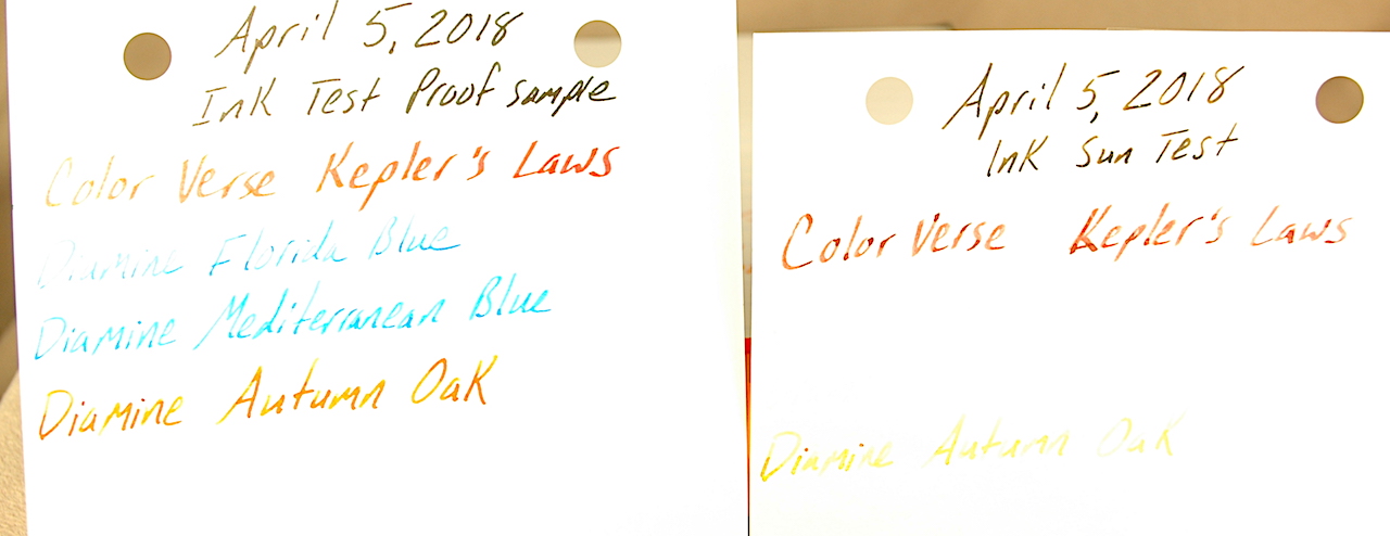
First you saw these Pelikan Edelstein inks in our UV ink fast test. Now we’re going back and checking their pH balance!

For years I told people…as I was told by many pen collectors and dealers before me…that you can always trust simple blue and black inks from the major pen manufacturers. However, just our initial testing indicates that might not be the best advice any longer.

Before I go on, let me preface the following by saying that we are not chemists. We feel confident in our results from our testing. However, we do not know the chemistry of the ink interacting with ink sacs, celluloid, gaskets, seals and other assemblies inside your pens. Our pH testing is simply raw data we gather from bottles of ink we have collected. Yet, it might help shed some light if you are experiencing trouble with certain inks interacting poorly with your vintage or modern pens over time.

Having recently written about Pelikan Edelstein inks in an ink-fast test, I thought I would revisit these inks for our pH testing. For those keeping score at home our meter and inks were tested and calibrated at 24ºC.

Pelikan Edelstein Amethyst               5.6
Pelikan Edelstein Aquamarine          3.3
Pelikan Edelstein Aventurine             6.4
Pelikan Edelstein Garnet                   6.5
Pelikan Edelstein Jade                       5.3
Pelikan Edelstein Olivine                    6.0
Pelikan Edelstein Ruby                       7.9
Pelikan Edelstein Sapphire                 3.7
Pelikan Edelstein Smokey Quartz       6.5
Pelikan Edelstein Tanzanite                7.3
Pelikan Edelstein Topaz                      6.4
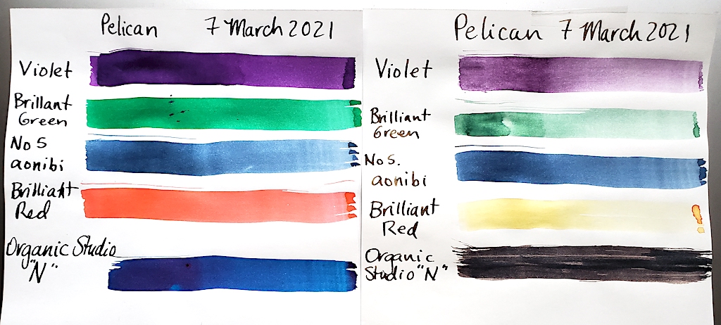
Pelikan Old Version Violet                   2.7
Pelikan Modern Violet                         3.4
Pelikan Brilliant Red                           6.9

Again, I’m not a chemist, and I have not studied how these inks interact chemically with ink sacs and other pen parts.

That said, what really strikes me as fascinating is that the “traditionally safe” blues such as Sapphire and Aquamarine are really acidic. I love Edelstein Sapphire and use it more than any of these other colors, and I would never have guessed it was as acidic at it is.

Also fascinating, I’ve been told for years never to put red ink in an ink sac, but Garnet, Ruby and Brilliant Red are among the closest inks to test near pH neutral.

Again, the chemicals in the ink might interact differently with the chemical compositions of our pens, but we find this to be a really fun look into our favorite inks. Many more UV and pH tests to come!

Pelikan Edelstein Inks Go Under the Sun

I feel that the harsh news must be tempered.

I LOVE Pelikan pens. It is my favorite modern pen brand. I LOVE Pelikan’s Edelstein inks. They are so vibrant and beautiful. I had extremely high hopes for testing them and having far better results than standard Pelikan inks. (I wrote a travel journal at 17 when visiting Germany and bought my first bottle of Pelikan Konigsblau Tinte—King’s Blue Ink, or Royal Blue by regular English naming conventions. I can barely read it, the ink is so faded after nearly 30 years.)

Look how vibrant and beautiful Pelikan Edelstein inks look when fresh on the page. Do you see what happens to them after 3 months in direct sunlight?

As fate would have it, I bought out an ink collection this past winter. There were more than 270 bottles of ink. Among the bottles were 12 different colors of Edelstein ink and 3 bottles of standard Pelikan inks, which I had not previously tested. Also included in this test are two non-Pelikan related inks.

Assisting me in this endeavor was my ever-more talented fiancé Dawn. You can immediately tell which test sheet is her’s by it being so much easier to see and read.

Pelikan inks were first started by German chemist Carl Hornemann in 1838, making Pelikan one of the oldest and most successful continuously operating ink companies in history. Yet, the company wasn’t really known as Pelikan until chemist Günther Wagner took over the company in 1871 and started using the Pelikan logo. The gemstone-inspired Edelstein inks were first launched with great success in 2011.

Our ink-fast test methodology remains simple. Put one sample in a sunny window for three months and one sample in a dark, cool place and check out the differences.

WOW!

Pelikan regular inks fare badly in three months of UV light. However, No. 5 Aonibi does very well.

None of the Pelikan inks withstood 3 months of UV light from the sun very well at all.  The beautiful Amethyst turned from purple to a faded brown. Blue-grey Tanzanite also turned colors to a faded brownish. My favorite Sapphire almost completely disappeared. So did Jade, Ruby and Topaz. When applied very thickly, Aquamarine, Olivine, Mandarin and Adventurine kinda held out. Only Garnet seemed to survive mostly intact.

Moving on to the standard Pelikan inks, Brilliant Red almost disappeared completely, turning a very faded yellow. Violet and Brilliant Green also lost about 70% to 80% of their color and visibility.

Our two non-Pelikan contestants were No. 5 Aonibi, which is a lovely blue-black when fresh and Organic Studio “N,” which is a stunningly beautiful sheening blue. Although I’ve never heard of No. 5 Aonibi, it held its own quite well in this test. Of the 17 inks sampled, it won the contest of looking the most like it did when it was first put to paper.

Organic Studio “N” could easily win the contest to be my new favorite blue ink, but it inexplicably turned black in the sun. That is way better than fading to near invisibility, but I really wish it held its true color when fresh on paper.

Bic Cristal Inks Get Testing

We tested these 8 Bic Cristal pens to see how ballpoint ink holds up to 6 months of sunlight. Blue, Pink, Green, Black, Grass-Stain Green, Purple, Turquoise and Red.

During my last visit with Ink-Fast Donn at the D.C. Pen Show in 2019, he said he was starting to test ballpoint inks to see how well they hold up to UV light.

Last summer, I discovered a collection of the famous and commonly used Bic Cristal ballpoints in my fencing gear. I taught a wonderful group of teens and tweens advanced competition maneuvers and strategy, and to help them remember their lessons and opponents, I insisted they keep “Diaries of Doom” and “Tomes of Terror.” To help personalize it more, I handed out colorful notebooks and pens.

Armed with 8 colors (blue, pink, green, grass-stain green, black, turquoise, purple and red), I created a sample on Rhodia paper and taped it to a sunny window of my home at the end of August. I took it down at the end of February and was surprised by the results.

This photo doesn’t really do full justice to the sample set and proof set. The blue doesn’t look as blue as it does in real life.

Surprise #1 to me was that the black ink faded. With fountain pen inks, you can generally count on black to be the most stable and fade-proof. While it didn’t fade away entirely, it had issues.

Side by side comparisons showcase the effect of 6 months of sunlight on Bic Cristal inks.

Surprise #2: Blue! Blue fountain pen inks fade something fierce under the withering sun. Bic Cristal blue got stronger! It lost some of its blueness and turned blacker, but it held on defiantly under the sun’s gaze.

Surprise #3: Grass-Stain Green didn’t fade as much as I thought it would. It faded a little.

Red and purple faded the most. Green, turquoise and pink faded a little, but survived okay.

Reflecting on this experiment, for some reason, I always assumed oil-based ballpoint inks would be far more permanent than water-based fountain pen inks. Yet, their chemical compositions all have their frailties. Some ballpoint colors react differently than fountain pen inks, but that shouldn’t surprise me as much as it did.

Lamy Crystal Inks Undergo Light-Fast Testing

With four moves in 2 years and a ton of other life changes, we were slow to test the new Lamy Crystal fountain pen inks to see how they would handle ultraviolet light and aging on paper. Luckily, we were able to start our three-month test this July. We actually let the test run about 3 and a half months.

To run our test, we used two sheets of Rhodia paper. Each of the 10 inks was first written on to the margin with a wet-writing glass dip nib. Then a swatch was drawn with a Q-tip with the intention of having a thick patch of ink and a thinned out portion so we could see the effects of UV light. One of the sheets was saved in a cool, dark, dry place. The other sheet  was posted in the sunniest window of our office. The inks tested were called: Obsidian, Azurite, Ruby, Topaz, Amazonite, Beryl, Benitoite, Agate, Peridot and Rhodonite.

For nearly 3 and a half months, we tested the left sheet of paper with 10 Lamy Crystal inks in the direct sunlight to see how much they would or wouldn’t fade.

Here are the results. If you click the photo, you will see a larger version of the photo. It is surprising how much some of the inks change and others do not change.

To the relief of many, the Lamy Crystal Obsidian black ink holds fast. It only fades a little, unlike a suprising number of black inks. Yet, the purplish blue “Azurite” fades heavily to a reddish color that looks like if you dipped your finger in merlot and wiped it on a piece of paper.

Ruby and Topaz both held their red and sepia-brown colors very well during their time in the sun.

Peridot landed right in the middle. If the green was laid down thickly, it held. If it was thin, it faded.

Benitoite might also have a middle grade for its time in the sun. It was the only color that got darker! Benitoite is a blue-black. It lost most of its blue in the transition, but its black got stronger.

Amazonite is an odd color change. To me, it is one of the two most beautiful colors when laid down fresh. It is a very vibrant green-blue. And when set thickly on the page, it remains dark after time in the sun. Yet, the odd part is that the green gets lost in the sun and a faded blue remains. Normally, blue is the color we’ve seen disappear.

Beryl is my other favorite color when fresh. It is a lovely purply pink. Yet, after 3 months of sunlight, it completely changed to a very faded red. Even the thick/dark parts of the ink faded to a red, which itself is a faded color though remained darker.

The two colors that faded the most were Agate and Rhodonite. Rhodonite starts a beautiful reddish-pink and faded to a barely visible pink. The Agate was a light grey that actually turned light brown also fading to nearly invisible.

Hopefully, this information helps you with your ink obsession. Happy writing!

More Ink Tests with Donn

Ink-fast testing image

Donn D. shared this new set of ink fast tests he made in 2018. Look how well Cross inks hold up!

Ink Guru Donn D. and I ran into each other again at the Chicago Pen Show a week ago, and I was pleased to see he had some new ink-fast tests to share. This batch is concerned with more fountain pen inks, and I was surprised to find great results with the Cross inks. Who knew? So often happens that Cross gets written off as a boring legacy brand. They make a lot of good ink and surprisingly good pens, in spite of their ubiquity on the scene here in the States.

Much of my conversation with Donn revolved around the fact that ballpoint inks are more susceptible to U.V. light than previously thought. He has found some fade out just as poorly as fountain pen inks. Given ballpoint inks are formulated with oil as a base, this surprised me. As thicker inks, I thought they’d last longer. With any luck, Donn will share those ballpoint ink results with us one day.

In the meantime, enjoy these great tests with fountain pen inks. Click the image to see a bigger version.

Meet the Ink Test Guru

Several years ago I met Donn D. at the Chicago Pen Show. We got to talking outside of the main room afterhours, and he was the one who introduced me to Ink-Fast Tests. He had a binder of very organized ink swatches that showed what an ink looked like when protected from the light, what it looked like after it had been left in the sun for 3 months and after it had been left in the sun for 6 months.

As I was on a quest for the perfect replacement blue for my beloved Waterman Florida Blue, I began making ink tests for this site. I figured you would be as curious as I am about how ink holds up to UV light.

Donn and I got together at this year’s Washington DC Pen Show and resumed our inky discussions. I asked if he would be so kind as to share some of his tests on the blog, and he said, “Yes.”

Included in this post are 4 pages of his tests of Pilot ink, Diamine ink, Noodler’s ink, Waterman ink, Parker ink and Pelikan ink…among others.

Donn described his methodology as such: “I exposed fountain pen ink samples to ultraviolet light from the sun for 3 months and 6 months.  The exposure method involved simply taping them to the inside of a patio door, which does not block UV very well.  I exposed all samples in the same manner, but not at the same time, and have no record of the number of cloudy vs. sunny days for each test.  The paper was standard office copy bond.

The inks in this test happen to be colors I like, rather than a general test of a manufacturer’s entire product line.

What surprised me most was how well green inks held up, and a chemist friend speculates a copper compound may be involved.

Note: Test sheet #1 shows 6-month results only.”

Thank you, Donn, for sharing so many of these ink tests. Everybody else, I hope these help you in your quest for the perfect inks.

Click on any of the images to see a larger, clearer representation of the inks tested. Please also note that these are not performance tests of the ink inside a fountain pen. Some of these inks are not as well suited to vintage pens as others. This is strictly to showcase how an ink will hold up to time and light. (For example, Noodler’s Ink often clogs the hell out of vintage pens. Beautiful inks but a pain to deal with unless you love spending hours cleaning pens.)

Ink Fast Test #5: Diamine & ColorVerse

I went a little ink crazy at Vanness Pens during the Little Rock Pen Show, back in April. Afterall, they only have the world’s largest selection of ink…and they were kind enough to ply just about all of the vendors and weekend pass holders with free food (including chocolate-covered bacon) and beer. As such, I dove further down the Diamine rabbit hole…and then I won a free bottle of ColorVerse Kepler’s Laws ink in a raffle!

These are before and after samples of Diamine and ColorVerse inks left in the sun for 3 months.

Now it is time to share my experiences with the inks. My all-time favorite blue ink is the old Waterman’s Florida Blue, so I had to try some of Diamine’s Florida Blue. Diamine Florida Blue is a very pale blue that is just a little too deep to be turquoise. I still prefer the much darker Waterman version. I put a test sample in a sunny window, and the UV rays completely erased the Diamine Florida Blue test sample! Definitely not archival quality ink, although it is attractive for artistic writing uses.

Diamine Mediterranean Blue ink is gorgeous when used in a really wet pen. The photo proof sample isn’t as generous of its deeper hues of blue. It could be my replacement for Waterman’s discontinued ink…except it too was completely erased by the sun!

My favorite ink find of the past year or two was Diamine’s Ancient Copper. When I saw the Diamine Autumn Oak at the shop, it looks about a shade lighter in a rich orangy brown. It is a beautiful ink when fresh. Annnnd, luckily it holds up a little better than Diamine blues in 3 months of sunlight.

Of the four inks, ColorVerse’s Kepler’s Laws held up best to the sun. It is a rich red color with purple hues and a little shimmer when fresh. (I don’t see the shimmer, but all of my pen pals insist that they see it.) It writes better than I thought it would. I was really worried it would clog up my pen, but I didn’t have that experience in a Delta Fusion A2 I have with a stub nib. After 3 months in the sun, the more vibrant red aspects vanished, but a slightly watery merlot color remained strong.

And for those who are curious about the black header ink, it is the already tested and proven Aurora black. A bad-ass ink that never quits.

Frau Tinte’s Iron Gall Ink Test

One of my favorite parts about owning a pen business is meeting so many amazing pen and ink collectors from around the world.

One of my many great new friends is a brilliant “amateur” ink historian from Germany who doesn’t want to be identified, so I shall simply refer to her as Frau Tinte. (Ms. Ink, auf Deutsch) In addition to collecting great vintage and modern pens and having a phenomenal talent with calligraphy scripts, Frau Tinte loves researching medieval ink recipes!

Frau Tinte’s iron gall ink goes down very faintly. You can barely read what you are writing. The cool thing is that you can smell the pomegranate and iron in the ink.

She has combed some truly amazing libraries in search of rare and original documents from as long ago as the 1200s and 1300s. As ink making was a very inexact science back then without a lot of consistent, formal measurements like today, recreating these inks is an art form in and of itself. Some of the ingredients are rather vaguely named, as the medieval German word for an item might not be what that ingredient is called today. Plus, old German scripts are practically a different language from modern German lettering. Yet, she methodically tests recipes until she can get reasonably consistent and accurate recreations.

Frau Tinte very kindly and graciously shared with me an old iron gall recreation that is partially made from pomegranates. You can smell the fruit and iron in the ink! The ink is toxic and highly aggressive in its relation to mammals, nibs and inkfeeds. She made it clear that I could only use this ink with a glass dip nib or a 14k gold dip nib with no inkfeed. If I filled a vintage or modern pen with it, it would quickly begin to eat the insides of the pen and feed.

Here are three samples of Frau Tinte’s Iron Gall Ink after a little more than a year in different elements.

Thus, I have spent the past year plus writing with it using a glass-nib dip pen. It is pretty amazing stuff. The iron in the ink oxidizes over time to get darker. Basically, it is rusting on the paper. When you write with it, you can barely read it. Yet, within a few minutes it darkens, and it can continue to darken for years. Many surviving handwritten documents from hundreds of years ago using this or similar iron gall inks are black, and you can see it is getting pretty dark in the samples, but it isn’t a true black, yet.

Wondering how a year would treat the ink, I created 4 samples. One was only seconds old when I shot it, so you can see what it is like to write with. It is a very faint grey that you can barely read. Test #1 was left in a cool, dry place with no direct sunlight. Test #2 was left in a window with direct sunlight. Test #3 was left in a dark, humid place. Each writing sample was written on Montblanc Meisterbütten paper…similar to the parchments used in the 1800s.

I thought the humid sample would have been the darkest, as it might have allowed for more rusting action, but it is about as dark as the control sample #1. The neatest result for me was the sunlight sample. The paper is bleached at least three shades whiter than the other samples. (Photo lighting makes that a little harder to see, but the difference is immediately obvious once you hold the samples together.) Although the ink is maybe a shade lighter than the other year-old samples, it is still really dark on the paper, unlike about 90% of the inks we leave in a window for only 3 or so months.

If you are looking for a permanent ink with a unique chemical signature, find yourself a good iron gall ink.

As for the availability of Frau Tinte’s creations, we are pondering the legal aspects of it on the market in the U.S. What worries us are the facts that it is toxic and how it can ruin pens so quickly if used inappropriately. I know you loyal readers are bright enough not to shoot it with your whiskey or fill your pens with it, but if McDonald’s can get sued for their coffee being too hot…well, you know where this can end up. Eventually, somebody’s poor kitty will find an open, untended bottle and think it is a snack or someone who possibly received it as a gift will fill their beloved $2,000 Montblanc with it. We definitely don’t want to be responsible for those tragedies. Yet, it would be nice for people who want to try it to have a safe and fun writing experience that is centuries old.

If you happen to be a product safety lawyer and happen to know the answers to such questions, please feel free to share them with me.

Ink Fast Test #3

Attracted by the many colors and properties of Noodler’s Inks, I just had to start exploring.

Finding the right orange ink for me became an obsession last winter. Loving the color samples online for Apache Sunset and Habanero, they were the first in my cart.

The top portion of this photo showcases fresh writing with Noodler’s Apache Sunset, Habanero, Polar Blue and Anti-Feather Black inks. The bottom of this photo shows how much or little they faded after being exposed to 6 months of summer sunlight.

Noodler’s Apache Sunset looked much darker in the online sample. In real life it was more of a running Pumpkin-Gut yellow-orange. It doesn’t offer much by way of shadowing effects unless you use a really wet nib or more preferably a wet, wide stub nib. In the six months it was posted in my sunniest window, it faded the most heavily, which really wasn’t surprising.

Friends know me quite well for my obsession with fiery hot tacos (My buddy Adam and I invented the notorious Flaming Hot Orgasmic Tacos from Hell while in college.), and I could not pass up a Noodler’s Habanero ink. This one looks spectacular and is the darkness that I thought Apache Sunset would be. It became my favorite of my 4 new Noodler’s inks. Unfortunately, its blazing color doesn’t hold up well to the blazing fury of the summer sun. As much as I love the color, I have noticed it is rather viscous. Generally, I have to thoroughly flush my pen every time between fillings of the Habanero ink. If I don’t, the pen gets too clogged up to write by the time I am half way through the second fill.

Since beginning these ink fast tests, I’ve been desperately looking for inks that won’t fade heavily with time or light. Noodler’s Bullet Proof inks are perfect for archival writing. Six months in the summer sun did little to diminish the strength of Noodler’s “Polar Blue” and “Anti-Feather Black.” These inks are promised to be UV resistant, water resistant, chemical uneraseable and many other incredible features. Our tests proved that out. When we soaked one sample in water, the paper disintegrated more than the ink.

Noodler’s Anti-Feather Black ink only gets a smidge fuzzy after being soaked in water. It holds its properties incredibly well in sunlight and under water…once it has been let dry, that is.

Yet, there is a cost to these inks as well. They clogged the living daylights out of two juicy writing pens. It was a matter of time more than of use. If I were to fill a pen with Anti-Feather Black and write it to empty in one day, there’d have been little problem. If I wrote out half of the ink in one day and then waited a week to use it again, then problems developed. Ink would dry out on the ink feed and start gumming up the works fairly quickly.

As much as I love the deep, rich black of the Anti-Feather, along with its archival qualities, I only reserve it for special occasions, using only a glass dip nib. The Polar Blue was so frustrating, I gave it away to a friend who wanted to try it.

Delving into Diamine Inks

It seems strange, even to me, that in spite of a lifetime using fountain pens, I had never previously gotten all that into inks. I used whatever was available, eventually falling in love with Waterman’s Florida Blue and Aurora’s black inks. And then Waterman went and discontinued Florida Blue. Sure, I bought up a bunch of it before it disappeared, but I found myself in ink crisis wanting to find something that I liked as much.

Witness the way sunlight fades fresh Diamine ink. The left writing sample spent 4 months in direct sunlight. The right writing sample is fresh out of the bottle. I was particularly impressed by the color, clarity and resistance to harsh UV rays.

Witness the way sunlight fades fresh Diamine ink. The left writing sample spent 4 months in direct sunlight. The right writing sample is fresh out of the bottle. I was particularly impressed by the color, clarity and resistance to harsh UV rays in the Diamine Ancient Copper ink.

This coincided nicely with a new generation of people exploring the wonders of many ink colors and brands! Now I have the bug, too. While still questing for my perfect Florida Blue replacement, I’ve been branching out trying new colors.

A penpal in Germany turned me on to the many wonders of Diamine last autumn. I picked out 4 colors to order and try on my own. I also performed an ink-fast test on them to see how they held up after spending 4 months in my window, during winter’s weaker light. Here are the results:

SHERWOOD GREEN: I’ve always loved Robin Hood stories, since I watched the Errol Flynn flick as a kid. Fresh on the page, it is a little darker and more yellow than I would have preferred, but it made a great ink for my Christmas cards last year. Given how dark and rich it is, I was surprised when it faded this much.

KENSINGTON BLUE: This is a beautiful dark blue with aqua accents in the shadowing, which you can’t see as well in this sample. Unfortunately, it suffers the same fate as many blues by fading too much over time.

PRUSSIAN BLUE: Given some German ancestry and an appreciation of their cheek-scarring fencing tactics, I had to try this ink. It is a good blue-black with some very nice shadow effects. As I am finding with other blue-blacks, it holds up a little better under the sun’s harsh rays.

ANCIENT COPPER: Hands down my favorite new ink of the past year! It’s rich, dark orange looks incredible when spread thin with a stub and then brought to a thick, darker clot when laid down thicker at the top or bottom of a loop. Its only downside is that it does seem to clog a bit in the pen over time. If I give my trusty Pelikan 800 a thorough flushing between refills, I have no troubles whatsoever. Best of all, it hardly fades at all, unlike my beautiful but fickle blues.