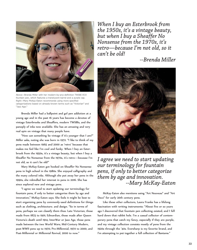
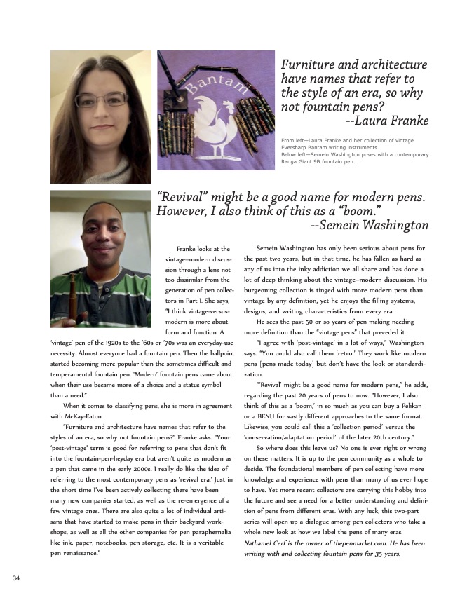
Apologies to a Parker 51

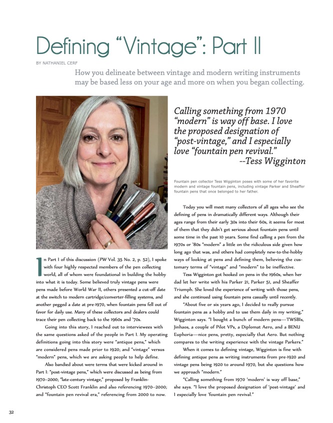
Time and again, I’ve mentioned the fountain pen that got me hooked into this crazy lifestyle. It was my mother’s father’s Sheaffer Balance Lifetime. Yet, I have another grandparental pen that never gets much publicity. It is a Parker 51 from my father’s side of the family.

This Parker 51 once belonged to either my father’s mother or father. I suspect it was Granddad’s, but either way it is a treasured keepsake.

The Parker 51 showed up in my life about 15 years after the Sheaffer. It was right around the year 2000. My father’s mother was getting sick and had to live with my parents. As they packed up her house, they discovered a Parker 51 in a desk drawer. They knew I liked old pens and sent it to me in Montana. At the time my collection was meager. My only other pens were a Sheaffer Imperial, a Rotring, a Waterman Phileas, Lamy Safari and Cross Townsend.

I recently pulled out the aforementioned 51 to write a letter and was struck by how little I knew about pens in 2000, when it showed up in my life. It would be several more years before I learned how to restore pens. I had never heard of a Parker 51. I had heard of Parker Duofolds because I had seen a modern Parker Duofold MacArthur Special Edition at Marshall Fields in Chicago. It was well out of my price range, and although its literature mentioned the original Duofolds, I assumed that none were left in existence! Honestly, I assumed that my Sheaffer was such a rare treasure that no other old-fashioned fountain pens could possibly exist. Good Lord, when I saw that modern Duofold in 1994, I was 18, and my 60-year-old pen might well have been what the dinosaurs wrote with.

That’s how little I knew. The internet only barely existed. I didn’t know a single soul who liked fountain pens. My parents thought they were archaic and messy. My friends parents thought the same. My relatives thought the same. I had not stumbled into any of the early pen catalogs and mailing lists. Only bank presidents wrote with Montblanc 149s to show off. In my tiny world, I was the last hold out.

Enter the 51, and my ignorance was on full display. It still worked and had an Aerometric filler with a silicon (sorry, pli-glass) ink sac. I assumed it was some deranged promotional pen my grandmother must have gotten in the 1980s for one of her many charitable donations. It didn’t look like a vintage pen to me. I didn’t know how to look for and understand a date code then. I didn’t know that the 51 was originally released in 1941 with the advertising stating that it was 10 years ahead of its time! The design certainly fooled me, as I thought it was from the 1980s. The date code that I now understand said it was made in 1950.

My paternal grandparents were both very formal people. The black barrel and lustraloy cap could have belonged to either of them, but as my grandmother was far more into flowery and feminine design, this pen, I now understand, was likely my grandfather’s.

My granddad, as he was called, died when I was only 8 or 9 years old. I never got to know him very well. He was always nice, but he was of a generation and upbringing that children were meant to be seen and not heard. He wasn’t the type of guy to romp around on the floor with me, but I don’t have any bad memories. As I grew up, I learned he had a business in professional sales in New York City. He was into electronics, fast cars, Broadway, a little bit of baseball and cocktail parties with witty conversation. As an adult, I’m surprised at how much we have in common, and I wish I could have known him as an adult. Our similarities baffle my own father, who wonder’s how his father’s tastes could have so completely skipped a generation.

My own father and I share the love of writing. My dad prefers ballpoints and typewriters to fountain pens and computers, but, hey, nobody’s perfect. All the same, I don’t think my grandfather likely wrote much besides orders, quite possibly on carbon copy paper. This might explain why the Parker 51 has such a firm extra-fine nib. The pen barely looked used when I got it. I suspect Granddad put it away as soon as he could get his hands on reliable ballpoint pens. I wonder if in the things left behind were a first or second-year Parker Jotter. I can see him zipping down the road in his much-beloved candy-apple red 1955 Ford Thunderbird and a Parker Jotter in his shirt pocket.

Of course, it would be nice to have that Thunderbird or any one of the myriad Lincoln Continentals that he drove over the years. I am very happy with his pen, but he sure had great taste in cars, too.

How Do I Start Collecting Pens: Why Are Some Pens More than Others?

A good friend recently asked me why some pens cost more than others. The cheeky, glib and true answer is supply and demand. But, it is more than that. Sometimes it is marketing. Sometimes its trends in the marketplace.

This is a “Big Red” senior Parker Duofold made of orange Permanite.

However, he was asking for something more specific. When looking at vintage pens, he saw wildly fluctuating prices for pens that looked almost the same to him. Why does the average super-famous senior Parker Duofold “Big Red” (orange) go for $100 or $200 and the average senior Parker Duofold in Mandarin Yellow go for $800 or $900?

Big Reds are pretty common, especially the later 1920s’ version made of “permanite.” Most vintage collections have several of these pens. Mandarin Yellow versions of the same pen are fairly rare. They didn’t make as many, and the material used to make the yellow turns very brittle with age. As such, a large percentage of the senior Mandarin Yellow Duofolds broke. Nevertheless, these are still beautiful pens, and their scarcity makes them all the more desirable. Senior-sized Duofolds cost the most back when they came out, so many people bought the smaller Junior and Lady Duofold models to save money. As such, collectors have chosen the rarer senior models to be the favorite, which is why junior and Lady Duofold versions of the pen in mandarin yellow sell for much less than the seniors.

Mandarin yellow was a much more fragile substance to make Parker Duofolds, and it didn’t age well. These Mandarin Duofolds are much more sought after because they are more scarce.

This also is a good place to demonstrate trends in the marketplace, too. I am writing this in October of 2022. Where as a reasonable price to pay for a senior Mandarin Parker Duofold is $800 to $900, five to seven years ago, these same pens were getting $1,200 to $1,500. These pens were in higher demand back then, and dealers couldn’t keep them in stock. The market has softened some since then. Why? 2 factors. 1.) Just about everybody who wanted one of these pens back then got one if they could afford it. 2.) Sadly, we are starting to see a passing of a generation of vintage pen collectors. There are more and more of these pens on the market, and younger generations of pen users and collectors are not as excited about vintage pens. ALSO, the younger generation is paying off insanely large sums of college debt and paying tons more for skyrocketing housing prices. In their hierarchy of stuff to pay for, a rare 100-year-old pen is not as pressing as next month’s rent or feeding a young family.

Staying in the Parker Duofold family, Senior Big Reds made of orange hard rubber are usually much more valuable than the more common and less fragile “permanite.” Streamlined Senior Parker Duofolds are rarer and tend to get more than the “traditional” flat-top designs. Pristine Lapis (blue) Senior Duofolds can command a lot more money due to the fact most Lapis Duofolds turned dark and nearly black in some cases. The same goes for the Pearl and Black Duofolds. They turned brown with discoloration. If you find a pristine one, those are going to get a lot more money. Another feature on a Parker Duofold that is highly regarded is the bandless senior Parker Duofold Big Red. These pens are also really hard to find. Most Duofolds had one, two or even three bands near the lip of the cap. The bands help to protect the cap when posting it on the tail of the pen. Bandless models weren’t common, and the caps often broke when people posted them. Soooo, many people will pay top dollar for a bandless senior Duofold.

We haven’t even left the Parker Duofold family, yet.

Flexible nibs, such as this Conklin #4 nib, are in high demand in 2022.

Flexible nibs are king right now. Everybody wants one, and so few pens came with flexible nibs over the years. All flex nib pens command top dollar. Basic Waterman 52s would sell for maybe $50 ten to fifteen years ago. Yet, many of their tiny #2 nibs have a little to a lot of flex, and these same pens now get between $100 and $150.

Conversely, one of the several Waterman pens that really draw big bucks are early 1920s Waterman #7 Pink pens. These were oversized…or close to it…. The distinguishing feature of these pens is a pink ring around the top of the cap AND the word “Pink” imprinted on the 14k gold nib. Waterman made these nibs specifically to be very flexible writers. All of the color-ring Waterman #7’s are fairly desirable, but Pink is the most sought. As such, these pens command much more money. You can probably find a Waterman 56 or 58 in black hard rubber from the same general time period for less…with the same basic flex nib…and save a bundle over the Pink.

Apparently, even cheap TWISBI fountain pens made in China are falling down this pricing rabbit hole. You can buy most TWISBI Eco fountain pens for around $15 to $20 brand new. However, just the other day I saw a “limited edition” transparent orange cap TWISBI Eco sell at an auction for more than $230! It was a discontinued color that people love enough to get into a bidding war over.

Most TWISBI Eco fountain pens are pretty inexpensive but this rare color model goes for more than $200 on some auctions sites.

There are probably hundreds of vintage pens (and modern) such as these to ask these questions of, and so I shall revisit this topic and question from time to time to help sort out why some pens are so much more valuable than others.

Caran D’Ache Chromatics Face the UV-pH Challenge

Swiss pen maker Caran D’Ache is most famous for its precision engineering on its line of ballpoint pens. They make nice fountain pens, too, but it is the company’s ballpoints that the world knows best. Yet, as so many pen makers now do, it also decided to enter the lucrative fountain pen ink market.

Here is a side-by-side comparison of Caran D’Ache Chromatic inks before and after undergoing 3 months of UV sunlight testing.

Caran D’Ache Chromatic Inks are a daring entry, indeed. From their hexagonal bottles that tip to fill to the last drop to their bright and cheery colors, Chromatics made an instant splash on the scene.

Naturally, we wanted to know how well these inks hold up to UV light from the sun and where they register on the scale of a pH test. We placed this sample in our sunniest window for 3 months. We also used our pH meter, which was calibrated to the heat and temperature of our testing station before testing the inks.

The results of our test were surprising. I falsely suspected that there might be some heavier pigmentation in the “Chromatic” inks that would make them shine and dazzle a bit on the page. However, virtually all of the ink colors lost seemingly 85 to 90% of their color, fading heavily from view. “Electric Orange” all but disappeared. Even a stalwart color such as “Cosmic Black” faded to a medium brown, and it had the most staying power.

The pH test results ranged all over the map. As a quick refresher on chemistry, a pH number of 7 is pH neutral like pure water. The closer to 0 something becomes the more acidic it is. The closer to 14 it goes, the more alkali or base something is. In theory, you want an ink that is pH neutral, BUT we have no idea how the chemicals in each ink will react to the chemicals of the ink sacs, converters, inkfeeds and the like. We have found some “neutral” inks to eat through ink sacs rapidly, while some seemingly alkali or acidic inks don’t bother a pen’s parts at all. The following is simply raw data for you to do with as you please.

COLOR:                              pH Score:
Cosmic Black                      6.9
Electric Orange                  8.9
Vibrant Green                     4.4
Idyllic Blue                          3.1
Infra Red                             8.2
Ultra Violet                         7.6
Magnetic Blue                    3.7
Organic Brown                   4.5
Hypnotic Turquoise         N/A

A few of the things that stand out to us are that Cosmic Black is almost perfectly neutral. Aligning with more of our past experiments, the blues were fairly acidic. Yet, playing against stereotype, the red and purple were closer to neutral. Green remains quite acidic, which is expected, but the brown also was acidic, which wasn’t expected.

As always, I hope you found this snippet of ink data helpful to your quest for the perfect ink for you.

Fun with Refills

You can see a Pilot G2 refill next to a Pelikan standard rollerball refill in this photo. Look closely, and you can see that a G2 will fit most rollerball pens that take standard RB refils.

Quite possibly the most popular disposable pens on earth are Pilot G2 gel pens. They are so incredibly smooth and fluid for any type of ball-tipped writing device.

About a year ago, in an act of refill desperation, I was out of standard rollerball refills and trying ship out a pen I had just sold, in which I promised a fresh, working rollerball refill. That is when I noticed that I had some spare Pilot G2 refills lying around, which I had gotten and ignored from a large collection I had purchased.

On closer inspection, I realized that the two refills were close enough alike that a G2 might fit in the Waterman that needed it. Lo and behold, it did. It wrote magnificently! Pretty soon I was popping them into Auroras, Pelikans and every other rollerball that needed a similarly sized refill.

Not all pens take them easily. As you can see, this Pelikan replacement refill is a little longer than the G2. BUT, if it turns out the G2 is too short, just wad up a little tissue and fill the back end of the pen with it until the G2 fits and writes without any jiggling.

I like rollerball refills just fine, but none compare to a G2…for me…in the writing experience. I don’t see using regular rollerball refills, again.

Pen Books: Waterman Past & Present

Staring at a shelf full of pen books, it struck me that I ought to share with you some of what these great tomes have to offer. As such, I would like to start with a pen-collecting classic.

Here is the cover to “Waterman Past & Present,” a definitive guide to Waterman pens spanning 1883 to 1958. It is a great resource for identifying each model of Waterman pens.

“Waterman Past & Present: The First Six Decades” by authors Max Davis and Gary Lehrer.

If you are just getting into vintage pens and/or Waterman pens, this book is an absolute must. Most professional collectors and dealers I know still use this book as one of their favorite references to identify classic Waterman pens.

The book’s authors are among the most trusted dealers in vintage pens. Max Davis once owned a pen shop in New York City, before moving to Europe to start several very successful websites. According to the book, he contributes most of the European advertising for Waterman and most of the ink displayed in one chapter. The rest of the book was completed by renowned pen expert Gary Lehrer, whose personal Waterman collection was possibly second-to-none. He also created with his wife Myrna one of the most successful vintage pen catalogs online and in print. I had the good fortune to know Gary and Myrna on the pen show circuit, and I was very sorry to learn of Gary’s passing earlier this year. He was an honest, kind and hard working pen man who helped to build pen collecting into the hobby it is today. He also was an excellent pen repairman.

Published in 2008, “Waterman Past & Present” is a 236 page book. Hardbound and coffee-table book size, it sports full-color on almost all of its thick, quality paper pages. After a very brief history about Louis Edson Waterman and his pens from 1883 to 1958, there is very little writing in this book.

Instead, it is a feast of images from common Waterman pens to some of the only known remaining rare models. Most of the pen photos are printed at their actual size, with specific details called out to help differentiate between models that might look similar. Along with the photos of pens are clear, easy to read images of original Waterman catalog pages AND magazine advertisements. Additionally, many of the original bottles of Waterman ink are present.

The only thing missing from this book appears to be Waterman pencils. Some appear in the ads and catalog pages shown, but few are photographed or given much thought.

Nevertheless, this remains a phenomenal resource for identifying Waterman pens, and it is wonderful to be able to see real samples of some rare pens that you and I might never seen in real life.

Plenty of Good ‘Ink’

I am happy to announce that “Ink CT” magazine just profiled ThePenMarket.com and my friend and Master Penman Hong Nhat Nguyen, owner of Rose Art Creative, for a story about vintage pens and handwriting styles.

Publisher Jeff Lilly has given me permission to share PDFs of the story here, but he says you can read the print more easily on his magazine platform, which let’s you blow up the print to read it more easily: https://issuu.com/inkpublications/docs/ink_magazine_-_august_2022/20.

Special thanks also goes out to my pen-loving friend Brenda Miller for being a part of this story.

Iroshizuku Ink Gets UV & pH Tested

No one should be surprised by the meteoric rise of Iroshizuku inks on the fountain pen scene. Japan’s finest ink makers have created dozens of colors and hues that offer vibrancy and shadowing while never clogging a vintage or modern fountain pen.

We picked up 24 bottles of this amazing ink and have submitted them to our rigorous UV and pH testing. Each of the following inks was placed in one my sunniest windows between July 16, 2021 and October 16, 2021. We calibrated our pH meter and tested these inks at 75.6ºF at 50% humidity. As a quick reminder, on a pH test, 0 is the extreme limit for acidic, 7 is neutral and 14 is the extreme end of alkali or base. Click the individual photos for a closer look.

In many of our tests, blue inks tend to be very susceptible to UV light. Not Iroshizuku! Unfortunately, many of its other colors fade badly. The images certainly explain more than I can. Nevertheless, I love the peachy salmon of a late summer sunset that is Fuyu Gaki ink, and like a sunset it fades almost entirely. The nearly emerald green of Shin Ryoku turns turquoise. The blue-black Fuyu Syogun turned a light-fog grey. And the black Take Sumi stayed dark but turned dark brown.

When it comes to pH, these are simply raw data points. We do not know specifically how they interact with the chemistry of the ink sacs and piston parts of your pen. Most of these Japanese inks are on the shallow end of the base depth chart.

Color                        pH
Murasaki-Shikibu  8.1
Chiku Rin                 8.8
Shin Ryoku              8.4
Juro Jin                    9.0
Shin-Kai                   8.4
Asa Gao                    8.4
Fuku Gaki                8.6
Yu Yake                    8.5
Kosa Mosu               9.1
Momiji                      8.9
Tsutsuji                    8.7
Yamabudo               9.1
Syo-Ro
Ku-Jaku                    8.5
Tsuki-Yo                   8.5
Ama-Iro                    8.8
Fuyu Syogun           8.5
Kiri-Same                9.0
Kon-Peki                  8.7
Tsuyu-Kusa             8.7
Aji-Sai                      9.2
Tsu Kushi                9.0
Ina-ho                      9.0
Take Sumi               8.3

Happy Memorial Day

Norwich’s largest Civil War memorial can be found on the Chelsea Parade of the “Millionaires’ Triangle.”

Here in the United States it is Memorial Day. For many, it is the unofficial start of summer and a day off work and school to gather with family and friends for picnics and barbecues. The true intent of the day is to reflect on the lives lost defending the United States in times of war.

This is my first Memorial Day in Norwich, Connecticut, my new home. We are one of the oldest cities in the country dating back to 1659…founded 39 years after the Pilgrims landed just up the coast in Plymouth, Massachusetts. My walks are steeped in history. Native Americans and English settlers fought wars here against each other and against other tribes. This city was active in the American Revolution. The Sons of Liberty met at a tavern that still stands to discuss strategy and foment revolution. America’s great general and even greater traitor Benedict Arnold was born here. And, yes, George Washington once slept here.

The men of Norwich have been represented in all of our wars. The city’s greatest tributes go to the men of Norwich who fought in the American Civil War. Norwich was as Yankee as they come. Norwich began the process of outlawing slavery before America was a country in 1774. The city was a critical hub on the Underground Railroad. The city was surprisingly unified in abolitionism, and Abraham Lincoln even spoke here during his first presidential campaign. City Hall still has the banner from his visit preserved for all to see. There are at least three Civil War memorials in the city, commemorating the lives of Norwich men who served and/or died so that others could be free and the nation reunited.

Here lies a Union soldier who died a prisoner of war at the horrifying prison camp in Andersonville, Ga.

Our cemetery is the most poignant memorial, as you can visit the actual graves of some of those men who were transported home after their final battle and lain to rest. The most powerful tombstones are those of the 9 soldiers brought back from mass graves dug at Andersonville, Georgia. If you are not familiar with Andersonville, it was the prototype of a concentration camp 80 years before World War II. Run by a German immigrant for the Confederacy, tens of thousands of Union prisoners of war were trapped in a confined prison yard with no sanitation, barely any drinking water and even less food. Photos of the men who survived were walking skeletons, skin stretched tightly over their bones.

About 15 soldiers from Norwich were known to have died at Andersonville. Norwich sent a man to retrieve all of their bodies the minute the war officially ended. He discovered 10 and was able to return 9 to our graveyard. The 9 are in a circle surrounding a flag pole and parrot gun (rifled cannon used in the Civil War). Surrounding them are dozens, if not hundreds of Civil War veterans who lived through the war and chose to be buried with their comrades who perished decades earlier.

Given Norwich’s abolitionist history, it can be little doubted these soldiers were mostly intent on freeing the slaves. Perhaps some even wanted black Americans to have the same rights and equal standing as white Americans. It was not an uncommon idea among 19th century abolitionists. Others might have fought to restore the union and deal a blow to the “states’ rights” argument that didn’t start gaining a lot of traction until after many southern states had already seceded from the Union under a pro-slavery banner.

The Civil War ended 157 years ago, and, yet, issues of equality have not been resolved and “states’ rights” sentiments have grown strong–along with voter suppression efforts–in the past 22 years.

As I reflect on this Memorial Day about those who gave their life for this country, I especially wonder what the ghosts of Norwich’s Civil War veterans would have to say about our modern society that is actively roiling in the issues they might have thought they resolved with their sacrifices so long ago.

J. Herbin Ink Goes Under the Sun

French inks haven’t previously undergone our rigorous testing, and we were excited to give them a UV light-fast test and pH test. We purchased a small collection of a dozen different colors of J. Herbin.

We started this test on March 7, 2021, by placing a sample of 13 inks in our sunniest window.

We test these J. Herbin inks to see how well they can withstand UV light and to see where they rank on the ol’ pH meter.

Believe it or not, this was our first time writing with J. Herbin ink. What really struck us was the vibrancy of the dry ink on the page. Of the colors I liked best, Rose Cyclamen really pops with a purple-pink splendor. Dawn’s favorite color is the electric turquoise blue of Bleu Pervenche. Eclat de Saphir is a solid daily blue. And my new permanent addition to my daily writing is the Amber de Birmanie. It is an incredible orangy brown.

Unfortunately, 3 months of direct sunlight does not treat these inks well. All of the colors except the gold metallic ink bleach substantially in UV light. You can see the damage in the photo. Some of the really drastic changes include Rose Cyclamen turning bright, light bubble-gum pink; the blue-black Bleu Nuit turns a pale, faded purple and Violette Pensee disappears almost completely! Larmes de Cassis turns from purple to pink.

The following show the pH results for each ink. We actually had three different bottles of the Bleue Nuit, Orange Indien and Bleu Pervenche. The labels on the outside of the bottle were different, so we list these two inks by their label results, too. As a quick refresher in chemistry, a pH number of 0 is as acidic as a chemical can be. 7 is neutral, like pure water. And 14 is the maximum extreme of alkali/base.

Perle Noir                          7.6
Cafe des Iles                     3.4
Rose Cyclamen                4.1
Bleue Nuit                         4.0 (Green Label)
Bleue Nuit                         6.9 (White & Blue Label)
Orange Indien                  4.9 (Green Label)
Orange Indien                  6.9 (White & Blue Label)
Bleue Myosotis                 2.2
Rouge Fuchsia                 4.6
Bleu Pervenche                7.0 (White & Blue Label)
Bleu Pervenche                6.2 (Green Label)
Eclat de Saphir                 6.4
Violette Pensee                 4.4
Amber de Birmanie         5.8
Larmes de Cassis              7.1

Pen World: Defining Vintage Part 2

The sequel to my story in Pen World Magazine is now on news stands. Click each photo to read each page of the story. We have permission to reprint it here from Pen World editor Nicky Pessaroff. Be sure to subscribe to Pen World to read this and many other great stories about pens.

Click the image to better read the story.

Click the image to better read the story.

Click the image to better read the story.