
 Shopping Cart


Even for experienced professionals, it is really difficult to gauge a nib by its number. We get calls and e-mail with some regularity asking for a nib of a certain number. The trouble is, we often aren’t sure what the customer really wants. If the nib brand isn’t specified it can be a really challenging to know what is really desired.
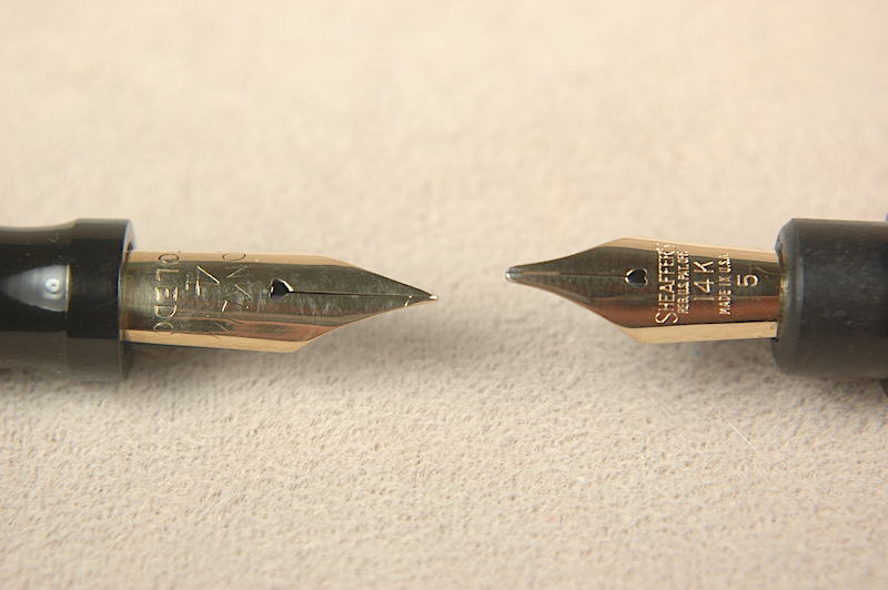
A number on a nib doesn’t always mean what it seems to mean. Here a #4 is larger than a #5.
Take this 14k gold Conklin #4 and 14k gold Sheaffer #5 for example. It is often assumed that nibs always followed a standardized system of sizing. After all, that would make the most sense. Unfortunately, especially in the golden era of vintage pens, many of the companies sized their own brands differently from their competitors. The only thing that seems uniform is that within each brand a #0 or #1 nib was the smallest and the sizes could go up to 12 or higher, though many seemed to top out around 8. Here you have a Conklin #4 being larger than a Sheaffer #5.
The closest to a standard setter in the 1920s and ’30s might have been “Warranted” nibs. These were usually 14k gold nibs that were used by a wide variety of 2nd tier pen brands and repairmen looking to get a pen up-and-running, again, if they didn’t have the proper branded nib. In some ways, these were the JoWo or Bock nibs of their time.
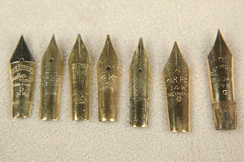
Nib sizes vary widely by brand in this photo.
Check out these nibs lined up together. From left to right: Sheaffer Feather Touch #5; Sheaffer 3-25; Waterman 2A; Unbranded #2; Mabie Todd #2; Star PE #6 and Diamond Medal #5. Note their lengths and widths in relation to their numbers and each other.
To size a nib properly, especially if it isn’t a branded nib, it is important to measure the nib. To do that, let’s discuss the anatomy of a nib. Let us start with the writing tip, which usually has a special tipping material to keep the nib from deforming with a lot of writing. The tip grows into the two (or three for music nibs) tines. The breather hole allows for the exchange of air and ink inside the pen, helping to facilitate ink flow. Usually the breather hole is centered at the widest part of the nib known as its shoulders. As the nib tapers down to its tail, that part is known as the body of the nib.
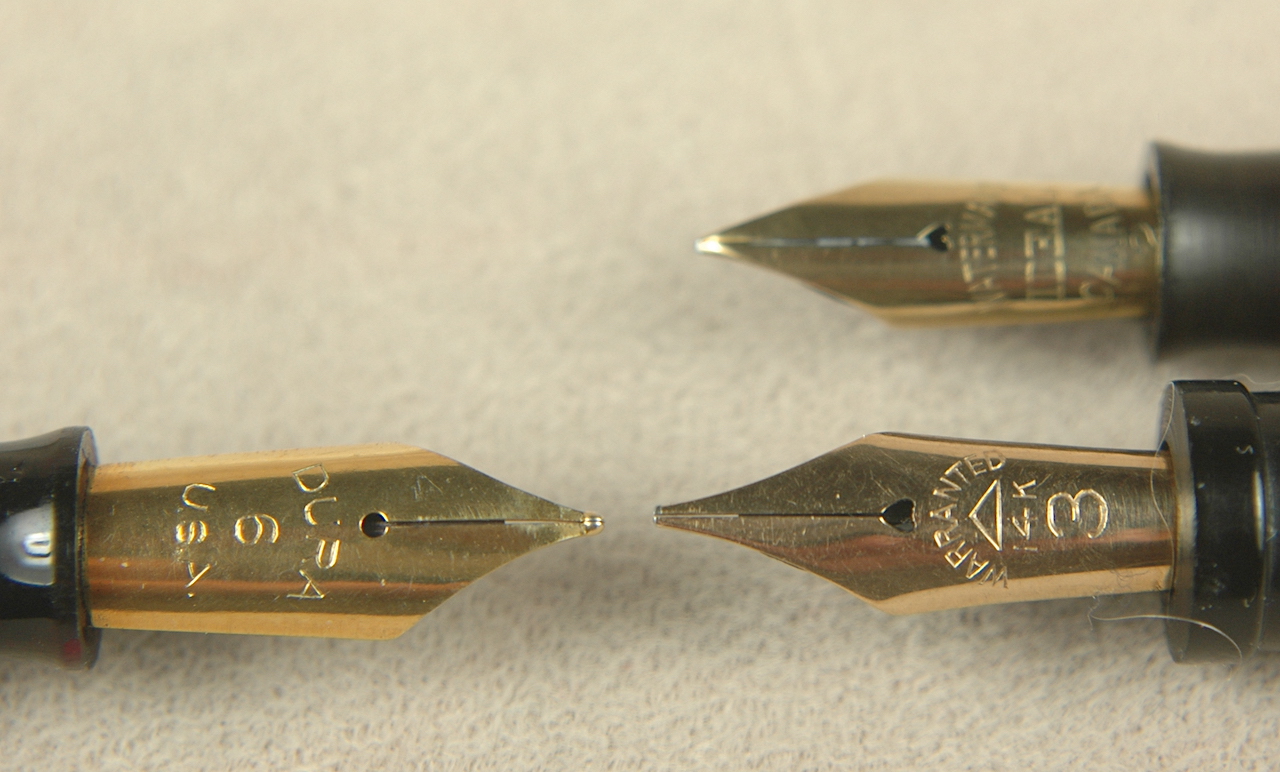
Here are 3 more numbered nibs muddying the waters of size referencing. The 6 is a little bigger than the 3, but it is definitely smaller than a JoWo 6, which I didn’t have in time for this article.
If you are looking for a good replacement nib, measure the length of your nib from tip to tail. (It is easier in centimeters and milimeters than 32nds and 64ths.) Then measure the shoulder. These two measurements will get you pretty close. Probably close enough in 90% of cases. Yet there is one last bit to account for, which is the width of the gold. As the technology improved nibs got stamped thinner and thinner. It is easy to feel the difference between a 1920s Sheaffer Lifetime and a 1950s Sheaffer Snorkel nib of open design.
This brings us to some of the more confusing numbers on nibs. Earlier you saw a photo of a Sheaffer 3-25 nib. Although most 3-25 nibs are the same general size, that number referenced the price and warranty length of the pen from the date it was purchased: $3 and 25 years. You might also see Sheaffer 5-30 and 7-30 nibs. If you ever find a 7-30 nib, snatch it up. Those are pretty rare. It was a clever marketing tactic by Sheaffer. For an extra dollar, you got the Lifetime warranty pen. If someone back then could already afford the $7, they could afford $8. Yet, how many people really used their Lifetime pens for 30 years or more? That is a question I would love to know the answer to. I’m sure a few did, but, for many, pens were a fashion accessory and statement, as well as a useful tool.
Sheaffer Lifetime pens of the 1920s and ’30s had elaborate serial numbers, which had for more to do with fighting black-market pen dealing than tracking customer pens.
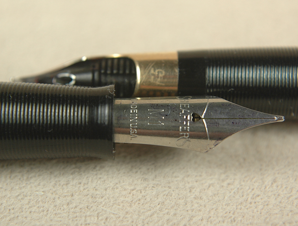
Showcasing the 1950s Sheaffer numbering system are two more nibs. M1 = Medium Steel Open Nib and F5 = Fine-Point, Two-Tone 14k gold Triumph Nib.
In the 1950s Sheaffer started an alphanumeric nib classification system, which was really quite inspired and gave a great deal of information about the nib. The first letter of the code was the point style: A = accountant (extra, extra razor-thin fine); B = Broad; F = Fine; G = Gregg Shorthand; M = Medium; S = Stub and X = Extra Fine. On hyper-rare occasions there could be two starting letters led by an F for flexible such as an FB5, as you will soon read.
The numbers that followed the first letter were: 1 = Steel Open Nib; 2 = Monotone 14k Gold Open Nib; 3 = Two-Tone 14k Gold Open Nib; 4 = Palladium Silver Triumph (conical) Nib; 5 = Two-Tone 14k Gold Triumph Nib and 6 = Palladium Silver Open Nib. And for those keeping score at home, the two-tone nibs were solid 14k gold with a decorative Palladium plating over about half the nib.
On rare occasions there was another letter that followed the number: L = Left Oblique and R = Right Oblique.
And there you have it. At the very least it is a start to understanding the numbers we see on nibs and what they might mean. I hope you found it to be helpful.