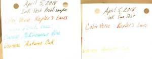
I went a little ink crazy at Vanness Pens during the Little Rock Pen Show, back in April. Afterall, they only have the world’s largest selection of ink…and they were kind enough to ply just about all of the vendors and weekend pass holders with free food (including chocolate-covered bacon) and beer. As such, I dove further down the Diamine rabbit hole…and then I won a free bottle of ColorVerse Kepler’s Laws ink in a raffle!
Now it is time to share my experiences with the inks. My all-time favorite blue ink is the old Waterman’s Florida Blue, so I had to try some of Diamine’s Florida Blue. Diamine Florida Blue is a very pale blue that is just a little too deep to be turquoise. I still prefer the much darker Waterman version. I put a test sample in a sunny window, and the UV rays completely erased the Diamine Florida Blue test sample! Definitely not archival quality ink, although it is attractive for artistic writing uses.
Diamine Mediterranean Blue ink is gorgeous when used in a really wet pen. The photo proof sample isn’t as generous of its deeper hues of blue. It could be my replacement for Waterman’s discontinued ink…except it too was completely erased by the sun!
My favorite ink find of the past year or two was Diamine’s Ancient Copper. When I saw the Diamine Autumn Oak at the shop, it looks about a shade lighter in a rich orangy brown. It is a beautiful ink when fresh. Annnnd, luckily it holds up a little better than Diamine blues in 3 months of sunlight.
Of the four inks, ColorVerse’s Kepler’s Laws held up best to the sun. It is a rich red color with purple hues and a little shimmer when fresh. (I don’t see the shimmer, but all of my pen pals insist that they see it.) It writes better than I thought it would. I was really worried it would clog up my pen, but I didn’t have that experience in a Delta Fusion A2 I have with a stub nib. After 3 months in the sun, the more vibrant red aspects vanished, but a slightly watery merlot color remained strong.
And for those who are curious about the black header ink, it is the already tested and proven Aurora black. A bad-ass ink that never quits.


 Shopping Cart


