


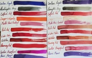
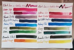
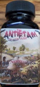
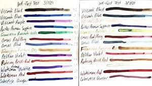
Inktober Wrapping Up Our Noodler’s Ink Tests
I can barely draw a stick figure, so for our contribution to Inktober, I thought I would share the last of the results from our deep dive into testing Noodler’s Inks. These are the final 22 inks from our big haul several years ago.
Examining Noodler’s Ink Part III
A new year means a new look at different inks. As such, here are 11…
Examining Noodler’s Ink Part II
For your writing pleasure, we have tested 10 more Noodler’s-brand inks. In Part I we…
Examining Noodler’s Ink Part 1
The one ink brand everyone is always talking about is Noodler’s Inks. People either love…
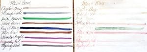
Loose Ends Ink Test
While wrapping up our ink tests in 2021, we had a bunch of loose bottles…
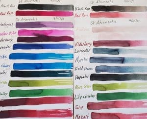
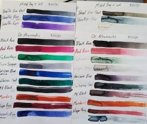
De Atramentis Starts Rich and Fades
Happy New Year! Let’s start the year right with a fresh look at some lesser…
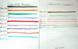
Caran D’Ache Chromatics Face the UV-pH Challenge
Swiss pen maker Caran D’Ache is most famous for its precision engineering on its line…
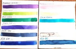
Iroshizuku Ink Gets UV & pH Tested
No one should be surprised by the meteoric rise of Iroshizuku inks on the fountain…
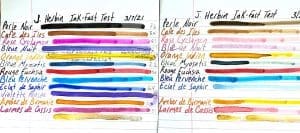
J. Herbin Ink Goes Under the Sun
French inks haven’t previously undergone our rigorous testing, and we were excited to give them…
A Potpourri of Ink Tests
As we have been conducting our ink tests, we ran into a grouping of mostly…
Whoa! Montblanc Inks…Beware!
Happy New Year, everybody! Sorry for the long absence. December and early 2022 have been…
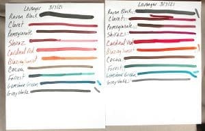
Levenger’s Ink Kicks Ass!
Mathematical and computer genius Alan Turing famously said, “Sometimes it is the people who no…