 Shopping Cart


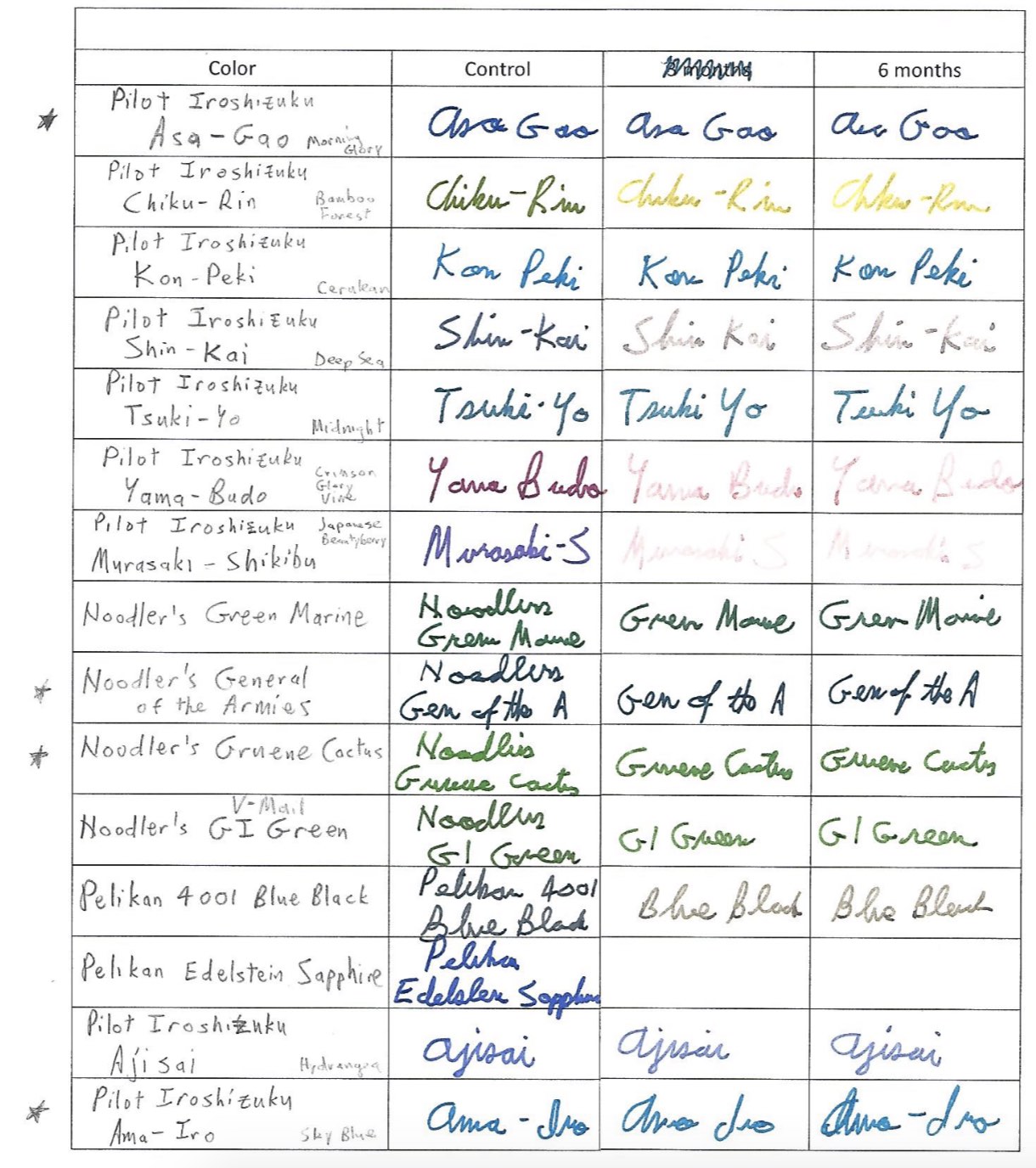
 No one should be surprised by the meteoric rise of Iroshizuku inks on the fountain pen scene. Japan’s finest ink makers have created dozens of colors and hues that offer vibrancy and shadowing while never clogging a vintage or modern fountain pen.
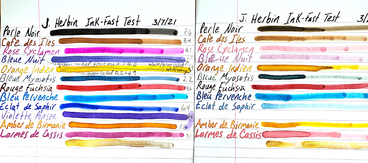
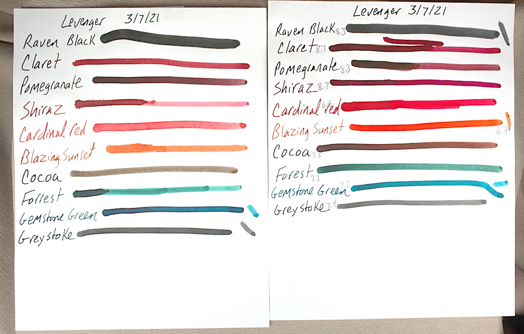
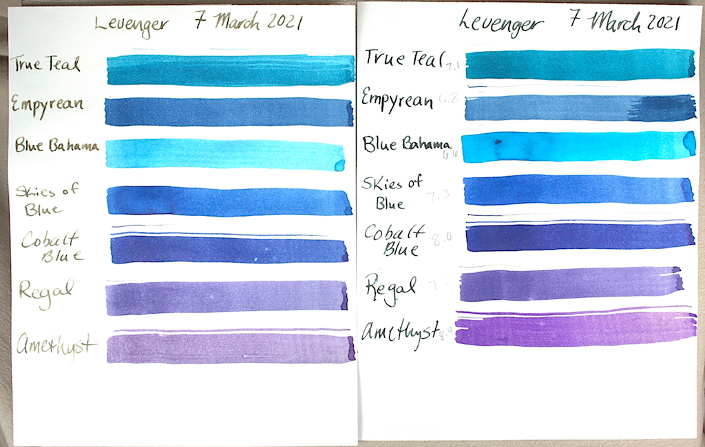
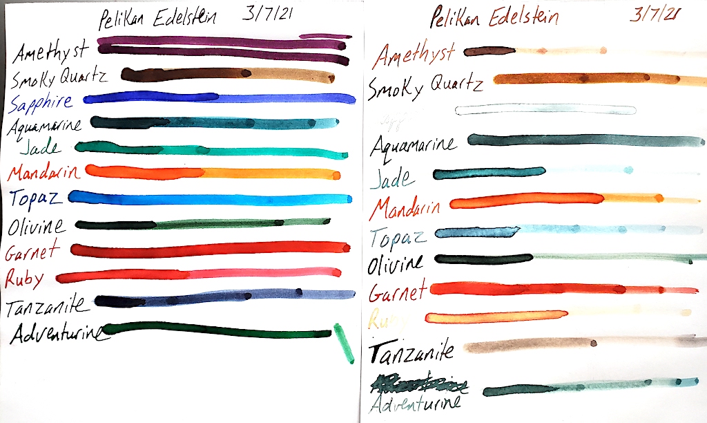
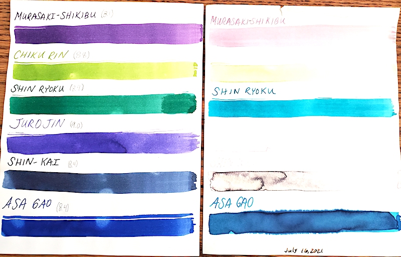
We picked up 24 bottles of this amazing ink and have submitted them to our rigorous UV and pH testing. Each of the following inks was placed in one my sunniest windows between July 16, 2021 and October 16, 2021. We calibrated our pH meter and tested these inks at 75.6ºF at 50% humidity. As a quick reminder, on a pH test, 0 is the extreme limit for acidic, 7 is neutral and 14 is the extreme end of alkali or base. Click the individual photos for a closer look.
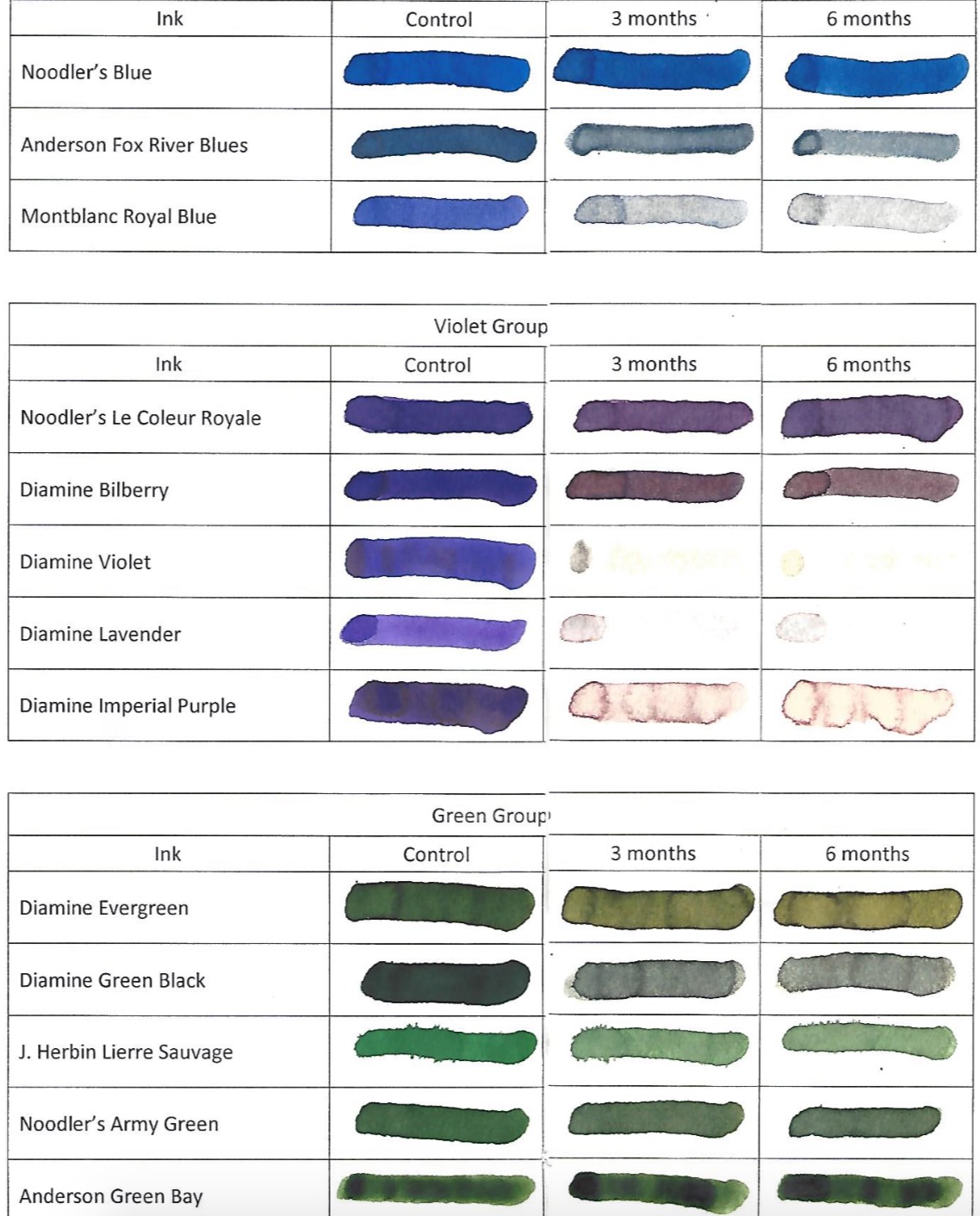
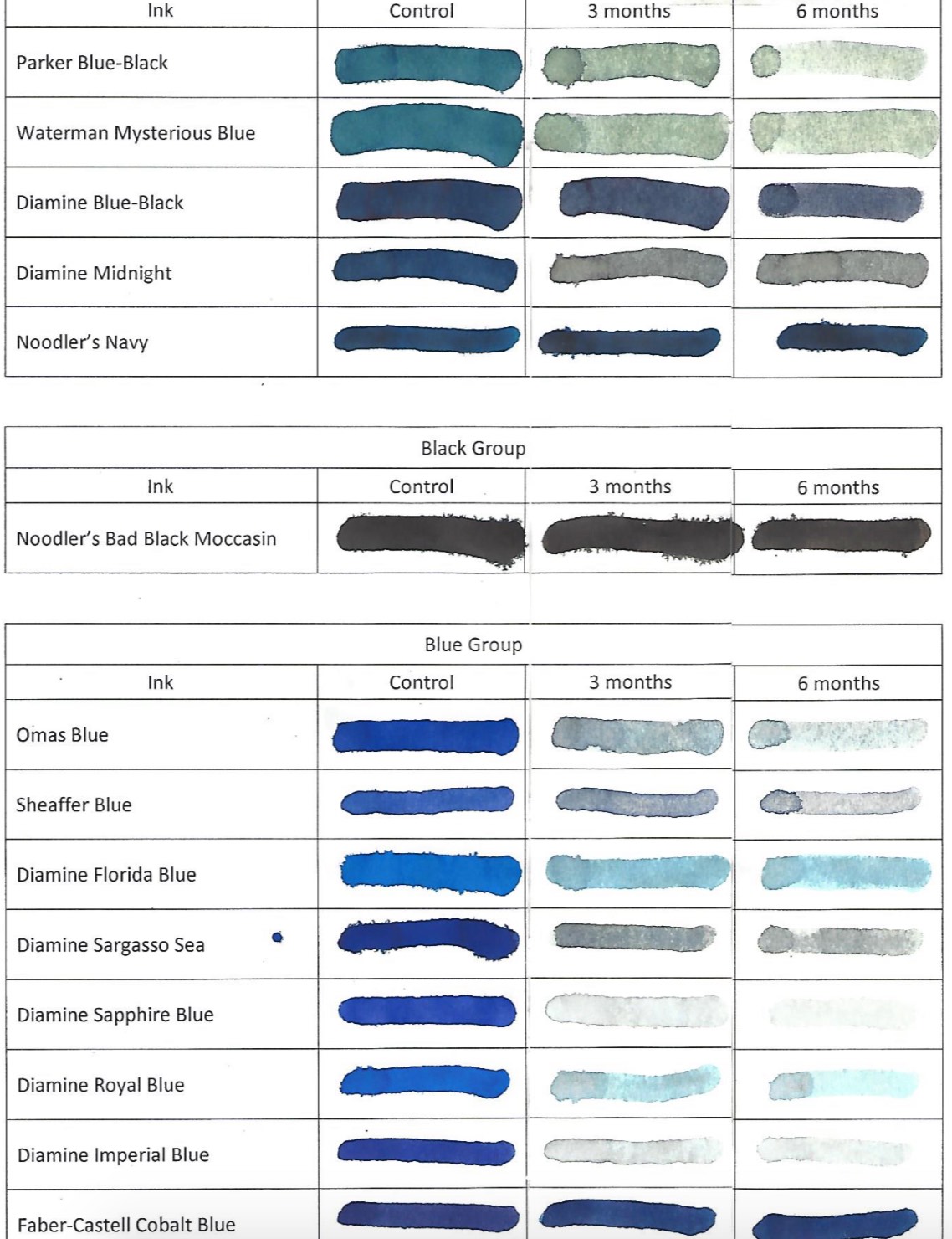
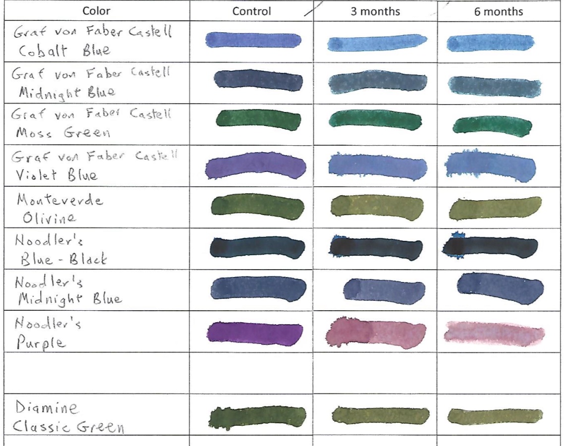
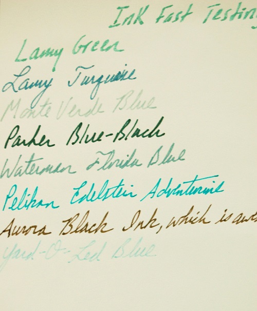
 In many of our tests, blue inks tend to be very susceptible to UV light. Not Iroshizuku! Unfortunately, many of its other colors fade badly. The images certainly explain more than I can. Nevertheless, I love the peachy salmon of a late summer sunset that is Fuyu Gaki ink, and like a sunset it fades almost entirely. The nearly emerald green of Shin Ryoku turns turquoise. The blue-black Fuyu Syogun turned a light-fog grey. And the black Take Sumi stayed dark but turned dark brown.
When it comes to pH, these are simply raw data points. We do not know specifically how they interact with the chemistry of the ink sacs and piston parts of your pen. Most of these Japanese inks are on the shallow end of the base depth chart.
Color pH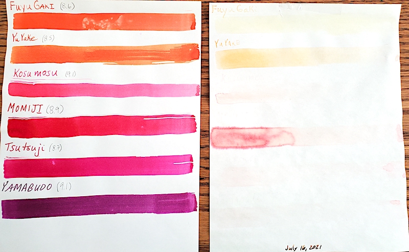
Murasaki-Shikibu 8.1
Chiku Rin 8.8
Shin Ryoku 8.4
Juro Jin 9.0
Shin-Kai 8.4
Asa Gao 8.4
Fuku Gaki 8.6
Yu Yake 8.5
Kosa Mosu 9.1
Momiji 8.9
Tsutsuji 8.7
Yamabudo 9.1
Syo-Ro
Ku-Jaku 8.5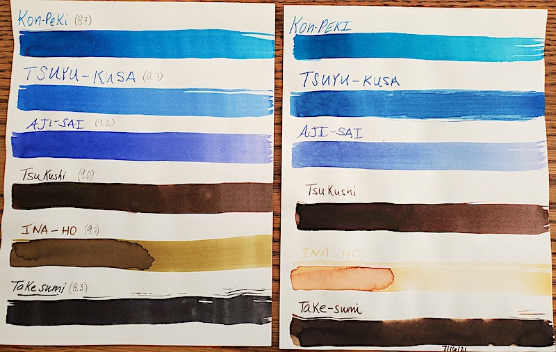
Tsuki-Yo 8.5
Ama-Iro 8.8
Fuyu Syogun 8.5
Kiri-Same 9.0
Kon-Peki 8.7
Tsuyu-Kusa 8.7
Aji-Sai 9.2
Tsu Kushi 9.0
Ina-ho 9.0
Take Sumi 8.3