 Shopping Cart


EDITOR’S NOTE: Polishing a vintage pen can be a surprisingly dangerous exercise in vintage pen restoration. If you use the wrong method on the wrong material, you will ruin your pen. If you overdo it with the correct method and correct material, you will ruin your pen. We will not be held liable for any problems that arise from your efforts to polish your pens. This is simply an explanation of what we do and have found success with with on our own pens. We do our best to warn about some of the pitfalls but we cannot guarantee we have explained all of them. Results may vary.
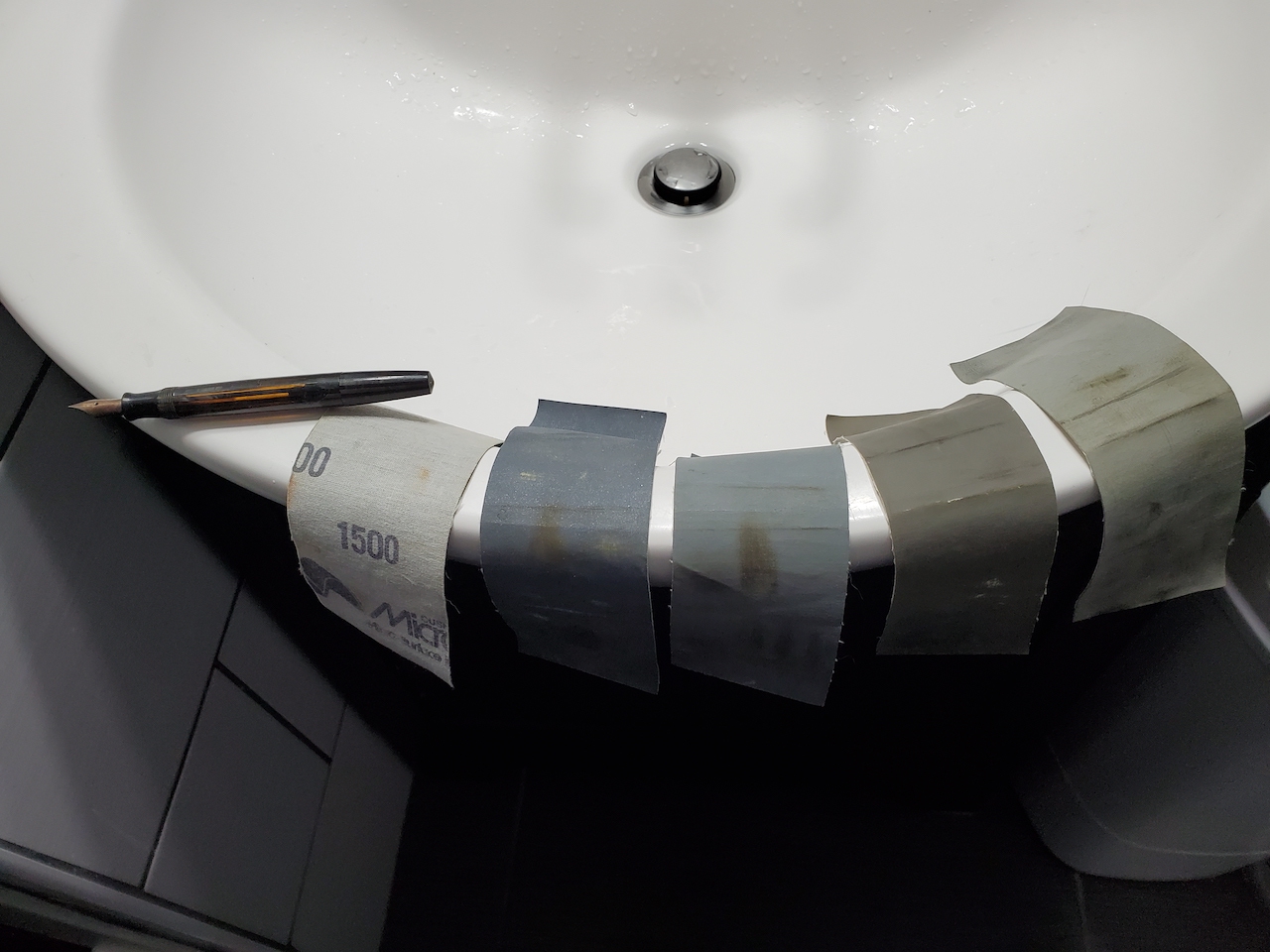
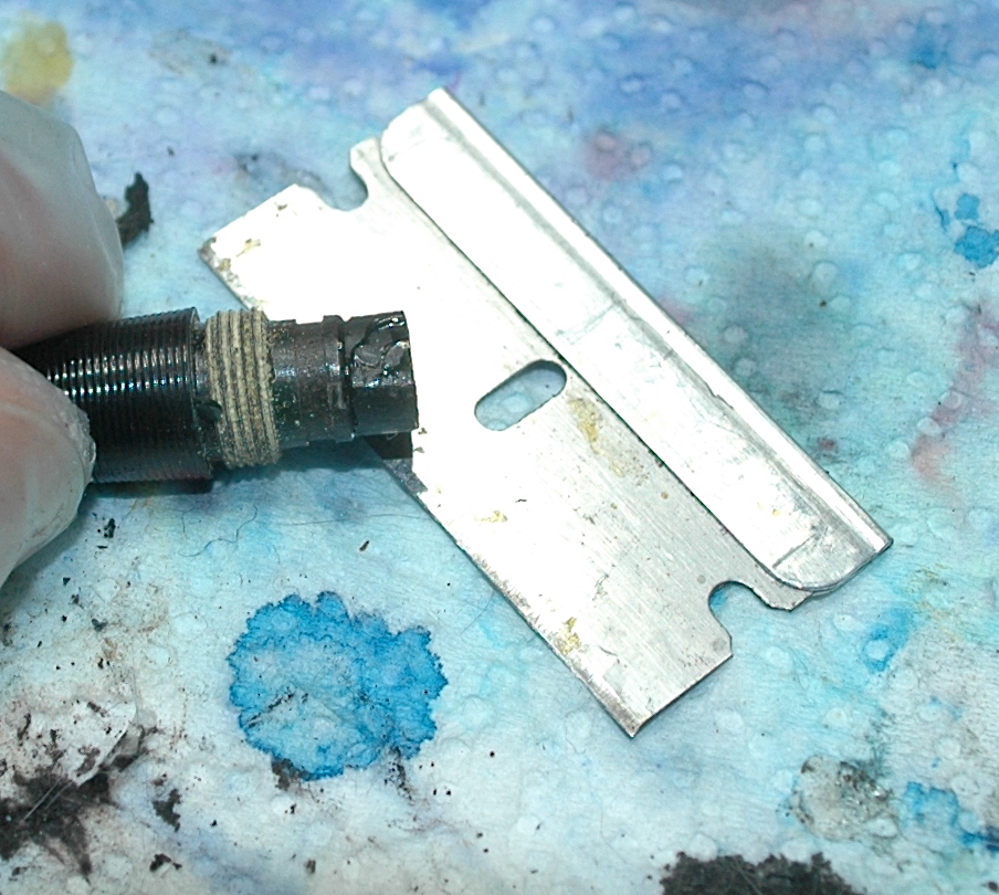
First gather your pen and Micro-mesh sanding cloths at your water source under bright light. You can see both the grit and cloth sides of these strips of various grits spanning 1500, 3600, 6000, 8000 and 12000.
This article explores wet sanding structurally sound celluloid pens by hand to a high-gloss shine. Never wet sand a pen made of hard rubber, especially if it has any sort of chasing design or imprint. Never wet sand a metal pen, either. Never try to wet sand a celluloid pen that is krazing or otherwise deteriorating, as you will destroy whatever is left of it. In this piece I take two heavily damaged Parker pens and restore their luster. However, before I got started on either of them, I examined them carefully to make sure they were free of that shattering plastic look called krazing and cracks in the barrel. A hairline crack in the lip of a cap is okay to wet sand, as long as you are very careful with it as you progress.
WHAT IS WET SANDING? Wet sanding is using different grits of specialty sand “paper” made out of cloth to first rough up and then smooth out the celluloid of a pen with some help from water.
I like using strips of a product called “Micro-mesh” cut into 2-inch by 6-inch sections. I use them in the grit levels of 1500, 3600, 6000, 8000 and 12000. Even if you only have one strip of each of those grits, it can last you dozens of pens.
WATER: You can use it two different ways. One with a thin stream of luke-warm water from a tap or the other way is in a large mixing bowl full of luke-warm water. The latter saves some water, and you can see just how crazy dirty plastic particles can get. Your hands are going to be in water for more than an hour, so you might want to wear some latex or rubber gloves.
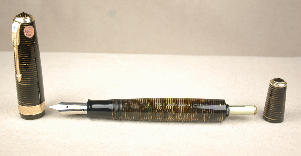
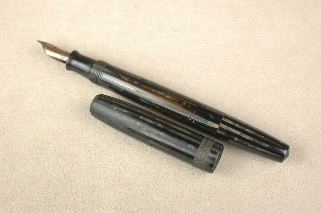
This is a Parker Duofold with a Vacumatic filler. It actually survived Hurricane Katrina nearly 20 years ago. It looks very tarnished and filthy and worn and awful.
HOW IT WORKS: The process to wet sand a pen to near perfection is simple but very repetitive and time consuming. You will want a well-lit area near your water source. There is much better lighting by my bathroom sink, so I make sure to have my 5 strips of Micro-mesh at the sink along with the pen I want to work on. I set a steady but thin stream of water at a temperature I find comfortable from the tap. Next I wet my strip of 1500-grit Micro-mesh. It doesn’t matter if you start with the cap or the barrel, but I like to start with the barrel because it takes longer.
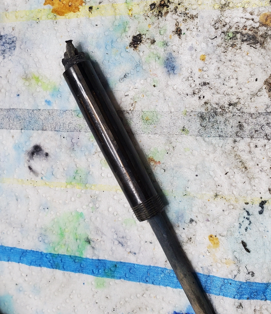
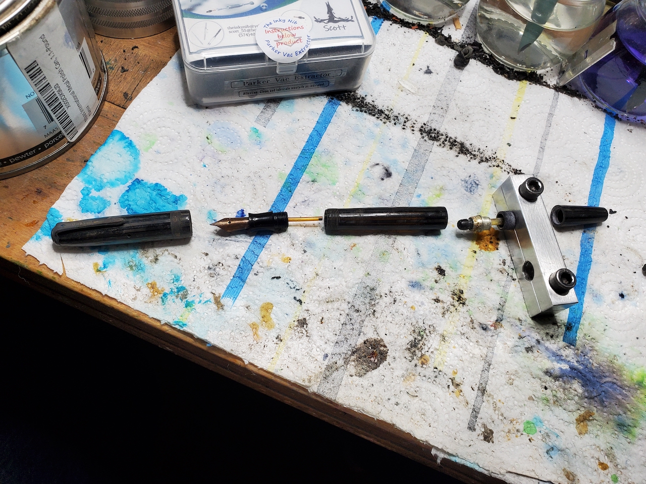
With the Parker Vacumatic pens I have chosen, I take off the main cap but leave the blind cap tightly secured to the barrel. I also have already replaced the diaphragm. This way, if there is a little blind-cap misalignment after the repair, I might be able to smooth it out a bit.
As a right-handed person, I hold the section of the barrel in my left hand. I take the first strip of 1500-grit mesh in my right hand and wet it under the running water. To help keep track of where I am at, I start with the open nib of the Parker Vacumatic facing up. I extend the barrel under the running water and I make 10 complete cycles of rubbing with the mesh strip against the barrel from the section threads to the tip of the blind cap and back to the threads. The 1500-grit mesh is going to scrape off an entire layer of the celluloid, removing the minor scratches and imperfections. Be careful, as it might also remove the last of a shallow barrel imprint! What luster your barrel might have once retained will look horrifyingly dull and scratched. Now I rotate the pen about an 8th or a 10th of a turn and do 10 more cycles of rubbing under the water. You will want to check that the mesh overlaps the original first cycle’s path to make sure you didn’t miss a spot. Take your time and be thorough. Keep the barrel under the running water or in the bowl no matter what grit of mesh you are using. Let the sanding mesh pass through the water. This helps remove the scraped away plastic…and it keeps the sanding from doing more harm than good. Dry sanding can wreck the finish. Keep rotating and doing 10 cycles until the barrel has been uniformly sanded by the 1500-grit mesh.
After the first round of wet sanding is finished, I like to dry off the barrel to inspect the progress and make sure I didn’t miss anything.
The hurricane survivor is halfway done. Notice the barrel is refreshingly shiny and clean compared to the untouched cap. Please notice the cap’s clip has been removed in preparation to wet sand the rest of the cap.
If everything looks evenly done, I take up my next strip of the mesh (3600 grit) and repeat everything I did the first time with the first strip. HOWEVER, now I do 20 cycles of sanding for each turn of the barrel. The reason is simple: That 1500-grit mesh really wrecked the celluloid and dug some deep sanding grooves into the barrel. 3600-grit mesh is half the strength of the harsher mesh and it take more effort to uniformly start cleaning up the damage from the first time through the process. Once you have uniformly polished the barrel with the 3600-grit mesh, dry it off and examine it.
Don’t be scared that the barrel still looks awful. Under that bright lights look for imperfections within the imperfections. The scuffed barrel will look even worse in a spot you missed. Imagine you just hired a local teen to mow your lawn. Before you pay this person, you check to see that they didn’t miss a spot or leave a thin strip of the grass that is much taller than the rest of the yard. Unlike a lawn that is easy to cut back down to size, a poorly wet sanded spot in the celluloid will only start to look worse, as the finer grits can’t fix what the harsher grits missed. As such, if you jump straight to the 6000-grit mesh, you might accidentally engrain a piece of the 1500-grit polishing portion that only the 3600-grit process can get out. If you find a spot you missed, just put that spot back under the water and give it another 10 cycles of 3600-grit sanding to see if that evens out the spot. Dry it off and check. Keep going until the spot looks uniform to the rest of the pen. You’ll mess up because you are new to it. It takes time and experience to catch the nuance of the sanding levels and how they look. If you get too ahead of yourself, just remember to go back to the stage you think you missed it at. It takes longer but you can correct the mistake.
If the 3600-grit polishing run on the barrel looks uniform and complete. Do it all over again with the 6000-grit mesh. ONLY THIS TIME, do 30 complete sanding cycles for each turn of the barrel. Again dry it off and inspect it for uniformity when you are done. Now it should look like you are making good progress. The finish will start turning from cloudy to glossy…like a fog is starting to lift.
When you are satisfied the 6000-grit work is uniform and complete, move on to the 8000-grit. Now make it 40 complete sanding cycles per turn of the barrel. If you are an impatient person, you might be tempted to call it “Mission Accomplished” when the 8000-grit efforts are dry and uniform. BUT, trust me, there is still a slight layer of haze in the finish of the celluloid.
The 12000-grit mesh is so smooth to the touch, even when dry, you might swear it isn’t gritty at all. However, once you’ve now made 50 complete cycles of wet sanding per turn of the barrel, you will be astounded once you have dried the barrel and made sure the work you did was uniform.
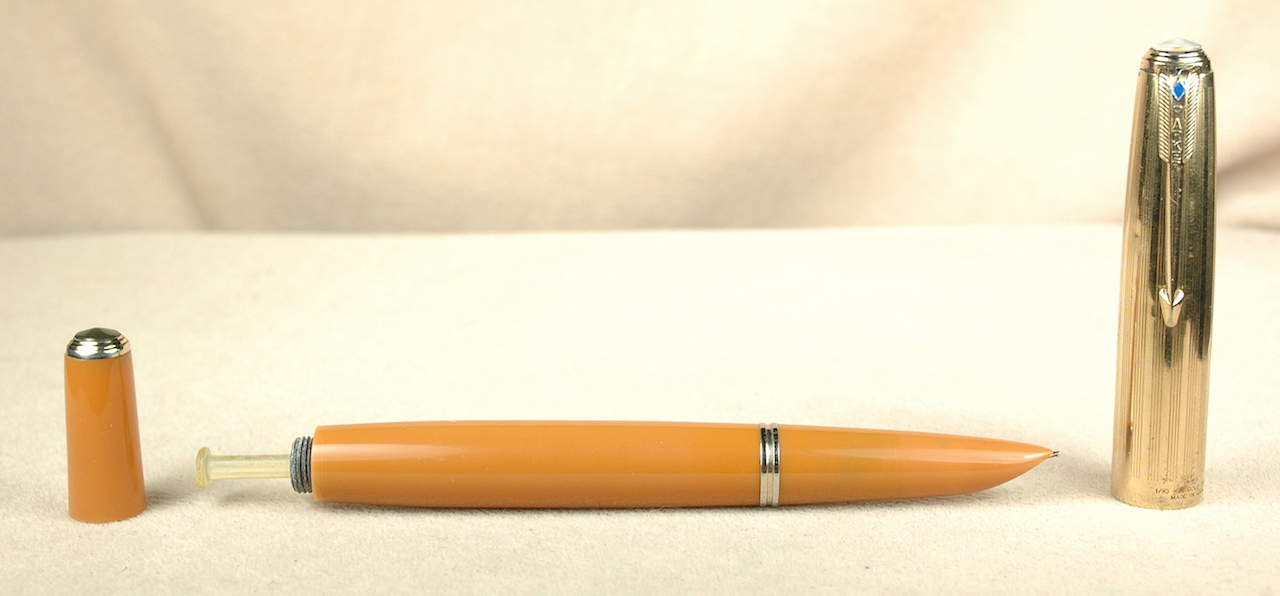
Here is the completed Parker Duofold. Notice the little blemish to the left of the clip. It was way too deep for the wet sanding to polish out of the cap.
Unless there are deep divots or scratches in the barrel, your barrel will now look like new. To help seal that finish and keep the pen shiny, I take just a tiny drop of mineral oil on a cotton rag and rub down the barrel. I then buff it with a dry cloth to remove any excess mineral oil.
With the barrel done, you can repeat this process all over again with the cap. Parker Vacumatics and “Duovacs” (slang for 2nd generation Parker Duofolds with vacumatic filling systems) are fortunate to have removable pocket clips. It is easier to wet sand a cap without its pocket clip. BUT, if you can’t remove the clip, that is okay. Just take your time and polish under the clip. Some people like to mask off the cap ring(s) while wet sanding the cap. You can brass/remove the plating on the cap bands if you wet sand them. However, if your pen is so ugly that you have to wet sand it, it likely was never going in a museum collection to begin with. Personally, I find it is just easier to wet sand the bands and take the risk. Sometimes they come out looking like new or sometimes I strip the plating. In either case, they are shiny.
PRO-TIPS & TRICKS: Start with a pen that you can ruin and not worry about. As with any new experience, it takes time to perfect the technique and find the ways to grip your pen parts and mesh to maximize comfort and effectiveness.
Wet sanding a complete pen takes me anywhere from 45 minutes to an hour and a half. I save it for pens that are desperate for the tender loving care.
One of the things I mess up the most are the ends of the cap and barrel. It is soothing and easy to wet sand the middle of a cap or barrel. It is easy to forget to get all the way to the barrel threads or end of the barrel…or each extreme end of the cap. Sometimes before drying off and checking to see how I’ve done, I just go back and work around the ends a second time to make sure I got them right.
Vacumatics were made for this type of polishing. Other pens with more exposed metal parts require more effort to keep them safe. For example: A Sheaffer Balance Lifetime is a great candidate for celluloid wet sanding. You just need to take extra steps to protect it. By keeping this lever filler in water, the inner J-bar for the filling system will get very wet. There is no way to get around that. Sooo, when you finish your polishing of this barrel, shake out the water, dry it as thoroughly as you can with Q-tips and then set it so that a little fan can blow room-temperature air into it overnight. If you completely dry it out as quickly as you can, it won’t rust and cause other problems. Only after it is completely dry should you finish the restoration by resaccing it.
Hopefully, this will help you make some of your favorite vintage and modern pens look like new. Please feel free to ask questions. This system works well for me. I know other people who have their own ways of polishing their pens that are different from mine. There is always more than one way to accomplish a task. Best of luck.

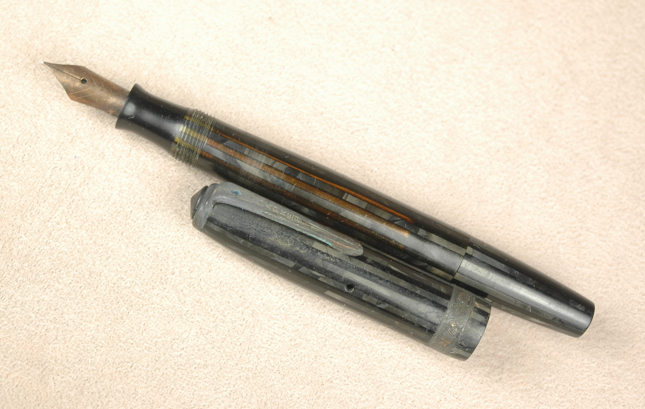
Here is a hurricane damaged Parker Vacumatic with nickel trim. It might look hopeless, but….
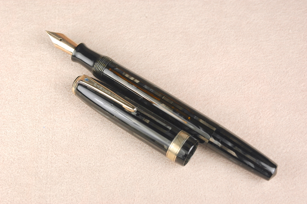
Wet sanding has renewed to finish of that poor hurricane ravaged Parker Vacumatic to make it look as close to new as possible.