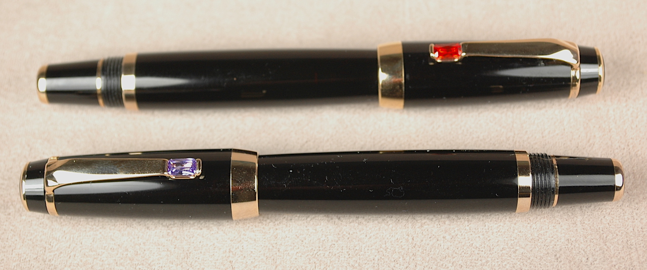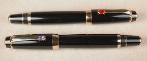
Is she? Or isn’t she? Can you pick out the real Montblanc Boheme in this photo?
One of my favorite additions to the Montblanc line-up in the past 20 years was the Montblanc Boheme. What made it my favorite was the retractable nib, which made it look similar to the classic safety fillers of yesteryear. Unlike the messy and unreliable vintage pens that still remain, this modern pen took a standard international cartridge. Another nice touch in the authentic Boheme was the realistic jewel placed in the clip. Genuine, factory-made jewels, they looked like convincing sapphires, rubies, emeralds and the like.
Or maybe one of these is the genuine Montblanc Boheme. Unless you are a really dedicated MB collector, it likely isn’t easy to tell truth from fiction.
We recently acquired a huge collection of pens. Making my life easier, this collector separated his collection of fake Montblancs from his collection of the genuine article. If you’ve read my past stories about fake Montblancs, you know I’m really saying something when I say these “new” fakes were extremely impressive.
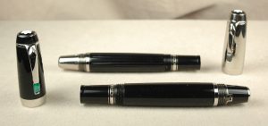
Today we will look at the fake Boheme, which I like to call the “Fauxeme.” I’ve posted 4 pens in the photos here. Can you tell which one is the real Montblanc Boheme? Don’t read ahead. Seriously. Take a guess. I’ll reveal the real McCoy in a little bit.
Making it harder to tell the truth about which pens are real is the fact Mont Blanc made a ton of different options on this line of pen. The most easily recognizable Bohemes have retractable nibs. But, MB made some with permanent nibs. I once rejected one such Boheme as an option to buy for the site because I had yet to hear about the fixed-nib models. Montblanc also varied the jewel colors and various metals and pen designs.
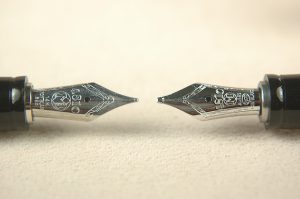
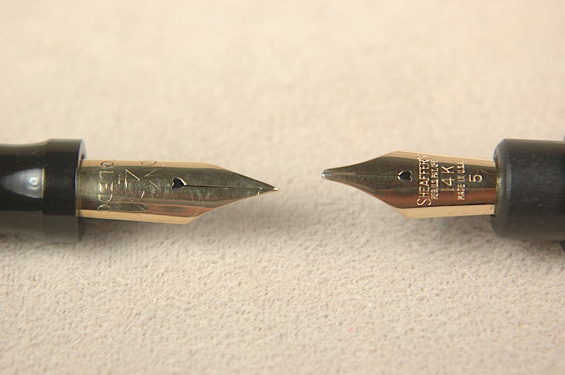
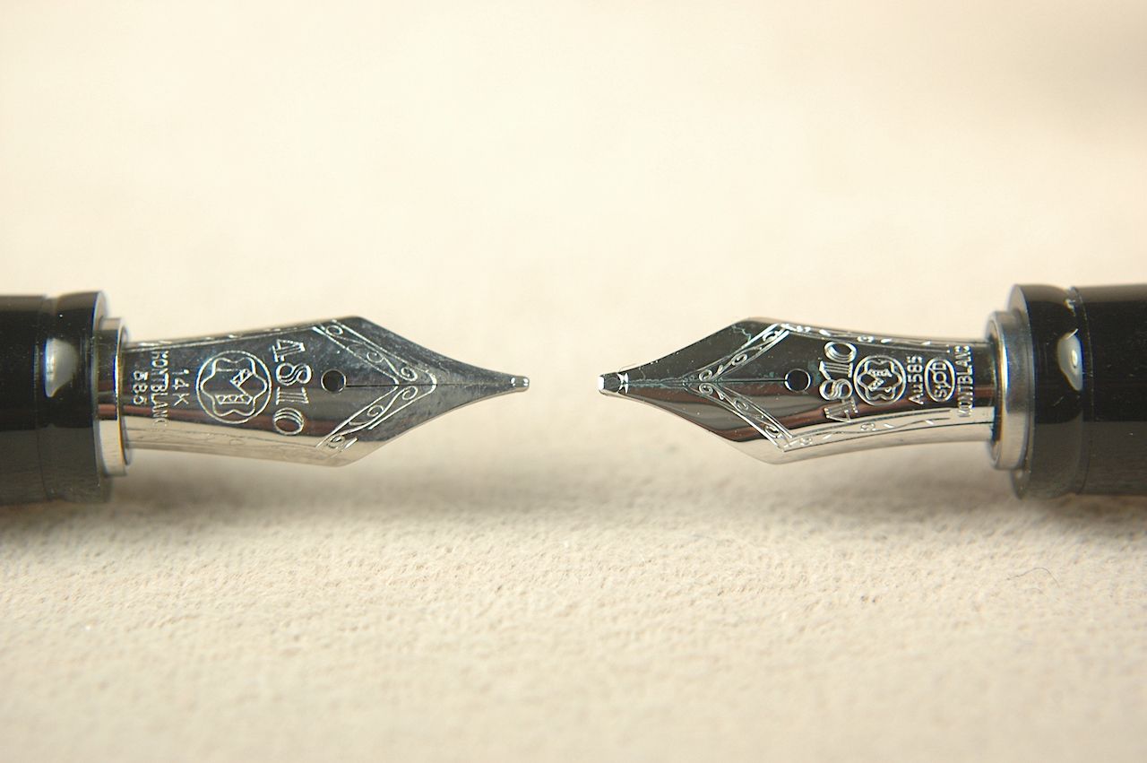
Which is the genuine Montblanc Boheme nib?
Fakers had a field day offering up their own designs which look insanely convincing. Look at these nibs in this photo. At first glance can you really tell which is real? The sections, collars and logos are identical. The imprinted words are different but can vary sometimes by the markets they are sold in. The one on the right is the authentic MB nib. The biggest difference between them, to me, is that when you write with the two nibs, one is clearly a scratchier steel nib. But if you are buying online, you can’t test for that.
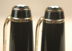
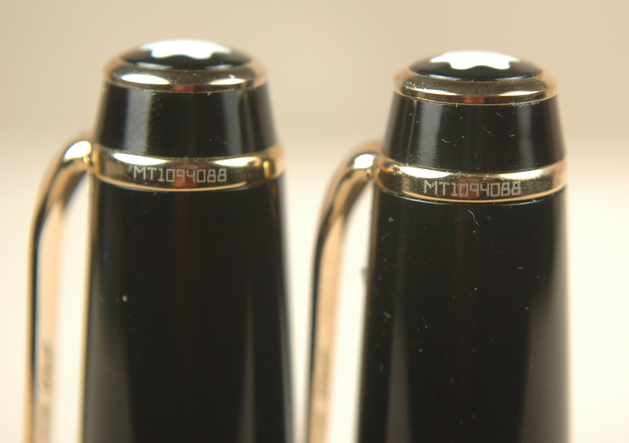
These two Montblanc Fauxemes share the same serial number, which is a well-known fake Montblanc serial number.
We established before that Montblanc sometimes recycles its serial numbers on the pocket-clip rings. However, if you look at the database we are developing of fake Montblanc serial numbers, you can cull two pens from this herd as fakes. It would be highly improbable to get two authentic pens with the same serial number. And the numbers on these caps are known fakes.
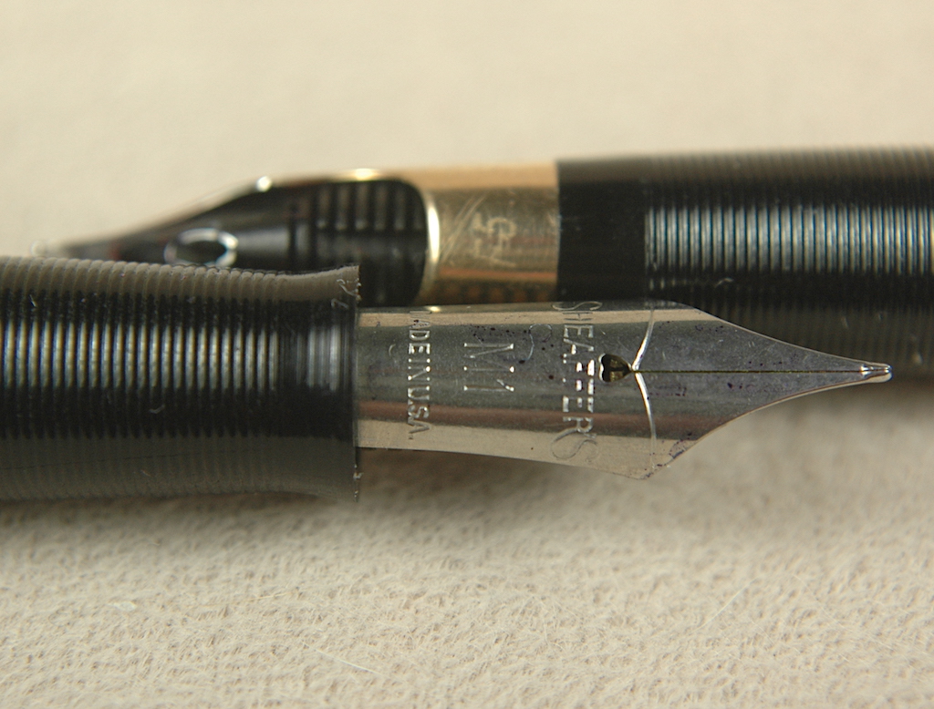
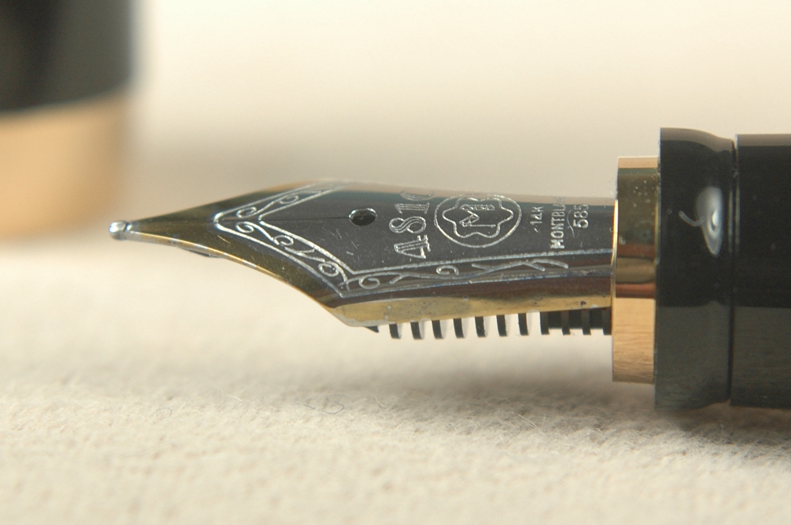
For as impressive as the fake Bohemes are, a lower quality of manufacturing gives away the pens, when you can examine them in person. The nib seems to be the biggest tell in many cases. First, if it is a scratchy steel writer that reminds you of a vintage Esterbrook, you know you are on the right tract to unmasking the facsimile. Yet, if you get to take an extremely close look at the two-tone version of the nib, you might see where the gold coloring is incomplete or worn off.
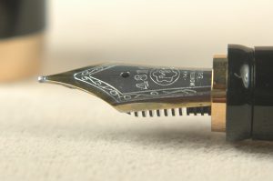
Can you see where the gold color has faded out on this steel nib?
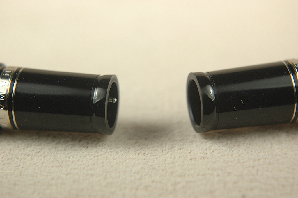
When it comes to the operation of the pen, the genuine Boheme has a bump sensation as you lock the nib into place to write. The Fauxeme hasn’t this feature. Also, when fully retracted, the real MB has no exposed nib tip.
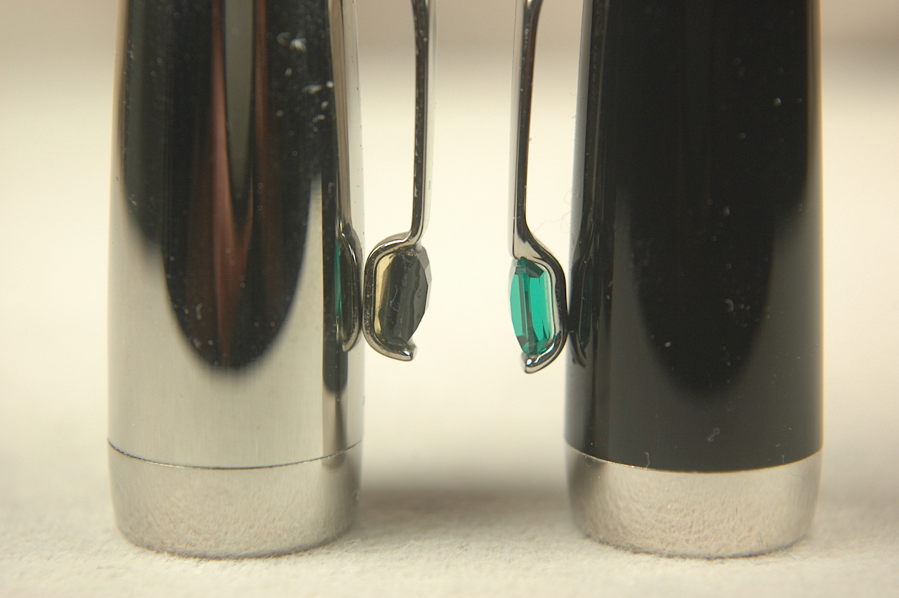
Another good indicator might be the setting of the “jewels” in the pocket clip. Montblanc will do this in a very clean and precise way. In the clip photo below, you can see the poorly set “onyx” that is glued in place and sports a big gap. Yet, the “emerald” version is snuggly fit without any mess.
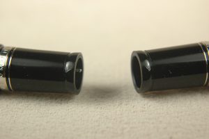
The pen on the left has a bit of the nib’s tip still visible when fully retracted. The authentic Montblanc pen on the right has the nib retracted out of sight, where it won’t get injured by a closed cap.
If the photos and explanation haven’t given it away already, the only real Montblanc Boheme in these photos is the lovely green-jeweled model.
With any luck, this article has helped you have a little more confidence in identifying authentic Montblanc Boheme pens. As a reminder, I am not an authorized Montblanc pen authenticator. I am sharing what I know with the public to help as best I can. If you would like your pen authenticated, please reach out directly to Montblanc, as it has an authentication service, though last I heard they charge a fairly stiff fee for their time and work. To learn more about Montblanc (and pen collecting, in general), please feel free to read through our previous stories listed under “How Do I Start Collecting Pens?“.
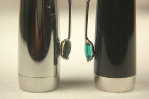
Notice the shoddy setting of the “onyx” jewel of the Fauxeme pen on the left. See how the “emerald” on the authentic Montblanc is a much better fit?

 Shopping Cart


 Since moving to Connecticut, I’ve befriended the artist and painter Jonathan Weinberg, who also happens to be the founder of the Charter Oak Pen Club and curator at The Maurice Sendak Foundation. (Yep, that Maurice Sendak who wrote “Where the Wild Things Are.”)