Tag Archives: #inktest

Caran D’Ache Chromatics Face the UV-pH Challenge

Swiss pen maker Caran D’Ache is most famous for its precision engineering on its line of ballpoint pens. They make nice fountain pens, too, but it is the company’s ballpoints that the world knows best. Yet, as so many pen makers now do, it also decided to enter the lucrative fountain pen ink market.

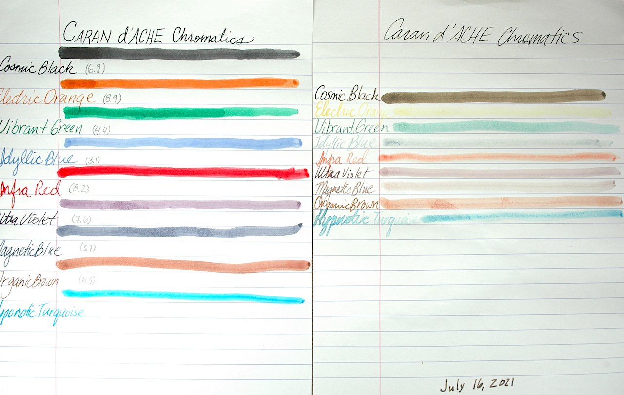
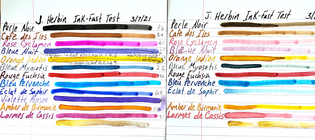
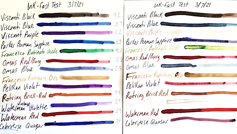
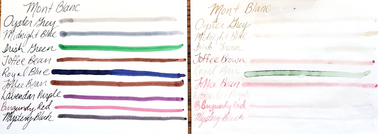
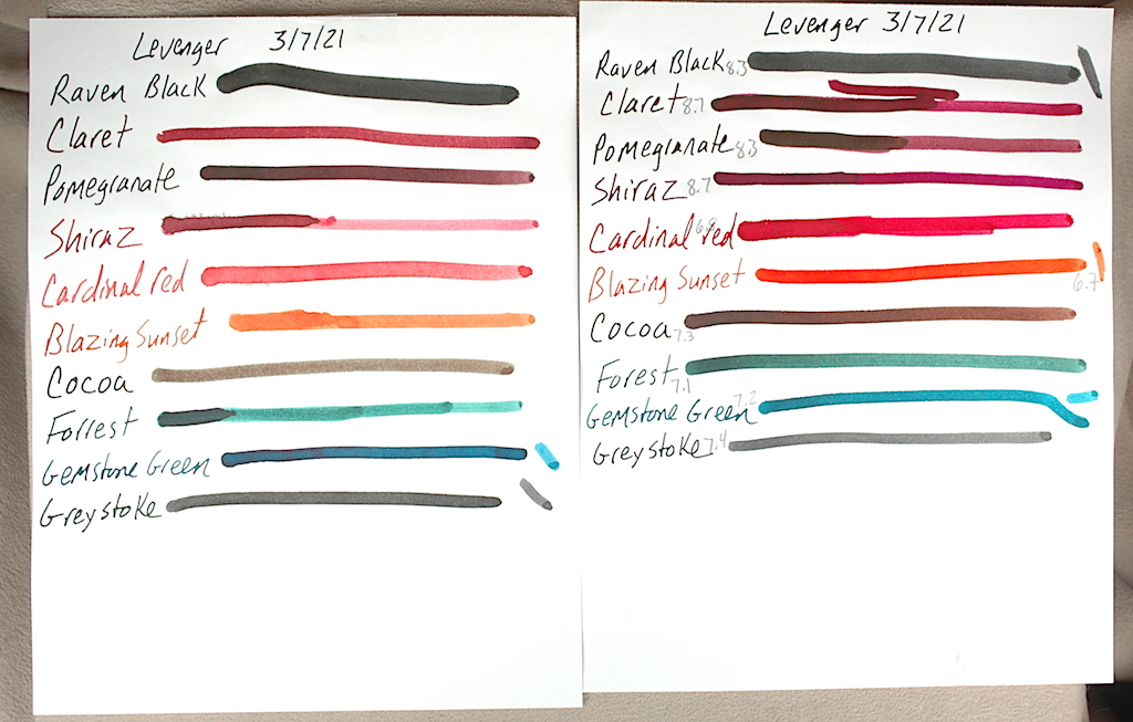
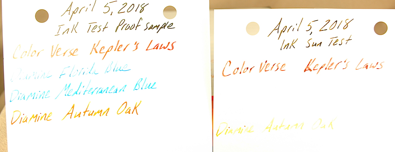
Here is a side-by-side comparison of Caran D’Ache Chromatic inks before and after undergoing 3 months of UV sunlight testing.

Caran D’Ache Chromatic Inks are a daring entry, indeed. From their hexagonal bottles that tip to fill to the last drop to their bright and cheery colors, Chromatics made an instant splash on the scene.

Naturally, we wanted to know how well these inks hold up to UV light from the sun and where they register on the scale of a pH test. We placed this sample in our sunniest window for 3 months. We also used our pH meter, which was calibrated to the heat and temperature of our testing station before testing the inks.

The results of our test were surprising. I falsely suspected that there might be some heavier pigmentation in the “Chromatic” inks that would make them shine and dazzle a bit on the page. However, virtually all of the ink colors lost seemingly 85 to 90% of their color, fading heavily from view. “Electric Orange” all but disappeared. Even a stalwart color such as “Cosmic Black” faded to a medium brown, and it had the most staying power.

The pH test results ranged all over the map. As a quick refresher on chemistry, a pH number of 7 is pH neutral like pure water. The closer to 0 something becomes the more acidic it is. The closer to 14 it goes, the more alkali or base something is. In theory, you want an ink that is pH neutral, BUT we have no idea how the chemicals in each ink will react to the chemicals of the ink sacs, converters, inkfeeds and the like. We have found some “neutral” inks to eat through ink sacs rapidly, while some seemingly alkali or acidic inks don’t bother a pen’s parts at all. The following is simply raw data for you to do with as you please.

COLOR:                              pH Score:
Cosmic Black                      6.9
Electric Orange                  8.9
Vibrant Green                     4.4
Idyllic Blue                          3.1
Infra Red                             8.2
Ultra Violet                         7.6
Magnetic Blue                    3.7
Organic Brown                   4.5
Hypnotic Turquoise         N/A

A few of the things that stand out to us are that Cosmic Black is almost perfectly neutral. Aligning with more of our past experiments, the blues were fairly acidic. Yet, playing against stereotype, the red and purple were closer to neutral. Green remains quite acidic, which is expected, but the brown also was acidic, which wasn’t expected.

As always, I hope you found this snippet of ink data helpful to your quest for the perfect ink for you.

J. Herbin Ink Goes Under the Sun

French inks haven’t previously undergone our rigorous testing, and we were excited to give them a UV light-fast test and pH test. We purchased a small collection of a dozen different colors of J. Herbin.

We started this test on March 7, 2021, by placing a sample of 13 inks in our sunniest window.

We test these J. Herbin inks to see how well they can withstand UV light and to see where they rank on the ol’ pH meter.

Believe it or not, this was our first time writing with J. Herbin ink. What really struck us was the vibrancy of the dry ink on the page. Of the colors I liked best, Rose Cyclamen really pops with a purple-pink splendor. Dawn’s favorite color is the electric turquoise blue of Bleu Pervenche. Eclat de Saphir is a solid daily blue. And my new permanent addition to my daily writing is the Amber de Birmanie. It is an incredible orangy brown.

Unfortunately, 3 months of direct sunlight does not treat these inks well. All of the colors except the gold metallic ink bleach substantially in UV light. You can see the damage in the photo. Some of the really drastic changes include Rose Cyclamen turning bright, light bubble-gum pink; the blue-black Bleu Nuit turns a pale, faded purple and Violette Pensee disappears almost completely! Larmes de Cassis turns from purple to pink.

The following show the pH results for each ink. We actually had three different bottles of the Bleue Nuit, Orange Indien and Bleu Pervenche. The labels on the outside of the bottle were different, so we list these two inks by their label results, too. As a quick refresher in chemistry, a pH number of 0 is as acidic as a chemical can be. 7 is neutral, like pure water. And 14 is the maximum extreme of alkali/base.

Perle Noir                          7.6
Cafe des Iles                     3.4
Rose Cyclamen                4.1
Bleue Nuit                         4.0 (Green Label)
Bleue Nuit                         6.9 (White & Blue Label)
Orange Indien                  4.9 (Green Label)
Orange Indien                  6.9 (White & Blue Label)
Bleue Myosotis                 2.2
Rouge Fuchsia                 4.6
Bleu Pervenche                7.0 (White & Blue Label)
Bleu Pervenche                6.2 (Green Label)
Eclat de Saphir                 6.4
Violette Pensee                 4.4
Amber de Birmanie         5.8
Larmes de Cassis              7.1

A Potpourri of Ink Tests

As we have been conducting our ink tests, we ran into a grouping of mostly orphaned bottles that wouldn’t make for a very big story individually. So we tested them together and got them all on one page.

The ink proof sheet is on the left and the UV tested inks are on the right. Click the image above to get a better look at the ink tests.

This batch of inks was given a UV light fast test in our sunniest window from March 7, 2021, to June 7, 2021. We also tested the pH levels of the inks to see just how neutral they are. The following is all raw data that we thought you might find interesting. As we do not know the chemical composition of each ink or ink sac/converter it might go into, a pH neutral ink does not guarantee it won’t have a bad chemical reaction inside your pen. We have a professional pH tester, which we calibrated just before testing these inks. As a quick chemistry refresher, a pH of 7 is neutral like distilled water. The closer you get to 0, the more acidic the ink is. The closer you get to 14, the more alkali/base the ink is.

Surprises are the most enjoyable parts of these tests. Blues remain entirely unpredictable. One of my all-time favorite blues is Parker Penman Sapphire. Instead of fading out like most blues, it turned purple! Visconti blue fades out when thinly applied, but the thicker lines create a majestic blue-black that is even prettier than the original blue. Colorverse Quasar turned from a rich blue to a light red-purple. Omas blue did what most blues do and faded heavily. Acidity didn’t seem to effect which brands faded and didn’t. Omas was the most acidic blue at 2.3, and Colorverse was the most neutral at 7.9. Both underwent dramatic changes.

There were subtle changes in some of the inks. Visconti’s black turned a dark brown in the sunlight.

Purples fared poorly. Visconti Purple turned a pale pink. Vintage 1960s’ Waterman’s Violet almost completely disappeared. Pelikan Violet held on kinda, turning a deep reddish pink.

Waterman’s Red and Omas’ Red/Burgundy held up best. Neither seemed very effected by the sun. Also interesting was that Omas’ ink was also almost pH neutral at 7.2. We are often warned red can be the most dangerous color to put in a fountain pen. If it is pH neutral, I wonder what chemical reactions happen when it is inside a pen.

We had never previously heard of Francesco Rubinato inks before, but we loved the “Verde” green ink that was somewhere between “Shamrock Shake” and “Kelly Green.” Unfortunately, it turns into a bile-like yellow green with UV exposure.

An OLD bottle of Rotring Red was a very curious color. It was more of a brick red with a hint of orange. Was that because it was already discolored and UV exposed or was Rotring red really like that? Either way, UV didn’t effect the dry ink on the page.

The only color not yet mentioned is the Francesco Rubinato Oro (gold). This is a goupy, heavily sedimented ink filled with gold-glitter. We DO NOT recommend it for fountain pens. It is ONLY GOOD for DIP PENS. Anyhow, UV light didn’t effect it at all, and because we didn’t want to ruin our pH tester, we didn’t check its pH level, either.

Here is the table of our pH results:

Visconti Black…………………………..4.2
Visconti Blue……………………………3.9
Visconti Purple…………………………3.2
Parker Penman Sapphire…………..5.3
Francesco Rubinato Verde…………4.1
Omas Red/Burg………………………..7.2
Omas Blue……………………………….2.3
Rotring Brick Red…………………….8.5
Waterman (1960s) Violet………….3.9
Waterman Red………………………..5.9
Colorverse Quasar…………………….7.9

Whoa! Montblanc Inks…Beware!

Happy New Year, everybody!

Sorry for the long absence. December and early 2022 have been quite the rollercoaster. Happily, all is well now, and we hope to be back to rockin’ and rollin’ the ink-o-sphere.

Wow! Three months in the sun fades the pigment right out of modern Montblanc inks. Mont Blanc ink burns worse than I do in sunlight.

The biggest shock to me in Dawn’s and my ink tests comes from Montblanc! At $26 retail for a 60ml bottle of ink, you’d think you’d get something close to perfection…especially with the company’s luxury marketing! It is worth it to do a little math here. A 60ml bottle of ink at $26 per bottle means the price of a single milliliter of ink is 43¢. A U.S. gallon is a shade over 3,785 milliliters. Ergo, a gallon of Montblanc ink costs $1,627.55! A gallon of gasoline here in Norwich is $3.39, and a gallon of milk can be found for $4.29. It will seem as though gas and milk are a better bargain, especially after these results.

Now before you start thinking I’m being completely unfair to Montblanc, I’ve always liked its ink. At pen shows I use it as my test ink for anyone wanting to dip a nib to try out a pen. When people asked me what was one of the safest brands of ink…based on no research but word of mouth around pen shows…I’d usually tell them they could trust Montblanc best.

I hereby rescind that proclamation of safety. I got my first wind that trouble was in the air when a customer returned a pen to me after only 3 or 4 months of use with Montblanc Mystery Black ink. Its rubber ink sac had melted. At the time, I thought that was weird and worried the customer had used something far more toxic and then tried to cover it up with Montblanc Mystery Black. Nope. I doubt that now.

Back in July, 2021, I stuck a sample of 8 new bottles of modern Montblanc ink swatches in my sunniest window. These inks included: Oyster Grey, Midnight Blue, Irish Green, Toffee Brown, Royal Blue, Lavender Purple, Burgundy Red and Mystery Black.

After only 3 months in the sun, nearly all faded out! Royal blue turned a faded green. Irish Green and  Lavender Purple almost went invisible.

When Dawn and I tested the fresh ink’s pH, we were equally surprised. For a quick chemistry refresher. Everything is measured in pH on a scale from 0 (extremely acidic) to 14 (a base that is extremely alkali). 7 (distilled water) is perfectly neutral. We calibrated our pH tester at 24.6ºC.

Here are our results from the Montblanc ink pH Test:

Mystery Black          4.3
Royal Blue                3.8
Burgundy Red         4.8
Midnight Blue         4.2
Irish Green               3.9
Oyster Grey              3.9
Toffee Brown           5.6
Lavender Purple     3.8

All of these inks are quite acidic. Blue and black inks are supposed to be the safest inks. They are very acidic in Montblanc! Now, we aren’t chemists. We do not know how the chemistry between the ink sacs, pistons and converters interacts with the ink. Yet, this raw data casts doubt on the safety of Montblanc ink. Perhaps it is the special “cleaner” Montblanc uses to keep inkfeeds clear that is to blame for the acidity. The company recommends only using MB ink in MB pens. Perhaps there is more to that than just their greed of simply wanting to sell more ink.

As we still have a few of the old bottles of Montblanc ink from the 1990s, we didn’t do a UV test on them, but we did a pH test and it was even worse.

Black          2.2
Turquoise 2.8
Red            6.5
Green        3.0

Maybe you’ve had great results. I certainly don’t want to ruin your faith in Montblanc ink, if it has always worked for you. However, it might not be the gold standard I once thought it was. The information here is simply raw data, but it seems striking.

Levenger’s Ink Kicks Ass!

Mathematical and computer genius Alan Turing famously said, “Sometimes it is the people who no one imagines anything of who do the things no one can imagine.” In addition to being one of my all-time favorite quotes about people, it seems to apply to the world of fountain pen inks, too.

Here is a side-by-side comparison of Levenger’s ink left in the sun for 3 months and the proof sample saved in the dark.

Ink collectors today understandably go ga-ga for Iroshizuku, Diamine, ColorVerse, J. Herbin, Noodlers and many other brands. Yet, often overlooked, is Levenger’s Ink. In many respects, Levenger’s kicked off the ink-color craze a decade or two before our current manufacturers and spectrum were readily available. Levenger’s has had scores of inks of every hue available since some time in the 1990s. Better yet, they are far more affordable than the competition.

Nevertheless, I kinda blew them off…until I stumbled into a large collection for sale. When Dawn and I started testing them for UV light fastness and pH balance, we were blown away.

We started testing 17 colors in March. From March 7, 2021, through June 7, 2021, we hung these samples in the sunniest window of our house. Afterward, we tested the ink still in the bottles with a pH meter calibrated to 21ºC.

Here is a side-by-side image of Levenger’s inks left in the sun for 3 months and the sample proof left in the dark.

Without a doubt, these are the most consistently light-fast inks we have tested to date. Even the worst-hit inks were still very close to their original colors. Blue Bahama likely lost the most vibrancy, but it is still easily read and distinguished. Cardinal Red faded to a rich pink, but it is still quite legible. Raven Black, Gemstone Green and Greystoke got DARKER in the sun!

Given the great results from the light-fast testing, we feared the worst with the pH tests. BUT! We were only further dazzled. Many of the inks were very close to neutral, and none of the inks veered off the spectrum of acidic or alkali.

As a basic chemistry refresher, 7 in a pH test is neutral. Distilled water is 7. The closer to 0 you go, the more acidic something is. In the opposite direction going up to 14 is more base or alkali. In theory, you don’t want an acid or a base sitting in your ink sac for too long. Yet, one thing we always like to remind people is that regardless of what the pH result is, we do not know the chemistry of the ink nor how it interacts with your rubber ink sacs, celluloids or converters and the like. Depending on the chemical reaction between the ink and what it is resting in, a neutral ink can do damage and an acidic ink might be safe. The pH measurement is simply a data point we find fascinating, but it doesn’t necessarily indicate which inks are safest for your pens. With that in mind, here are our Levenger pH results:

Ink Color              pH Measurement
True Teal                        7.1
Empyrean                      6.8
Blue Bahama                 6.6
Skies of Blue                 7.3
Cobalt Blue                   8.0
Regal                             7.2
Amethyst                      8.4
Raven Black                 8.3
Claret                            8.7
Pomegranate               8.3
Shiraz                           8.7
Cardinal Red               6.8
Blazing Sunset            6.7
Cocoa                           7.3
Forest                           7.1
Gemstone Green        7.2
Greystoke                    7.4

As always, I hope you find this information to be interesting and enjoyable.

Diamine Versus the Sun & a pH Test

People often ask what my favorite ink brand is, and, more-and-more it is Diamine. Just like the Beatles, Diamine is based out of Liverpool in the United Kingdom. However, they beat the Beatles to the scene by 100 years in 1864.

In all of my experience with the ink, so far, it has been very fountain pen friendly. I’ve had great success with it in modern and vintage pens, plus, it has a zillion different colors for sale. The only things I don’t mess with are their shimmer inks because shimmer inks clog the daylights out of pens.

Diamine blue inks generally hold up pretty well to the sun’s harsh rays. It is a rare feat among blue inks.

When I stumbled into 14 different ink bottles from a collection I knew it was time to do one of our famous inkfast tests and pH tests.

The results are interesting. Although they lose a bit of their luster, most of the blues are pretty tough and don’t let the sun and UV light bully them. Silver Fox barely fades at all. When still fresh looking, three of my favorite blues in production are Diamine’s “Majestic Blue,” “Blue/Black” and “Blue Velvet.” The only blue to really fade much was “Presidential Blue.”


Ancient Copper holds its beauty better than most colors, and it is almost pH neutral!

Breaking into some of the more colorful Diamine inks, the sun proves more aggressive. “Ancient Copper” holds up amazingly well, but  “Red Dragon” takes a hit. “Amazing Amethyst” really takes it  hard and almost completely fades out. The very popular “Oxblood” fairs well, but it still fades a bit.

The pH testing surprised us. As a quick reminder, in the world of pH testing a 0 is extremely acidic, 7 is neutral and 14 is extremely alkali or base. We calibrated the testing device and tested the inks at 24ºC.

Diamine Ink Name              pH  Test  Result
Ancient Copper                                   6.7
Red Dragon                                        2.5
Oxblood                                              2.5
Amazing Amethyst                             6.1
Sherwood Green                                4.4
Blue/Black                                          4.1
Oxford Blue                                        3.8
Presidential Blue                                3.2
Majestic Blue                                     4.2
1864 Blue/Black                                4.5
Silver Fox                                          4.0

Before you throw out any ink you might love, please keep in mind that the pH is only a data point. We don’t know what chemicals are in each ink, and we don’t know how their chemical properties will react to your ink sacs or converters. We’ve seen acidic inks used safely in ink sacs for years and neutral inks destroy ink sacs in a matter of months.

That said, we’ve always had great success with Ancient Copper, which is one of our personal favorite ink colors.

We hope this information is interesting to you…and maybe even help you.

Pelikan Edelstein Inks Go Under the Sun

I feel that the harsh news must be tempered.

I LOVE Pelikan pens. It is my favorite modern pen brand. I LOVE Pelikan’s Edelstein inks. They are so vibrant and beautiful. I had extremely high hopes for testing them and having far better results than standard Pelikan inks. (I wrote a travel journal at 17 when visiting Germany and bought my first bottle of Pelikan Konigsblau Tinte—King’s Blue Ink, or Royal Blue by regular English naming conventions. I can barely read it, the ink is so faded after nearly 30 years.)

Look how vibrant and beautiful Pelikan Edelstein inks look when fresh on the page. Do you see what happens to them after 3 months in direct sunlight?

As fate would have it, I bought out an ink collection this past winter. There were more than 270 bottles of ink. Among the bottles were 12 different colors of Edelstein ink and 3 bottles of standard Pelikan inks, which I had not previously tested. Also included in this test are two non-Pelikan related inks.

Assisting me in this endeavor was my ever-more talented fiancé Dawn. You can immediately tell which test sheet is her’s by it being so much easier to see and read.

Pelikan inks were first started by German chemist Carl Hornemann in 1838, making Pelikan one of the oldest and most successful continuously operating ink companies in history. Yet, the company wasn’t really known as Pelikan until chemist Günther Wagner took over the company in 1871 and started using the Pelikan logo. The gemstone-inspired Edelstein inks were first launched with great success in 2011.

Our ink-fast test methodology remains simple. Put one sample in a sunny window for three months and one sample in a dark, cool place and check out the differences.

WOW!

Pelikan regular inks fare badly in three months of UV light. However, No. 5 Aonibi does very well.

None of the Pelikan inks withstood 3 months of UV light from the sun very well at all.  The beautiful Amethyst turned from purple to a faded brown. Blue-grey Tanzanite also turned colors to a faded brownish. My favorite Sapphire almost completely disappeared. So did Jade, Ruby and Topaz. When applied very thickly, Aquamarine, Olivine, Mandarin and Adventurine kinda held out. Only Garnet seemed to survive mostly intact.

Moving on to the standard Pelikan inks, Brilliant Red almost disappeared completely, turning a very faded yellow. Violet and Brilliant Green also lost about 70% to 80% of their color and visibility.

Our two non-Pelikan contestants were No. 5 Aonibi, which is a lovely blue-black when fresh and Organic Studio “N,” which is a stunningly beautiful sheening blue. Although I’ve never heard of No. 5 Aonibi, it held its own quite well in this test. Of the 17 inks sampled, it won the contest of looking the most like it did when it was first put to paper.

Organic Studio “N” could easily win the contest to be my new favorite blue ink, but it inexplicably turned black in the sun. That is way better than fading to near invisibility, but I really wish it held its true color when fresh on paper.

Bic Cristal Inks Get Testing

We tested these 8 Bic Cristal pens to see how ballpoint ink holds up to 6 months of sunlight. Blue, Pink, Green, Black, Grass-Stain Green, Purple, Turquoise and Red.

During my last visit with Ink-Fast Donn at the D.C. Pen Show in 2019, he said he was starting to test ballpoint inks to see how well they hold up to UV light.

Last summer, I discovered a collection of the famous and commonly used Bic Cristal ballpoints in my fencing gear. I taught a wonderful group of teens and tweens advanced competition maneuvers and strategy, and to help them remember their lessons and opponents, I insisted they keep “Diaries of Doom” and “Tomes of Terror.” To help personalize it more, I handed out colorful notebooks and pens.

Armed with 8 colors (blue, pink, green, grass-stain green, black, turquoise, purple and red), I created a sample on Rhodia paper and taped it to a sunny window of my home at the end of August. I took it down at the end of February and was surprised by the results.

This photo doesn’t really do full justice to the sample set and proof set. The blue doesn’t look as blue as it does in real life.

Surprise #1 to me was that the black ink faded. With fountain pen inks, you can generally count on black to be the most stable and fade-proof. While it didn’t fade away entirely, it had issues.

Side by side comparisons showcase the effect of 6 months of sunlight on Bic Cristal inks.

Surprise #2: Blue! Blue fountain pen inks fade something fierce under the withering sun. Bic Cristal blue got stronger! It lost some of its blueness and turned blacker, but it held on defiantly under the sun’s gaze.

Surprise #3: Grass-Stain Green didn’t fade as much as I thought it would. It faded a little.

Red and purple faded the most. Green, turquoise and pink faded a little, but survived okay.

Reflecting on this experiment, for some reason, I always assumed oil-based ballpoint inks would be far more permanent than water-based fountain pen inks. Yet, their chemical compositions all have their frailties. Some ballpoint colors react differently than fountain pen inks, but that shouldn’t surprise me as much as it did.

More Ink Tests with Donn

Ink-fast testing image

Donn D. shared this new set of ink fast tests he made in 2018. Look how well Cross inks hold up!

Ink Guru Donn D. and I ran into each other again at the Chicago Pen Show a week ago, and I was pleased to see he had some new ink-fast tests to share. This batch is concerned with more fountain pen inks, and I was surprised to find great results with the Cross inks. Who knew? So often happens that Cross gets written off as a boring legacy brand. They make a lot of good ink and surprisingly good pens, in spite of their ubiquity on the scene here in the States.

Much of my conversation with Donn revolved around the fact that ballpoint inks are more susceptible to U.V. light than previously thought. He has found some fade out just as poorly as fountain pen inks. Given ballpoint inks are formulated with oil as a base, this surprised me. As thicker inks, I thought they’d last longer. With any luck, Donn will share those ballpoint ink results with us one day.

In the meantime, enjoy these great tests with fountain pen inks. Click the image to see a bigger version.

Ink Fast Test #5: Diamine & ColorVerse

I went a little ink crazy at Vanness Pens during the Little Rock Pen Show, back in April. Afterall, they only have the world’s largest selection of ink…and they were kind enough to ply just about all of the vendors and weekend pass holders with free food (including chocolate-covered bacon) and beer. As such, I dove further down the Diamine rabbit hole…and then I won a free bottle of ColorVerse Kepler’s Laws ink in a raffle!

These are before and after samples of Diamine and ColorVerse inks left in the sun for 3 months.

Now it is time to share my experiences with the inks. My all-time favorite blue ink is the old Waterman’s Florida Blue, so I had to try some of Diamine’s Florida Blue. Diamine Florida Blue is a very pale blue that is just a little too deep to be turquoise. I still prefer the much darker Waterman version. I put a test sample in a sunny window, and the UV rays completely erased the Diamine Florida Blue test sample! Definitely not archival quality ink, although it is attractive for artistic writing uses.

Diamine Mediterranean Blue ink is gorgeous when used in a really wet pen. The photo proof sample isn’t as generous of its deeper hues of blue. It could be my replacement for Waterman’s discontinued ink…except it too was completely erased by the sun!

My favorite ink find of the past year or two was Diamine’s Ancient Copper. When I saw the Diamine Autumn Oak at the shop, it looks about a shade lighter in a rich orangy brown. It is a beautiful ink when fresh. Annnnd, luckily it holds up a little better than Diamine blues in 3 months of sunlight.

Of the four inks, ColorVerse’s Kepler’s Laws held up best to the sun. It is a rich red color with purple hues and a little shimmer when fresh. (I don’t see the shimmer, but all of my pen pals insist that they see it.) It writes better than I thought it would. I was really worried it would clog up my pen, but I didn’t have that experience in a Delta Fusion A2 I have with a stub nib. After 3 months in the sun, the more vibrant red aspects vanished, but a slightly watery merlot color remained strong.

And for those who are curious about the black header ink, it is the already tested and proven Aurora black. A bad-ass ink that never quits.