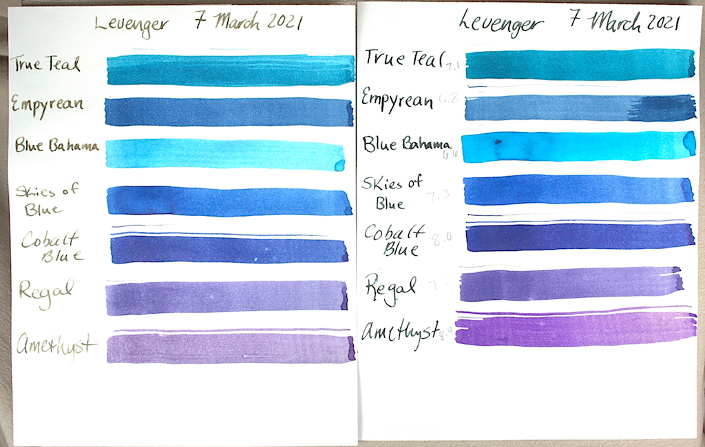
Tag Archives: ink test

Examining Noodler’s Ink Part II

For your writing pleasure, we have tested 10 more Noodler’s-brand inks. In Part I we delved into the various controversies, merits and problems with Noodler’s Ink. To read about that, please click on the Part I link.

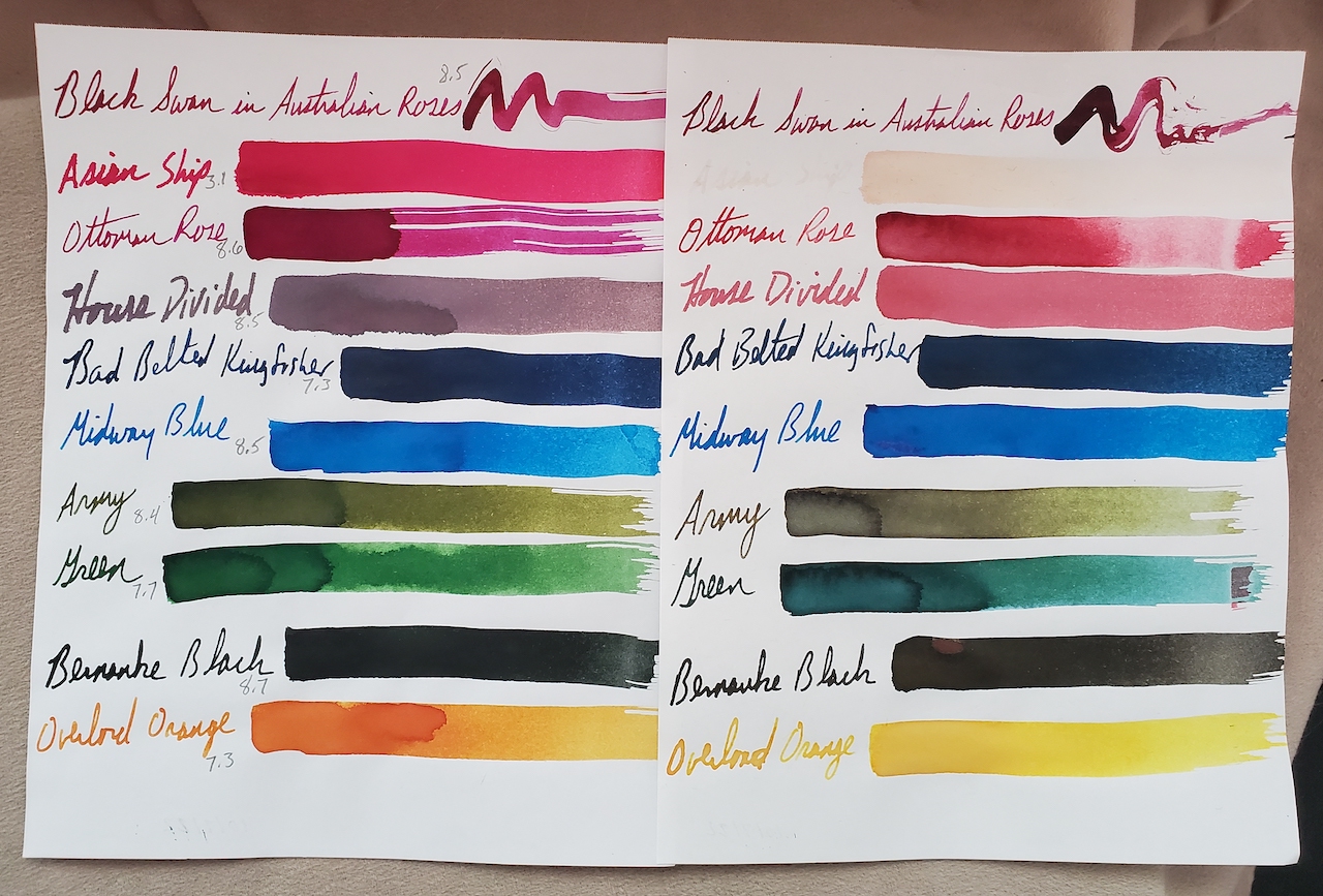
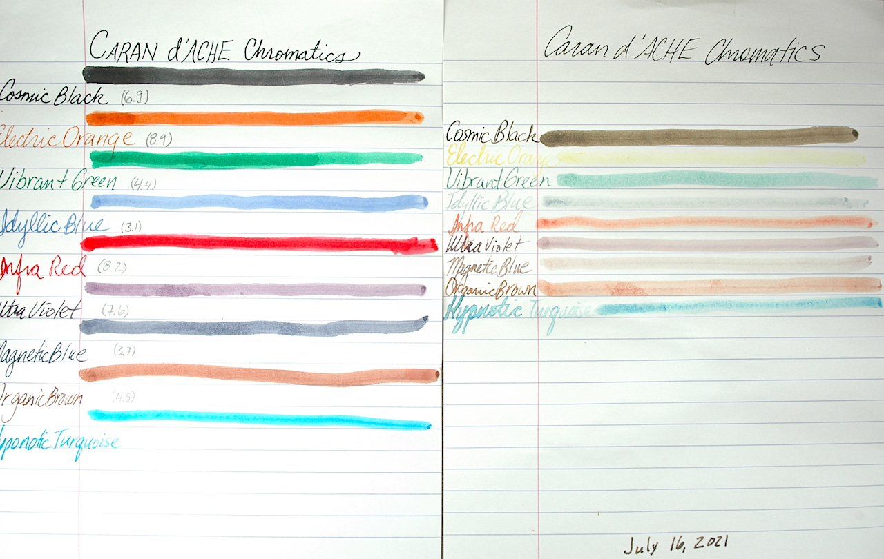
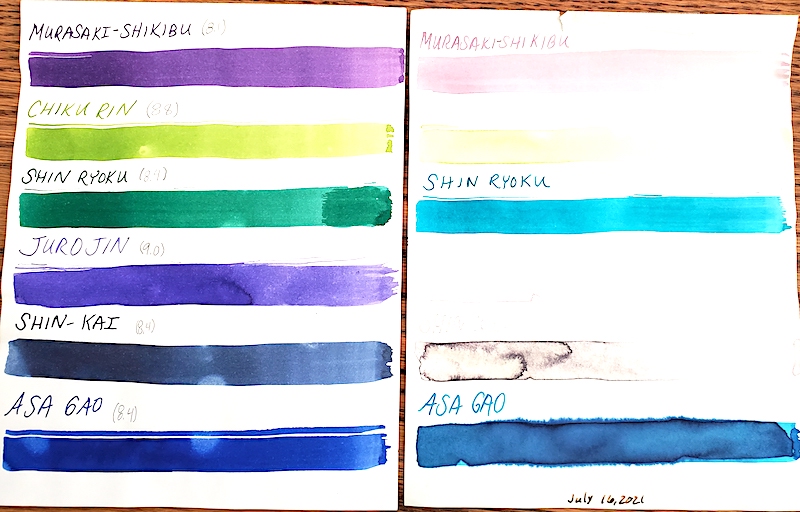
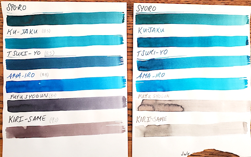
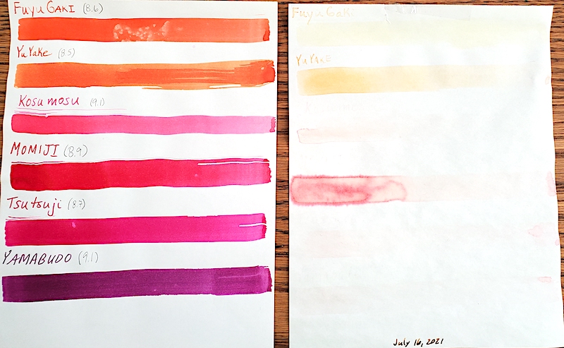
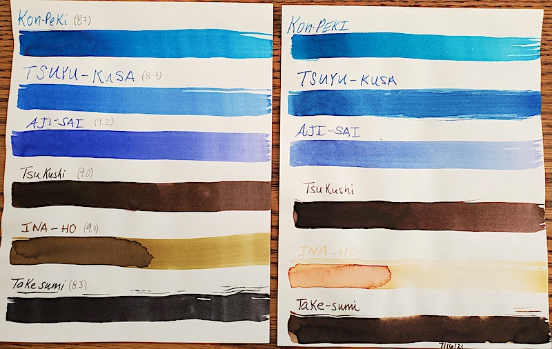
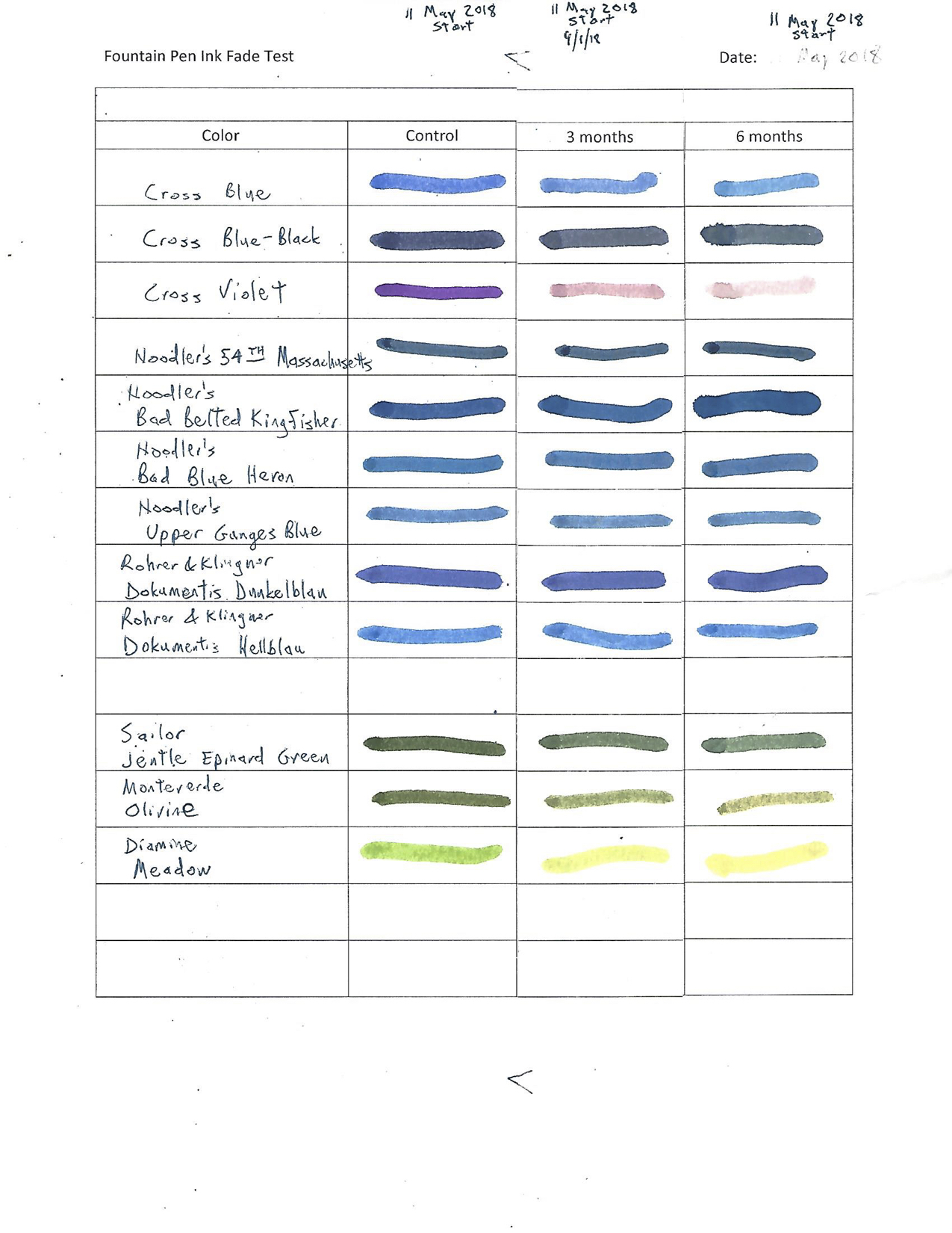
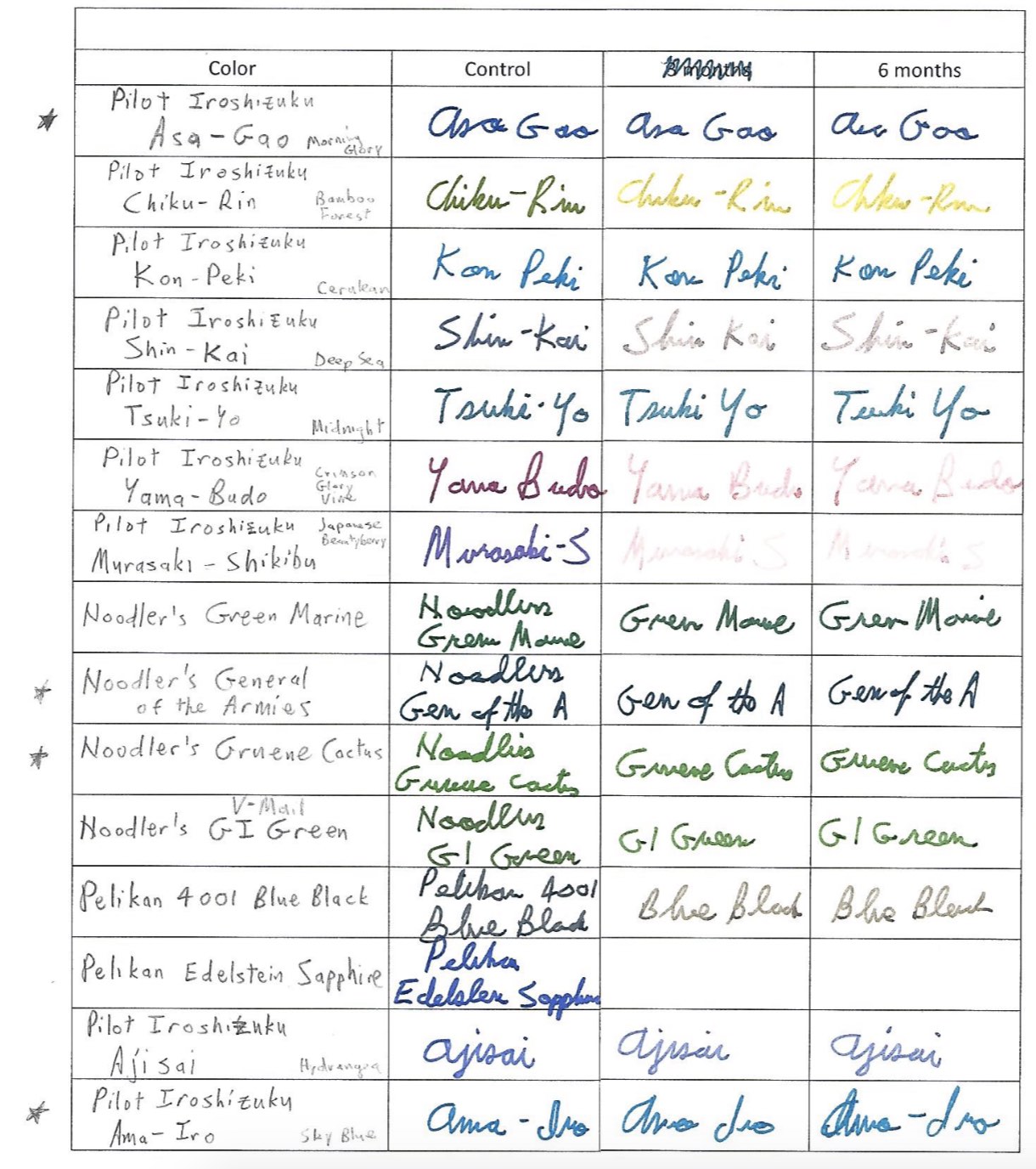
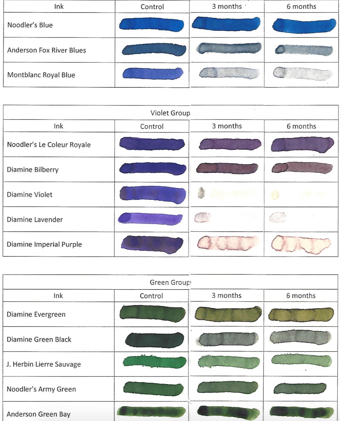
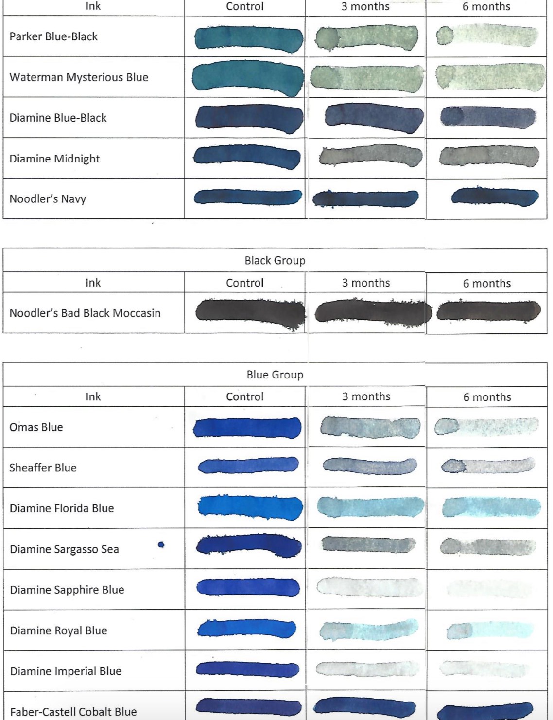
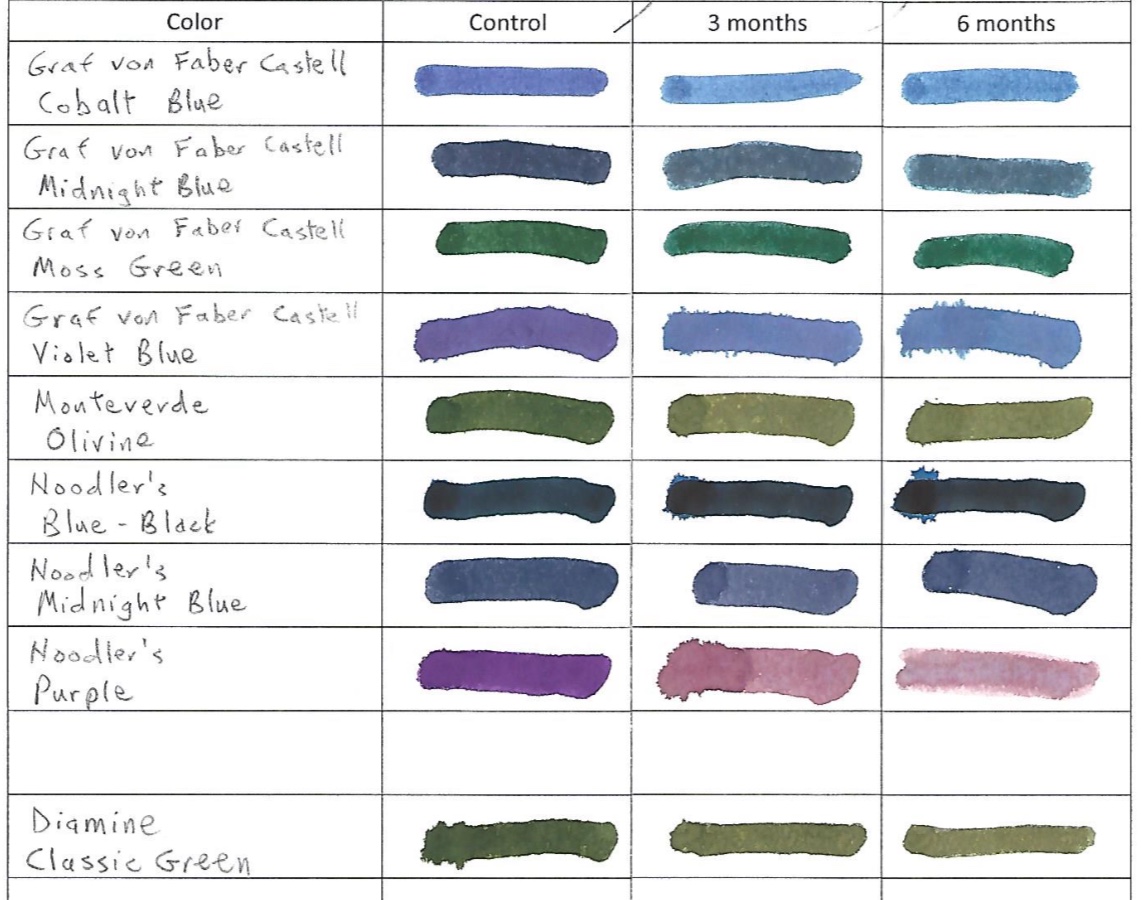
10 Noodler’s inks are on display here as a color-fast testing measure. The sheet on the left has the test proof that was stored in darkoom. The page on the right shows how some of the inks faded after 9 months in the sunlight.

Today’s ink spent 9 months in our sunniest window for a light-fast test. We also tested them for a pH reading, to verify or deny Noodler’s claim that all of its inks are pH neutral.

Let’s start with the color-fast (or light-fast) testing. It is always interesting to see what colors fade. “Black Swan in Australian Roses” is a red-black color that held up really well under prolonged UV exposure–hardly any fading or change in color. “Asian Ship” is a stunning deep pink. Unfortunately, it faded to nearly invisible. “Ottoman Rose” is a lovely purple with dark undertones. However, it fades rather badly in sunlight to a red-brick color, though shaded lines fade almost completely.

Another American Civil War-themed ink is called “House Divided.” It s a gray ink with some blue-ish undertones. On our Rhodia test pad it seemed to be surprisingly feathery. When it set in the sun for 9 months, it faded to a pale reddish pink…a fitting change for an ink based on the bloodshed of the war.

The blue inks we tested are surprisingly strong. “Bad Belted Kingfisher” is a nice dark blue that some might say borders on blue-black. It definitely doesn’t seem to lose an ounce of color. “Midway Blue” is one of the many World War II-themed inks. It is a bright, medium blue, which also doesn’t seem to fade in the sun.

“Army” green has a certain camouflage flair as an earthy yellow-green that is more green than yellow. UV light tends to fade out the yellow parts, leaving behind a darker green.

“Green” is close to an emerald green color at the start. UV light fades out its yellow properties and leaves behind a darker, bluer green.

Ben Bernanke was the chairman of the Federal Reserve for 8 years, overseeing the worst of the Great Recession. The owner of Noodler’s Ink seems rather obsessed with the guy and has, I think, created several Bernanke-themed inks. We tested “Bernanke Black.” It is a nice black when fresh. UV light fades it a bit to brown.

Whereas yellow is what faded out of the green inks above, the red is what fades out of “Overlord Orange,” another WWII ink. After prolonged exposure to the sun, the pumpkin orange fades to a paler yellow.

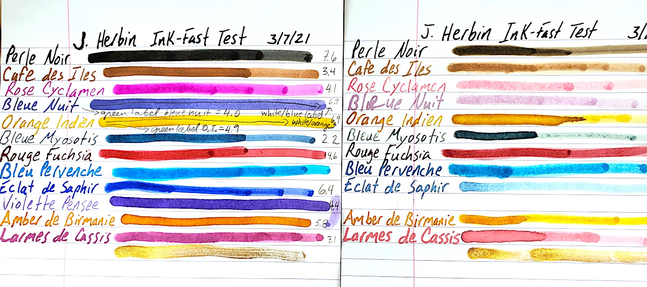
For those, like me, who haven’t taken high school chemistry in more than 30 years, the pH scale runs from 0 for the most acidic to 14 for the most base/alkali. A 7 is pH neutral, like distilled water. Aside from “Asian Ship,” most of the inks don’t stray especially far from pH neutrality. Here are our results, after we calibrated our testing equipment.

Noodler’s Ink                                  pH Result:
Black Swan in Australian Roses    8.5
Asian Ship                                            3.1
Ottoman Rose                                    8.6
House Divided                                    8.5
Bad Belted Kingfisher                      7.3
Midway Blue                                       8.5
Army                                                     8.4
Green                                                    7.7
Bernanke Black                                  8.7
Overlord Orange                               7.3

Please remember that the pH doesn’t necessarily mean anything with regard to how it will behave in your pen. It is a raw data point. How it will blend with the chemistry of your ink sac, converter plastic and seals is an entirely different matter.

Caran D’Ache Chromatics Face the UV-pH Challenge

Swiss pen maker Caran D’Ache is most famous for its precision engineering on its line of ballpoint pens. They make nice fountain pens, too, but it is the company’s ballpoints that the world knows best. Yet, as so many pen makers now do, it also decided to enter the lucrative fountain pen ink market.

Here is a side-by-side comparison of Caran D’Ache Chromatic inks before and after undergoing 3 months of UV sunlight testing.

Caran D’Ache Chromatic Inks are a daring entry, indeed. From their hexagonal bottles that tip to fill to the last drop to their bright and cheery colors, Chromatics made an instant splash on the scene.

Naturally, we wanted to know how well these inks hold up to UV light from the sun and where they register on the scale of a pH test. We placed this sample in our sunniest window for 3 months. We also used our pH meter, which was calibrated to the heat and temperature of our testing station before testing the inks.

The results of our test were surprising. I falsely suspected that there might be some heavier pigmentation in the “Chromatic” inks that would make them shine and dazzle a bit on the page. However, virtually all of the ink colors lost seemingly 85 to 90% of their color, fading heavily from view. “Electric Orange” all but disappeared. Even a stalwart color such as “Cosmic Black” faded to a medium brown, and it had the most staying power.

The pH test results ranged all over the map. As a quick refresher on chemistry, a pH number of 7 is pH neutral like pure water. The closer to 0 something becomes the more acidic it is. The closer to 14 it goes, the more alkali or base something is. In theory, you want an ink that is pH neutral, BUT we have no idea how the chemicals in each ink will react to the chemicals of the ink sacs, converters, inkfeeds and the like. We have found some “neutral” inks to eat through ink sacs rapidly, while some seemingly alkali or acidic inks don’t bother a pen’s parts at all. The following is simply raw data for you to do with as you please.

COLOR:                              pH Score:
Cosmic Black                      6.9
Electric Orange                  8.9
Vibrant Green                     4.4
Idyllic Blue                          3.1
Infra Red                             8.2
Ultra Violet                         7.6
Magnetic Blue                    3.7
Organic Brown                   4.5
Hypnotic Turquoise         N/A

A few of the things that stand out to us are that Cosmic Black is almost perfectly neutral. Aligning with more of our past experiments, the blues were fairly acidic. Yet, playing against stereotype, the red and purple were closer to neutral. Green remains quite acidic, which is expected, but the brown also was acidic, which wasn’t expected.

As always, I hope you found this snippet of ink data helpful to your quest for the perfect ink for you.

Iroshizuku Ink Gets UV & pH Tested

No one should be surprised by the meteoric rise of Iroshizuku inks on the fountain pen scene. Japan’s finest ink makers have created dozens of colors and hues that offer vibrancy and shadowing while never clogging a vintage or modern fountain pen.

We picked up 24 bottles of this amazing ink and have submitted them to our rigorous UV and pH testing. Each of the following inks was placed in one my sunniest windows between July 16, 2021 and October 16, 2021. We calibrated our pH meter and tested these inks at 75.6ºF at 50% humidity. As a quick reminder, on a pH test, 0 is the extreme limit for acidic, 7 is neutral and 14 is the extreme end of alkali or base. Click the individual photos for a closer look.

In many of our tests, blue inks tend to be very susceptible to UV light. Not Iroshizuku! Unfortunately, many of its other colors fade badly. The images certainly explain more than I can. Nevertheless, I love the peachy salmon of a late summer sunset that is Fuyu Gaki ink, and like a sunset it fades almost entirely. The nearly emerald green of Shin Ryoku turns turquoise. The blue-black Fuyu Syogun turned a light-fog grey. And the black Take Sumi stayed dark but turned dark brown.

When it comes to pH, these are simply raw data points. We do not know specifically how they interact with the chemistry of the ink sacs and piston parts of your pen. Most of these Japanese inks are on the shallow end of the base depth chart.

Color                        pH
Murasaki-Shikibu  8.1
Chiku Rin                 8.8
Shin Ryoku              8.4
Juro Jin                    9.0
Shin-Kai                   8.4
Asa Gao                    8.4
Fuku Gaki                8.6
Yu Yake                    8.5
Kosa Mosu               9.1
Momiji                      8.9
Tsutsuji                    8.7
Yamabudo               9.1
Syo-Ro
Ku-Jaku                    8.5
Tsuki-Yo                   8.5
Ama-Iro                    8.8
Fuyu Syogun           8.5
Kiri-Same                9.0
Kon-Peki                  8.7
Tsuyu-Kusa             8.7
Aji-Sai                      9.2
Tsu Kushi                9.0
Ina-ho                      9.0
Take Sumi               8.3

J. Herbin Ink Goes Under the Sun

French inks haven’t previously undergone our rigorous testing, and we were excited to give them a UV light-fast test and pH test. We purchased a small collection of a dozen different colors of J. Herbin.

We started this test on March 7, 2021, by placing a sample of 13 inks in our sunniest window.

We test these J. Herbin inks to see how well they can withstand UV light and to see where they rank on the ol’ pH meter.

Believe it or not, this was our first time writing with J. Herbin ink. What really struck us was the vibrancy of the dry ink on the page. Of the colors I liked best, Rose Cyclamen really pops with a purple-pink splendor. Dawn’s favorite color is the electric turquoise blue of Bleu Pervenche. Eclat de Saphir is a solid daily blue. And my new permanent addition to my daily writing is the Amber de Birmanie. It is an incredible orangy brown.

Unfortunately, 3 months of direct sunlight does not treat these inks well. All of the colors except the gold metallic ink bleach substantially in UV light. You can see the damage in the photo. Some of the really drastic changes include Rose Cyclamen turning bright, light bubble-gum pink; the blue-black Bleu Nuit turns a pale, faded purple and Violette Pensee disappears almost completely! Larmes de Cassis turns from purple to pink.

The following show the pH results for each ink. We actually had three different bottles of the Bleue Nuit, Orange Indien and Bleu Pervenche. The labels on the outside of the bottle were different, so we list these two inks by their label results, too. As a quick refresher in chemistry, a pH number of 0 is as acidic as a chemical can be. 7 is neutral, like pure water. And 14 is the maximum extreme of alkali/base.

Perle Noir                          7.6
Cafe des Iles                     3.4
Rose Cyclamen                4.1
Bleue Nuit                         4.0 (Green Label)
Bleue Nuit                         6.9 (White & Blue Label)
Orange Indien                  4.9 (Green Label)
Orange Indien                  6.9 (White & Blue Label)
Bleue Myosotis                 2.2
Rouge Fuchsia                 4.6
Bleu Pervenche                7.0 (White & Blue Label)
Bleu Pervenche                6.2 (Green Label)
Eclat de Saphir                 6.4
Violette Pensee                 4.4
Amber de Birmanie         5.8
Larmes de Cassis              7.1

A Potpourri of Ink Tests

As we have been conducting our ink tests, we ran into a grouping of mostly orphaned bottles that wouldn’t make for a very big story individually. So we tested them together and got them all on one page.

The ink proof sheet is on the left and the UV tested inks are on the right. Click the image above to get a better look at the ink tests.

This batch of inks was given a UV light fast test in our sunniest window from March 7, 2021, to June 7, 2021. We also tested the pH levels of the inks to see just how neutral they are. The following is all raw data that we thought you might find interesting. As we do not know the chemical composition of each ink or ink sac/converter it might go into, a pH neutral ink does not guarantee it won’t have a bad chemical reaction inside your pen. We have a professional pH tester, which we calibrated just before testing these inks. As a quick chemistry refresher, a pH of 7 is neutral like distilled water. The closer you get to 0, the more acidic the ink is. The closer you get to 14, the more alkali/base the ink is.

Surprises are the most enjoyable parts of these tests. Blues remain entirely unpredictable. One of my all-time favorite blues is Parker Penman Sapphire. Instead of fading out like most blues, it turned purple! Visconti blue fades out when thinly applied, but the thicker lines create a majestic blue-black that is even prettier than the original blue. Colorverse Quasar turned from a rich blue to a light red-purple. Omas blue did what most blues do and faded heavily. Acidity didn’t seem to effect which brands faded and didn’t. Omas was the most acidic blue at 2.3, and Colorverse was the most neutral at 7.9. Both underwent dramatic changes.

There were subtle changes in some of the inks. Visconti’s black turned a dark brown in the sunlight.

Purples fared poorly. Visconti Purple turned a pale pink. Vintage 1960s’ Waterman’s Violet almost completely disappeared. Pelikan Violet held on kinda, turning a deep reddish pink.

Waterman’s Red and Omas’ Red/Burgundy held up best. Neither seemed very effected by the sun. Also interesting was that Omas’ ink was also almost pH neutral at 7.2. We are often warned red can be the most dangerous color to put in a fountain pen. If it is pH neutral, I wonder what chemical reactions happen when it is inside a pen.

We had never previously heard of Francesco Rubinato inks before, but we loved the “Verde” green ink that was somewhere between “Shamrock Shake” and “Kelly Green.” Unfortunately, it turns into a bile-like yellow green with UV exposure.

An OLD bottle of Rotring Red was a very curious color. It was more of a brick red with a hint of orange. Was that because it was already discolored and UV exposed or was Rotring red really like that? Either way, UV didn’t effect the dry ink on the page.

The only color not yet mentioned is the Francesco Rubinato Oro (gold). This is a goupy, heavily sedimented ink filled with gold-glitter. We DO NOT recommend it for fountain pens. It is ONLY GOOD for DIP PENS. Anyhow, UV light didn’t effect it at all, and because we didn’t want to ruin our pH tester, we didn’t check its pH level, either.

Here is the table of our pH results:

Visconti Black…………………………..4.2
Visconti Blue……………………………3.9
Visconti Purple…………………………3.2
Parker Penman Sapphire…………..5.3
Francesco Rubinato Verde…………4.1
Omas Red/Burg………………………..7.2
Omas Blue……………………………….2.3
Rotring Brick Red…………………….8.5
Waterman (1960s) Violet………….3.9
Waterman Red………………………..5.9
Colorverse Quasar…………………….7.9

Levenger’s Ink Kicks Ass!

Mathematical and computer genius Alan Turing famously said, “Sometimes it is the people who no one imagines anything of who do the things no one can imagine.” In addition to being one of my all-time favorite quotes about people, it seems to apply to the world of fountain pen inks, too.

Here is a side-by-side comparison of Levenger’s ink left in the sun for 3 months and the proof sample saved in the dark.

Ink collectors today understandably go ga-ga for Iroshizuku, Diamine, ColorVerse, J. Herbin, Noodlers and many other brands. Yet, often overlooked, is Levenger’s Ink. In many respects, Levenger’s kicked off the ink-color craze a decade or two before our current manufacturers and spectrum were readily available. Levenger’s has had scores of inks of every hue available since some time in the 1990s. Better yet, they are far more affordable than the competition.

Nevertheless, I kinda blew them off…until I stumbled into a large collection for sale. When Dawn and I started testing them for UV light fastness and pH balance, we were blown away.

We started testing 17 colors in March. From March 7, 2021, through June 7, 2021, we hung these samples in the sunniest window of our house. Afterward, we tested the ink still in the bottles with a pH meter calibrated to 21ºC.

Here is a side-by-side image of Levenger’s inks left in the sun for 3 months and the sample proof left in the dark.

Without a doubt, these are the most consistently light-fast inks we have tested to date. Even the worst-hit inks were still very close to their original colors. Blue Bahama likely lost the most vibrancy, but it is still easily read and distinguished. Cardinal Red faded to a rich pink, but it is still quite legible. Raven Black, Gemstone Green and Greystoke got DARKER in the sun!

Given the great results from the light-fast testing, we feared the worst with the pH tests. BUT! We were only further dazzled. Many of the inks were very close to neutral, and none of the inks veered off the spectrum of acidic or alkali.

As a basic chemistry refresher, 7 in a pH test is neutral. Distilled water is 7. The closer to 0 you go, the more acidic something is. In the opposite direction going up to 14 is more base or alkali. In theory, you don’t want an acid or a base sitting in your ink sac for too long. Yet, one thing we always like to remind people is that regardless of what the pH result is, we do not know the chemistry of the ink nor how it interacts with your rubber ink sacs, celluloids or converters and the like. Depending on the chemical reaction between the ink and what it is resting in, a neutral ink can do damage and an acidic ink might be safe. The pH measurement is simply a data point we find fascinating, but it doesn’t necessarily indicate which inks are safest for your pens. With that in mind, here are our Levenger pH results:

Ink Color              pH Measurement
True Teal                        7.1
Empyrean                      6.8
Blue Bahama                 6.6
Skies of Blue                 7.3
Cobalt Blue                   8.0
Regal                             7.2
Amethyst                      8.4
Raven Black                 8.3
Claret                            8.7
Pomegranate               8.3
Shiraz                           8.7
Cardinal Red               6.8
Blazing Sunset            6.7
Cocoa                           7.3
Forest                           7.1
Gemstone Green        7.2
Greystoke                    7.4

As always, I hope you find this information to be interesting and enjoyable.

Pelikan Edelstein Inks Go Under the Sun

I feel that the harsh news must be tempered.

I LOVE Pelikan pens. It is my favorite modern pen brand. I LOVE Pelikan’s Edelstein inks. They are so vibrant and beautiful. I had extremely high hopes for testing them and having far better results than standard Pelikan inks. (I wrote a travel journal at 17 when visiting Germany and bought my first bottle of Pelikan Konigsblau Tinte—King’s Blue Ink, or Royal Blue by regular English naming conventions. I can barely read it, the ink is so faded after nearly 30 years.)

Look how vibrant and beautiful Pelikan Edelstein inks look when fresh on the page. Do you see what happens to them after 3 months in direct sunlight?

As fate would have it, I bought out an ink collection this past winter. There were more than 270 bottles of ink. Among the bottles were 12 different colors of Edelstein ink and 3 bottles of standard Pelikan inks, which I had not previously tested. Also included in this test are two non-Pelikan related inks.

Assisting me in this endeavor was my ever-more talented fiancé Dawn. You can immediately tell which test sheet is her’s by it being so much easier to see and read.

Pelikan inks were first started by German chemist Carl Hornemann in 1838, making Pelikan one of the oldest and most successful continuously operating ink companies in history. Yet, the company wasn’t really known as Pelikan until chemist Günther Wagner took over the company in 1871 and started using the Pelikan logo. The gemstone-inspired Edelstein inks were first launched with great success in 2011.

Our ink-fast test methodology remains simple. Put one sample in a sunny window for three months and one sample in a dark, cool place and check out the differences.

WOW!

Pelikan regular inks fare badly in three months of UV light. However, No. 5 Aonibi does very well.

None of the Pelikan inks withstood 3 months of UV light from the sun very well at all.  The beautiful Amethyst turned from purple to a faded brown. Blue-grey Tanzanite also turned colors to a faded brownish. My favorite Sapphire almost completely disappeared. So did Jade, Ruby and Topaz. When applied very thickly, Aquamarine, Olivine, Mandarin and Adventurine kinda held out. Only Garnet seemed to survive mostly intact.

Moving on to the standard Pelikan inks, Brilliant Red almost disappeared completely, turning a very faded yellow. Violet and Brilliant Green also lost about 70% to 80% of their color and visibility.

Our two non-Pelikan contestants were No. 5 Aonibi, which is a lovely blue-black when fresh and Organic Studio “N,” which is a stunningly beautiful sheening blue. Although I’ve never heard of No. 5 Aonibi, it held its own quite well in this test. Of the 17 inks sampled, it won the contest of looking the most like it did when it was first put to paper.

Organic Studio “N” could easily win the contest to be my new favorite blue ink, but it inexplicably turned black in the sun. That is way better than fading to near invisibility, but I really wish it held its true color when fresh on paper.

More Ink Tests with Donn

Ink-fast testing image

Donn D. shared this new set of ink fast tests he made in 2018. Look how well Cross inks hold up!

Ink Guru Donn D. and I ran into each other again at the Chicago Pen Show a week ago, and I was pleased to see he had some new ink-fast tests to share. This batch is concerned with more fountain pen inks, and I was surprised to find great results with the Cross inks. Who knew? So often happens that Cross gets written off as a boring legacy brand. They make a lot of good ink and surprisingly good pens, in spite of their ubiquity on the scene here in the States.

Much of my conversation with Donn revolved around the fact that ballpoint inks are more susceptible to U.V. light than previously thought. He has found some fade out just as poorly as fountain pen inks. Given ballpoint inks are formulated with oil as a base, this surprised me. As thicker inks, I thought they’d last longer. With any luck, Donn will share those ballpoint ink results with us one day.

In the meantime, enjoy these great tests with fountain pen inks. Click the image to see a bigger version.

Meet the Ink Test Guru

Several years ago I met Donn D. at the Chicago Pen Show. We got to talking outside of the main room afterhours, and he was the one who introduced me to Ink-Fast Tests. He had a binder of very organized ink swatches that showed what an ink looked like when protected from the light, what it looked like after it had been left in the sun for 3 months and after it had been left in the sun for 6 months.

As I was on a quest for the perfect replacement blue for my beloved Waterman Florida Blue, I began making ink tests for this site. I figured you would be as curious as I am about how ink holds up to UV light.

Donn and I got together at this year’s Washington DC Pen Show and resumed our inky discussions. I asked if he would be so kind as to share some of his tests on the blog, and he said, “Yes.”

Included in this post are 4 pages of his tests of Pilot ink, Diamine ink, Noodler’s ink, Waterman ink, Parker ink and Pelikan ink…among others.

Donn described his methodology as such: “I exposed fountain pen ink samples to ultraviolet light from the sun for 3 months and 6 months.  The exposure method involved simply taping them to the inside of a patio door, which does not block UV very well.  I exposed all samples in the same manner, but not at the same time, and have no record of the number of cloudy vs. sunny days for each test.  The paper was standard office copy bond.

The inks in this test happen to be colors I like, rather than a general test of a manufacturer’s entire product line.

What surprised me most was how well green inks held up, and a chemist friend speculates a copper compound may be involved.

Note: Test sheet #1 shows 6-month results only.”

Thank you, Donn, for sharing so many of these ink tests. Everybody else, I hope these help you in your quest for the perfect inks.

Click on any of the images to see a larger, clearer representation of the inks tested. Please also note that these are not performance tests of the ink inside a fountain pen. Some of these inks are not as well suited to vintage pens as others. This is strictly to showcase how an ink will hold up to time and light. (For example, Noodler’s Ink often clogs the hell out of vintage pens. Beautiful inks but a pain to deal with unless you love spending hours cleaning pens.)

Frau Tinte’s Iron Gall Ink Test

One of my favorite parts about owning a pen business is meeting so many amazing pen and ink collectors from around the world.

One of my many great new friends is a brilliant “amateur” ink historian from Germany who doesn’t want to be identified, so I shall simply refer to her as Frau Tinte. (Ms. Ink, auf Deutsch) In addition to collecting great vintage and modern pens and having a phenomenal talent with calligraphy scripts, Frau Tinte loves researching medieval ink recipes!

Frau Tinte’s iron gall ink goes down very faintly. You can barely read what you are writing. The cool thing is that you can smell the pomegranate and iron in the ink.

She has combed some truly amazing libraries in search of rare and original documents from as long ago as the 1200s and 1300s. As ink making was a very inexact science back then without a lot of consistent, formal measurements like today, recreating these inks is an art form in and of itself. Some of the ingredients are rather vaguely named, as the medieval German word for an item might not be what that ingredient is called today. Plus, old German scripts are practically a different language from modern German lettering. Yet, she methodically tests recipes until she can get reasonably consistent and accurate recreations.

Frau Tinte very kindly and graciously shared with me an old iron gall recreation that is partially made from pomegranates. You can smell the fruit and iron in the ink! The ink is toxic and highly aggressive in its relation to mammals, nibs and inkfeeds. She made it clear that I could only use this ink with a glass dip nib or a 14k gold dip nib with no inkfeed. If I filled a vintage or modern pen with it, it would quickly begin to eat the insides of the pen and feed.

Here are three samples of Frau Tinte’s Iron Gall Ink after a little more than a year in different elements.

Thus, I have spent the past year plus writing with it using a glass-nib dip pen. It is pretty amazing stuff. The iron in the ink oxidizes over time to get darker. Basically, it is rusting on the paper. When you write with it, you can barely read it. Yet, within a few minutes it darkens, and it can continue to darken for years. Many surviving handwritten documents from hundreds of years ago using this or similar iron gall inks are black, and you can see it is getting pretty dark in the samples, but it isn’t a true black, yet.

Wondering how a year would treat the ink, I created 4 samples. One was only seconds old when I shot it, so you can see what it is like to write with. It is a very faint grey that you can barely read. Test #1 was left in a cool, dry place with no direct sunlight. Test #2 was left in a window with direct sunlight. Test #3 was left in a dark, humid place. Each writing sample was written on Montblanc Meisterbütten paper…similar to the parchments used in the 1800s.

I thought the humid sample would have been the darkest, as it might have allowed for more rusting action, but it is about as dark as the control sample #1. The neatest result for me was the sunlight sample. The paper is bleached at least three shades whiter than the other samples. (Photo lighting makes that a little harder to see, but the difference is immediately obvious once you hold the samples together.) Although the ink is maybe a shade lighter than the other year-old samples, it is still really dark on the paper, unlike about 90% of the inks we leave in a window for only 3 or so months.

If you are looking for a permanent ink with a unique chemical signature, find yourself a good iron gall ink.

As for the availability of Frau Tinte’s creations, we are pondering the legal aspects of it on the market in the U.S. What worries us are the facts that it is toxic and how it can ruin pens so quickly if used inappropriately. I know you loyal readers are bright enough not to shoot it with your whiskey or fill your pens with it, but if McDonald’s can get sued for their coffee being too hot…well, you know where this can end up. Eventually, somebody’s poor kitty will find an open, untended bottle and think it is a snack or someone who possibly received it as a gift will fill their beloved $2,000 Montblanc with it. We definitely don’t want to be responsible for those tragedies. Yet, it would be nice for people who want to try it to have a safe and fun writing experience that is centuries old.

If you happen to be a product safety lawyer and happen to know the answers to such questions, please feel free to share them with me.