
 Shopping Cart


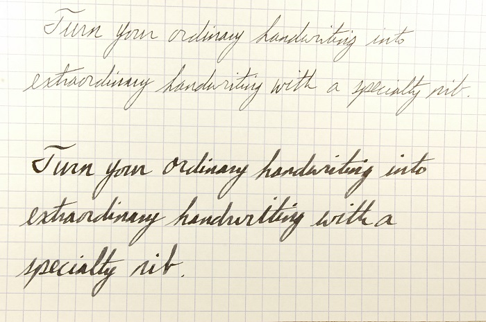
See the difference a 1.5mm Lamy nib can make for your handwriting? Not only do the letters take on more distinctive shapes, the ink, itself, provides shadows and highlights on every letter. It is far more interesting than a boring old fine-point nib.
It should be noted that my handwriting is terrible. Some of my friends who almost never write anything by hand think it is amazing simply because I can still do it. No writing expert on earth would praise it. However, with a with a nice broad stub nib, it looks much more exotic and fascinating.
You, too, can impress some of the people some of the time with a few simple handwriting tricks I have picked up over the years.
Unless you already have beautiful penmanship, I recommend staying away from those extra-fine nibs that are so in vogue today. Relax and let your handwriting out a bit to breathe.
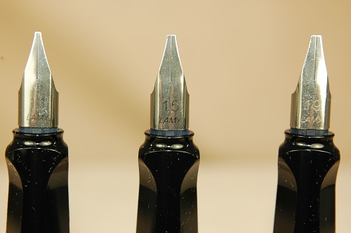
Lamy calligraphy nibs range in size from 1.1mm to 1.9mm. Each provides a distinctive nuance to you handwriting. The Lamy Joy fountain pen set is a great way to try all three sizes for fewer than $70.
Trick #1 to Handwriting Coolness: A stub nib. We now carry brand-new Lamy Joy calligraphy sets that feature three nibs: a 1.1mm nib, 1.5mm nib and a 1.9mm nib. These super-smooth broad flat steel nibs can create some wicked curves, lines and angles in your natural handwriting.
Trick #2 to Handwriting Coolness: Slow down.
Trick #3 to Handwriting Coolness: Think about what you are doing. When using a stub nib, the angle at which you write becomes crucial to developing richer characters. Experiment with ways to use the flat edge sideways for skinny lines and the flat edge of the nib vertically for thick lines. Watch as you practice O’s for how the circle should grow from skinny to fat and skinny again. See what happens when you try to grip your pen in one set position and write with your arm instead of your fingers and wrist. By setting the wrist, you can make more dynamic letters.
Trick #4 to Handwriting Coolness: Ink. If you think all inks are the same, think again. Most bottled inks are inconsistent, especially when using a stub nib. Very few blacks are true blacks, and many blues and blue-blacks are also inconsistent.
For example: Yard-O-Led Jet Black is really a charcoal grey. With a 1.5mm nib, the inconsistency is obvious, as the ink goes from black to grey in places. This gives your writing a fascinating texture and appeal. Pelikan and Cross (Okay, these two inks are exactly the same because they are made and bottled by Pelikan.) Royal Blue ink also has many inconsistent colorings when written with any medium nib or larger. Just keep in mind that Pelikan Royal Blue also fades heavily with time. It might not be ideal for your archiving projects.
I hope this helps set you on the write…oops…right path to improving your handwriting and developing a fascinating new look to your correspondence.
Yes, yes. It is a shameless plug, but I really do hope you consider buying one of our Lamy Joy sets because they really will introduce you (or a loved one) to several great stub nib variations that write well for a very affordable price under $70. The sets not only come with three nibs, but ink cartridges and an instruction manual with advice about making the most of the nibs. It is even packaged in a handy collector’s tin.
If you really want to get all fancy-shmancy, try our rare Mont Blanc Generations fountain pen with a 14k stub nib for only $99.99.