 Shopping Cart


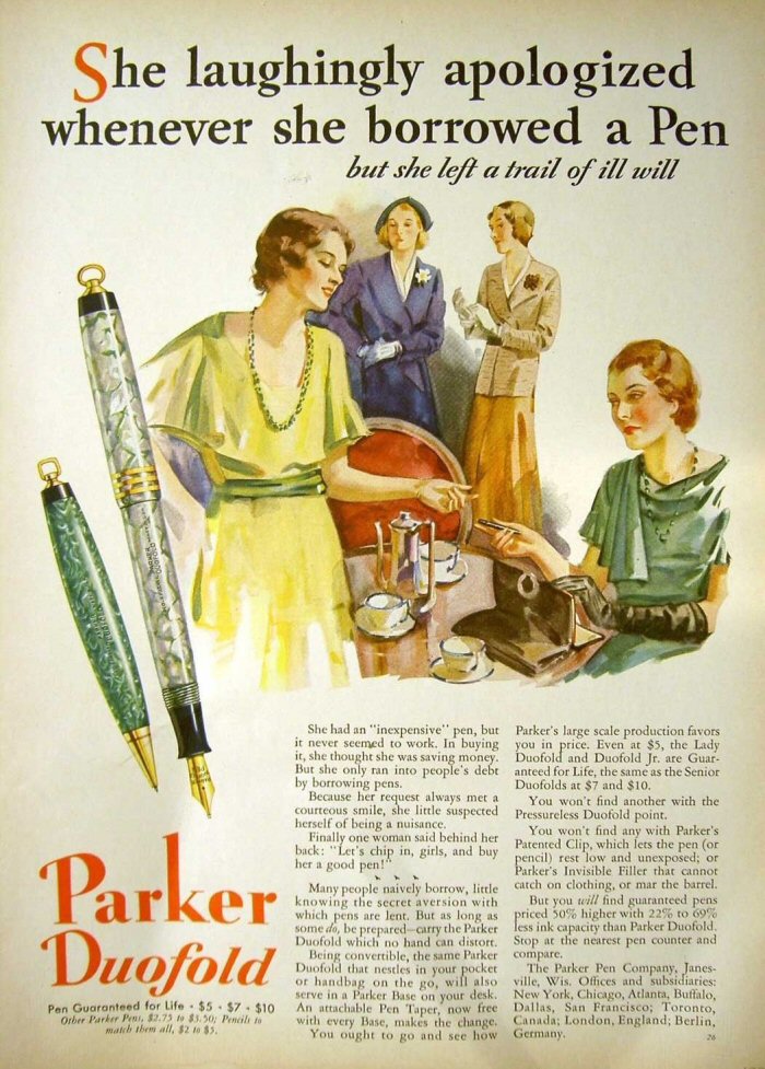
Despite the beautiful watercolor painting and classic 1930s fashion, this vintage pen ad is loaded with sexism that seems sure to guarantee the Lady Duofold never sold.
Seriously, how effective was this catty Parker Duofold ad from 1931?!
The ad headline reads like a movie synopsis for a cheap melodrama about a bunch of bitchy women who haven’t got much else to complain about in life. In case it is too small on your computer or mobile device it reads: “She laughingly apologized whenever she borrowed a pen, but she left a trail of ill will.”
It is hilarious for all of the wrong reasons.
The copy block only gets better…I mean worse:
“She had an ‘inexpensive’ pen, but it never seemed to work. In buying it, she thought she was saving money. But she only ran into people’s debt by borrowing pens.
“Because her request always met a courteous smile, she little suspected herself of being a nuisance.”
Is it any wonder Parker stopped making “Lady’s” pens not long after this ad came out in 1931?
As bad as the marketing was, the Lady Duofolds were and still are remarkably good pens. They write smoothly and are easy to maintain. We have a very nice one for sale, if you don’t mind a little discoloration. It still works perfectly. CLICK HERE to see this fully restored vintage pen.