Tag Archives: ink pH

J. Herbin Ink Goes Under the Sun

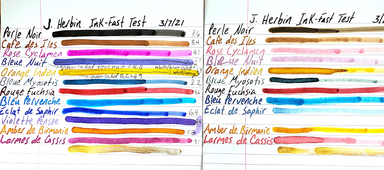
French inks haven’t previously undergone our rigorous testing, and we were excited to give them a UV light-fast test and pH test. We purchased a small collection of a dozen different colors of J. Herbin.

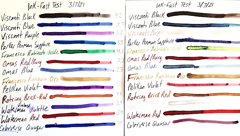
We started this test on March 7, 2021, by placing a sample of 13 inks in our sunniest window.

We test these J. Herbin inks to see how well they can withstand UV light and to see where they rank on the ol’ pH meter.

Believe it or not, this was our first time writing with J. Herbin ink. What really struck us was the vibrancy of the dry ink on the page. Of the colors I liked best, Rose Cyclamen really pops with a purple-pink splendor. Dawn’s favorite color is the electric turquoise blue of Bleu Pervenche. Eclat de Saphir is a solid daily blue. And my new permanent addition to my daily writing is the Amber de Birmanie. It is an incredible orangy brown.

Unfortunately, 3 months of direct sunlight does not treat these inks well. All of the colors except the gold metallic ink bleach substantially in UV light. You can see the damage in the photo. Some of the really drastic changes include Rose Cyclamen turning bright, light bubble-gum pink; the blue-black Bleu Nuit turns a pale, faded purple and Violette Pensee disappears almost completely! Larmes de Cassis turns from purple to pink.

The following show the pH results for each ink. We actually had three different bottles of the Bleue Nuit, Orange Indien and Bleu Pervenche. The labels on the outside of the bottle were different, so we list these two inks by their label results, too. As a quick refresher in chemistry, a pH number of 0 is as acidic as a chemical can be. 7 is neutral, like pure water. And 14 is the maximum extreme of alkali/base.

Perle Noir                          7.6
Cafe des Iles                     3.4
Rose Cyclamen                4.1
Bleue Nuit                         4.0 (Green Label)
Bleue Nuit                         6.9 (White & Blue Label)
Orange Indien                  4.9 (Green Label)
Orange Indien                  6.9 (White & Blue Label)
Bleue Myosotis                 2.2
Rouge Fuchsia                 4.6
Bleu Pervenche                7.0 (White & Blue Label)
Bleu Pervenche                6.2 (Green Label)
Eclat de Saphir                 6.4
Violette Pensee                 4.4
Amber de Birmanie         5.8
Larmes de Cassis              7.1

A Potpourri of Ink Tests

As we have been conducting our ink tests, we ran into a grouping of mostly orphaned bottles that wouldn’t make for a very big story individually. So we tested them together and got them all on one page.

The ink proof sheet is on the left and the UV tested inks are on the right. Click the image above to get a better look at the ink tests.

This batch of inks was given a UV light fast test in our sunniest window from March 7, 2021, to June 7, 2021. We also tested the pH levels of the inks to see just how neutral they are. The following is all raw data that we thought you might find interesting. As we do not know the chemical composition of each ink or ink sac/converter it might go into, a pH neutral ink does not guarantee it won’t have a bad chemical reaction inside your pen. We have a professional pH tester, which we calibrated just before testing these inks. As a quick chemistry refresher, a pH of 7 is neutral like distilled water. The closer you get to 0, the more acidic the ink is. The closer you get to 14, the more alkali/base the ink is.

Surprises are the most enjoyable parts of these tests. Blues remain entirely unpredictable. One of my all-time favorite blues is Parker Penman Sapphire. Instead of fading out like most blues, it turned purple! Visconti blue fades out when thinly applied, but the thicker lines create a majestic blue-black that is even prettier than the original blue. Colorverse Quasar turned from a rich blue to a light red-purple. Omas blue did what most blues do and faded heavily. Acidity didn’t seem to effect which brands faded and didn’t. Omas was the most acidic blue at 2.3, and Colorverse was the most neutral at 7.9. Both underwent dramatic changes.

There were subtle changes in some of the inks. Visconti’s black turned a dark brown in the sunlight.

Purples fared poorly. Visconti Purple turned a pale pink. Vintage 1960s’ Waterman’s Violet almost completely disappeared. Pelikan Violet held on kinda, turning a deep reddish pink.

Waterman’s Red and Omas’ Red/Burgundy held up best. Neither seemed very effected by the sun. Also interesting was that Omas’ ink was also almost pH neutral at 7.2. We are often warned red can be the most dangerous color to put in a fountain pen. If it is pH neutral, I wonder what chemical reactions happen when it is inside a pen.

We had never previously heard of Francesco Rubinato inks before, but we loved the “Verde” green ink that was somewhere between “Shamrock Shake” and “Kelly Green.” Unfortunately, it turns into a bile-like yellow green with UV exposure.

An OLD bottle of Rotring Red was a very curious color. It was more of a brick red with a hint of orange. Was that because it was already discolored and UV exposed or was Rotring red really like that? Either way, UV didn’t effect the dry ink on the page.

The only color not yet mentioned is the Francesco Rubinato Oro (gold). This is a goupy, heavily sedimented ink filled with gold-glitter. We DO NOT recommend it for fountain pens. It is ONLY GOOD for DIP PENS. Anyhow, UV light didn’t effect it at all, and because we didn’t want to ruin our pH tester, we didn’t check its pH level, either.

Here is the table of our pH results:

Visconti Black…………………………..4.2
Visconti Blue……………………………3.9
Visconti Purple…………………………3.2
Parker Penman Sapphire…………..5.3
Francesco Rubinato Verde…………4.1
Omas Red/Burg………………………..7.2
Omas Blue……………………………….2.3
Rotring Brick Red…………………….8.5
Waterman (1960s) Violet………….3.9
Waterman Red………………………..5.9
Colorverse Quasar…………………….7.9

Levenger’s Ink Kicks Ass!

Mathematical and computer genius Alan Turing famously said, “Sometimes it is the people who no one imagines anything of who do the things no one can imagine.” In addition to being one of my all-time favorite quotes about people, it seems to apply to the world of fountain pen inks, too.

Here is a side-by-side comparison of Levenger’s ink left in the sun for 3 months and the proof sample saved in the dark.

Ink collectors today understandably go ga-ga for Iroshizuku, Diamine, ColorVerse, J. Herbin, Noodlers and many other brands. Yet, often overlooked, is Levenger’s Ink. In many respects, Levenger’s kicked off the ink-color craze a decade or two before our current manufacturers and spectrum were readily available. Levenger’s has had scores of inks of every hue available since some time in the 1990s. Better yet, they are far more affordable than the competition.

Nevertheless, I kinda blew them off…until I stumbled into a large collection for sale. When Dawn and I started testing them for UV light fastness and pH balance, we were blown away.

We started testing 17 colors in March. From March 7, 2021, through June 7, 2021, we hung these samples in the sunniest window of our house. Afterward, we tested the ink still in the bottles with a pH meter calibrated to 21ºC.

Here is a side-by-side image of Levenger’s inks left in the sun for 3 months and the sample proof left in the dark.

Without a doubt, these are the most consistently light-fast inks we have tested to date. Even the worst-hit inks were still very close to their original colors. Blue Bahama likely lost the most vibrancy, but it is still easily read and distinguished. Cardinal Red faded to a rich pink, but it is still quite legible. Raven Black, Gemstone Green and Greystoke got DARKER in the sun!

Given the great results from the light-fast testing, we feared the worst with the pH tests. BUT! We were only further dazzled. Many of the inks were very close to neutral, and none of the inks veered off the spectrum of acidic or alkali.

As a basic chemistry refresher, 7 in a pH test is neutral. Distilled water is 7. The closer to 0 you go, the more acidic something is. In the opposite direction going up to 14 is more base or alkali. In theory, you don’t want an acid or a base sitting in your ink sac for too long. Yet, one thing we always like to remind people is that regardless of what the pH result is, we do not know the chemistry of the ink nor how it interacts with your rubber ink sacs, celluloids or converters and the like. Depending on the chemical reaction between the ink and what it is resting in, a neutral ink can do damage and an acidic ink might be safe. The pH measurement is simply a data point we find fascinating, but it doesn’t necessarily indicate which inks are safest for your pens. With that in mind, here are our Levenger pH results:

Ink Color              pH Measurement
True Teal                        7.1
Empyrean                      6.8
Blue Bahama                 6.6
Skies of Blue                 7.3
Cobalt Blue                   8.0
Regal                             7.2
Amethyst                      8.4
Raven Black                 8.3
Claret                            8.7
Pomegranate               8.3
Shiraz                           8.7
Cardinal Red               6.8
Blazing Sunset            6.7
Cocoa                           7.3
Forest                           7.1
Gemstone Green        7.2
Greystoke                    7.4

As always, I hope you find this information to be interesting and enjoyable.