Tag Archives: ink fast testing

De Atramentis Starts Rich and Fades

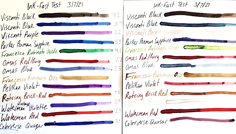
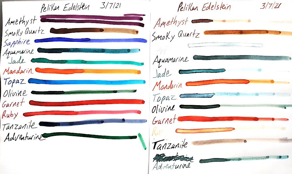
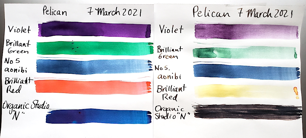
Happy New Year! Let’s start the year right with a fresh look at some lesser known inks.

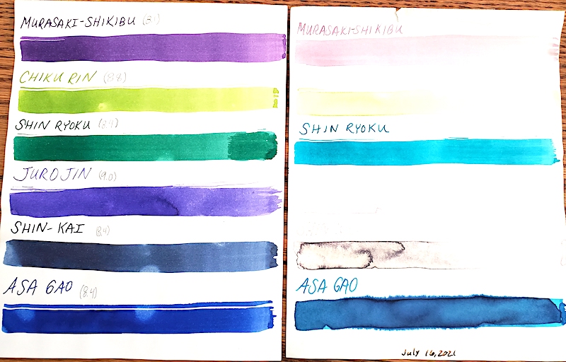
De Atramentis is the Latin word for ink. The company is based in Germany. It specializes in a series of specialty inks, including perfumed inks. We obtained 13 colors from a collection and decided to test them with 6 months of UV light. We also tested their pH level.

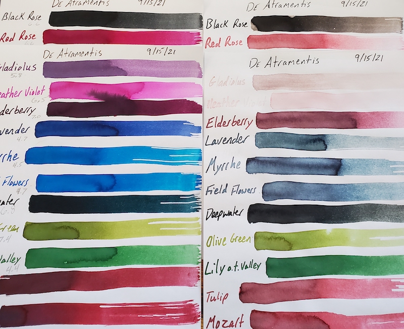
Here are the results of our UV light testing of De Atramentis inks. The left side is unexposed to UV light. The right side was in a sunny window for about 6 months.

The inks we tested were Black Rose, Red Rose, Gladiolus, Heather Violet, Elderberry, Lavender, Myrrhe, Field Flowers, Deepwater, Olive Green, Lily of the Valley, Tulip and Mozart.

Straight out of the bottle, I love the rich, vibrant, saturated colors of the inks. A blue-ink addict, I especially love the Myrrhe and Field Flowers. Lavender is lovely but it is a deep blue, not purple, as I would expect. Deepwater is a blue-black. Lily of the Valley stands out as a very pretty green, to me. Red Rose shades from reddish purple to a nice pinky-purple, fuchsia, maybe.

Click the photo for a close-up look at the DeAtramentis inks.

After spending most of autumn and winter in my sunniest window, the results surprised me. You can see the results in the photo, but there was a unique unevenness to how the colors handled the UV light. Most of them lost their special vibrant saturation. It always surprises me when black inks such as Black Rose fade a bit. Red rose took a hit but didn’t completely fade out the way Gladiolus and Heather Violet did. The deep, rich purple of Elderberry faded substantially but still held on. Lavendar, Myrrhe and Field Flowers faded heavily to what basically is the same color! Deepwater lost its blue to become more of a black. Yet Olive Green and Lily of the Valley didn’t lose much of their color or vibrancy at all! Tulip and Mozart seemed to have lost about half of their original color.

Vibrant and saturated colors often fare poorly on pH tests, as they are usually quite acidic or base/alkali. In our testing, the results were fairly pH neutral for these inks. As a brief reminder, pH neutral is 7 on the scale of 0 to 14. Pure distilled water is a 7. O is acidic and 14 is alkali or base. In theory, we want our inks as close to 7 as we can get them. BUT, it is important to note that we have no idea how the ingredients in these inks will interact with the rubber ink sacs, celluloid and elements of your converters. A 7 pH with ingredients that might cause some sort of chemical reaction with a rubber ink sac might be disastrous for a pen. Therefore, this is simply raw data that I hope you find interesting.

Black Rose………………….6.6
Red Rose…………………….6.6
Gladiolus…………………….5.8
Heather Violet…………….6.5
Elderberry…………………..7.0
Lavender…………………….4.7
Myrrhe……………………….4.5
Field Flowers………………4.7
Deepwater………………….6.8
Olive Green…………………7.4
Lily of the Valley…………4.4
Tulip………………………….6.0
Mozart……………………….5.4

Iroshizuku Ink Gets UV & pH Tested

No one should be surprised by the meteoric rise of Iroshizuku inks on the fountain pen scene. Japan’s finest ink makers have created dozens of colors and hues that offer vibrancy and shadowing while never clogging a vintage or modern fountain pen.

We picked up 24 bottles of this amazing ink and have submitted them to our rigorous UV and pH testing. Each of the following inks was placed in one my sunniest windows between July 16, 2021 and October 16, 2021. We calibrated our pH meter and tested these inks at 75.6ºF at 50% humidity. As a quick reminder, on a pH test, 0 is the extreme limit for acidic, 7 is neutral and 14 is the extreme end of alkali or base. Click the individual photos for a closer look.

In many of our tests, blue inks tend to be very susceptible to UV light. Not Iroshizuku! Unfortunately, many of its other colors fade badly. The images certainly explain more than I can. Nevertheless, I love the peachy salmon of a late summer sunset that is Fuyu Gaki ink, and like a sunset it fades almost entirely. The nearly emerald green of Shin Ryoku turns turquoise. The blue-black Fuyu Syogun turned a light-fog grey. And the black Take Sumi stayed dark but turned dark brown.

When it comes to pH, these are simply raw data points. We do not know specifically how they interact with the chemistry of the ink sacs and piston parts of your pen. Most of these Japanese inks are on the shallow end of the base depth chart.

Color                        pH
Murasaki-Shikibu  8.1
Chiku Rin                 8.8
Shin Ryoku              8.4
Juro Jin                    9.0
Shin-Kai                   8.4
Asa Gao                    8.4
Fuku Gaki                8.6
Yu Yake                    8.5
Kosa Mosu               9.1
Momiji                      8.9
Tsutsuji                    8.7
Yamabudo               9.1
Syo-Ro
Ku-Jaku                    8.5
Tsuki-Yo                   8.5
Ama-Iro                    8.8
Fuyu Syogun           8.5
Kiri-Same                9.0
Kon-Peki                  8.7
Tsuyu-Kusa             8.7
Aji-Sai                      9.2
Tsu Kushi                9.0
Ina-ho                      9.0
Take Sumi               8.3

A Potpourri of Ink Tests

As we have been conducting our ink tests, we ran into a grouping of mostly orphaned bottles that wouldn’t make for a very big story individually. So we tested them together and got them all on one page.

The ink proof sheet is on the left and the UV tested inks are on the right. Click the image above to get a better look at the ink tests.

This batch of inks was given a UV light fast test in our sunniest window from March 7, 2021, to June 7, 2021. We also tested the pH levels of the inks to see just how neutral they are. The following is all raw data that we thought you might find interesting. As we do not know the chemical composition of each ink or ink sac/converter it might go into, a pH neutral ink does not guarantee it won’t have a bad chemical reaction inside your pen. We have a professional pH tester, which we calibrated just before testing these inks. As a quick chemistry refresher, a pH of 7 is neutral like distilled water. The closer you get to 0, the more acidic the ink is. The closer you get to 14, the more alkali/base the ink is.

Surprises are the most enjoyable parts of these tests. Blues remain entirely unpredictable. One of my all-time favorite blues is Parker Penman Sapphire. Instead of fading out like most blues, it turned purple! Visconti blue fades out when thinly applied, but the thicker lines create a majestic blue-black that is even prettier than the original blue. Colorverse Quasar turned from a rich blue to a light red-purple. Omas blue did what most blues do and faded heavily. Acidity didn’t seem to effect which brands faded and didn’t. Omas was the most acidic blue at 2.3, and Colorverse was the most neutral at 7.9. Both underwent dramatic changes.

There were subtle changes in some of the inks. Visconti’s black turned a dark brown in the sunlight.

Purples fared poorly. Visconti Purple turned a pale pink. Vintage 1960s’ Waterman’s Violet almost completely disappeared. Pelikan Violet held on kinda, turning a deep reddish pink.

Waterman’s Red and Omas’ Red/Burgundy held up best. Neither seemed very effected by the sun. Also interesting was that Omas’ ink was also almost pH neutral at 7.2. We are often warned red can be the most dangerous color to put in a fountain pen. If it is pH neutral, I wonder what chemical reactions happen when it is inside a pen.

We had never previously heard of Francesco Rubinato inks before, but we loved the “Verde” green ink that was somewhere between “Shamrock Shake” and “Kelly Green.” Unfortunately, it turns into a bile-like yellow green with UV exposure.

An OLD bottle of Rotring Red was a very curious color. It was more of a brick red with a hint of orange. Was that because it was already discolored and UV exposed or was Rotring red really like that? Either way, UV didn’t effect the dry ink on the page.

The only color not yet mentioned is the Francesco Rubinato Oro (gold). This is a goupy, heavily sedimented ink filled with gold-glitter. We DO NOT recommend it for fountain pens. It is ONLY GOOD for DIP PENS. Anyhow, UV light didn’t effect it at all, and because we didn’t want to ruin our pH tester, we didn’t check its pH level, either.

Here is the table of our pH results:

Visconti Black…………………………..4.2
Visconti Blue……………………………3.9
Visconti Purple…………………………3.2
Parker Penman Sapphire…………..5.3
Francesco Rubinato Verde…………4.1
Omas Red/Burg………………………..7.2
Omas Blue……………………………….2.3
Rotring Brick Red…………………….8.5
Waterman (1960s) Violet………….3.9
Waterman Red………………………..5.9
Colorverse Quasar…………………….7.9

Pelikan Edelstein Inks Go Under the Sun

I feel that the harsh news must be tempered.

I LOVE Pelikan pens. It is my favorite modern pen brand. I LOVE Pelikan’s Edelstein inks. They are so vibrant and beautiful. I had extremely high hopes for testing them and having far better results than standard Pelikan inks. (I wrote a travel journal at 17 when visiting Germany and bought my first bottle of Pelikan Konigsblau Tinte—King’s Blue Ink, or Royal Blue by regular English naming conventions. I can barely read it, the ink is so faded after nearly 30 years.)

Look how vibrant and beautiful Pelikan Edelstein inks look when fresh on the page. Do you see what happens to them after 3 months in direct sunlight?

As fate would have it, I bought out an ink collection this past winter. There were more than 270 bottles of ink. Among the bottles were 12 different colors of Edelstein ink and 3 bottles of standard Pelikan inks, which I had not previously tested. Also included in this test are two non-Pelikan related inks.

Assisting me in this endeavor was my ever-more talented fiancé Dawn. You can immediately tell which test sheet is her’s by it being so much easier to see and read.

Pelikan inks were first started by German chemist Carl Hornemann in 1838, making Pelikan one of the oldest and most successful continuously operating ink companies in history. Yet, the company wasn’t really known as Pelikan until chemist Günther Wagner took over the company in 1871 and started using the Pelikan logo. The gemstone-inspired Edelstein inks were first launched with great success in 2011.

Our ink-fast test methodology remains simple. Put one sample in a sunny window for three months and one sample in a dark, cool place and check out the differences.

WOW!

Pelikan regular inks fare badly in three months of UV light. However, No. 5 Aonibi does very well.

None of the Pelikan inks withstood 3 months of UV light from the sun very well at all.  The beautiful Amethyst turned from purple to a faded brown. Blue-grey Tanzanite also turned colors to a faded brownish. My favorite Sapphire almost completely disappeared. So did Jade, Ruby and Topaz. When applied very thickly, Aquamarine, Olivine, Mandarin and Adventurine kinda held out. Only Garnet seemed to survive mostly intact.

Moving on to the standard Pelikan inks, Brilliant Red almost disappeared completely, turning a very faded yellow. Violet and Brilliant Green also lost about 70% to 80% of their color and visibility.

Our two non-Pelikan contestants were No. 5 Aonibi, which is a lovely blue-black when fresh and Organic Studio “N,” which is a stunningly beautiful sheening blue. Although I’ve never heard of No. 5 Aonibi, it held its own quite well in this test. Of the 17 inks sampled, it won the contest of looking the most like it did when it was first put to paper.

Organic Studio “N” could easily win the contest to be my new favorite blue ink, but it inexplicably turned black in the sun. That is way better than fading to near invisibility, but I really wish it held its true color when fresh on paper.