Tag Archives: fountain pen ink

Lamy Crystal Inks Undergo Light-Fast Testing

With four moves in 2 years and a ton of other life changes, we were slow to test the new Lamy Crystal fountain pen inks to see how they would handle ultraviolet light and aging on paper. Luckily, we were able to start our three-month test this July. We actually let the test run about 3 and a half months.

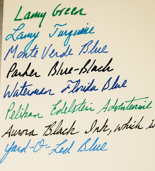
To run our test, we used two sheets of Rhodia paper. Each of the 10 inks was first written on to the margin with a wet-writing glass dip nib. Then a swatch was drawn with a Q-tip with the intention of having a thick patch of ink and a thinned out portion so we could see the effects of UV light. One of the sheets was saved in a cool, dark, dry place. The other sheet  was posted in the sunniest window of our office. The inks tested were called: Obsidian, Azurite, Ruby, Topaz, Amazonite, Beryl, Benitoite, Agate, Peridot and Rhodonite.

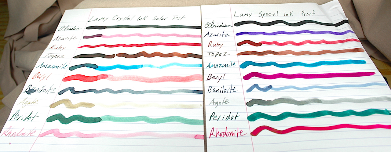
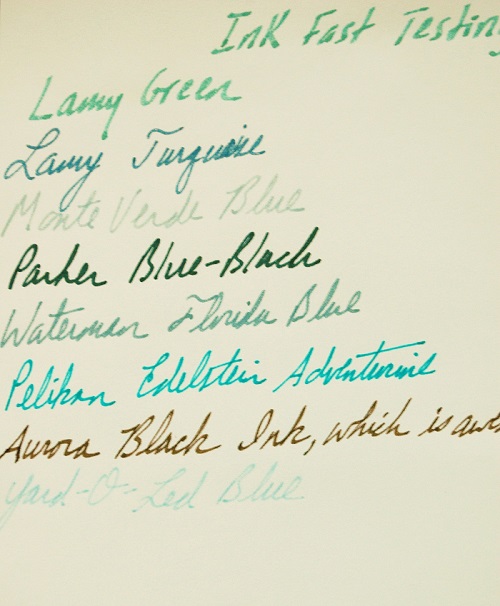
For nearly 3 and a half months, we tested the left sheet of paper with 10 Lamy Crystal inks in the direct sunlight to see how much they would or wouldn’t fade.

Here are the results. If you click the photo, you will see a larger version of the photo. It is surprising how much some of the inks change and others do not change.

To the relief of many, the Lamy Crystal Obsidian black ink holds fast. It only fades a little, unlike a suprising number of black inks. Yet, the purplish blue “Azurite” fades heavily to a reddish color that looks like if you dipped your finger in merlot and wiped it on a piece of paper.

Ruby and Topaz both held their red and sepia-brown colors very well during their time in the sun.

Peridot landed right in the middle. If the green was laid down thickly, it held. If it was thin, it faded.

Benitoite might also have a middle grade for its time in the sun. It was the only color that got darker! Benitoite is a blue-black. It lost most of its blue in the transition, but its black got stronger.

Amazonite is an odd color change. To me, it is one of the two most beautiful colors when laid down fresh. It is a very vibrant green-blue. And when set thickly on the page, it remains dark after time in the sun. Yet, the odd part is that the green gets lost in the sun and a faded blue remains. Normally, blue is the color we’ve seen disappear.

Beryl is my other favorite color when fresh. It is a lovely purply pink. Yet, after 3 months of sunlight, it completely changed to a very faded red. Even the thick/dark parts of the ink faded to a red, which itself is a faded color though remained darker.

The two colors that faded the most were Agate and Rhodonite. Rhodonite starts a beautiful reddish-pink and faded to a barely visible pink. The Agate was a light grey that actually turned light brown also fading to nearly invisible.

Hopefully, this information helps you with your ink obsession. Happy writing!

Meet the Ink Test Guru

Several years ago I met Donn D. at the Chicago Pen Show. We got to talking outside of the main room afterhours, and he was the one who introduced me to Ink-Fast Tests. He had a binder of very organized ink swatches that showed what an ink looked like when protected from the light, what it looked like after it had been left in the sun for 3 months and after it had been left in the sun for 6 months.

As I was on a quest for the perfect replacement blue for my beloved Waterman Florida Blue, I began making ink tests for this site. I figured you would be as curious as I am about how ink holds up to UV light.

Donn and I got together at this year’s Washington DC Pen Show and resumed our inky discussions. I asked if he would be so kind as to share some of his tests on the blog, and he said, “Yes.”

Included in this post are 4 pages of his tests of Pilot ink, Diamine ink, Noodler’s ink, Waterman ink, Parker ink and Pelikan ink…among others.

Donn described his methodology as such: “I exposed fountain pen ink samples to ultraviolet light from the sun for 3 months and 6 months.  The exposure method involved simply taping them to the inside of a patio door, which does not block UV very well.  I exposed all samples in the same manner, but not at the same time, and have no record of the number of cloudy vs. sunny days for each test.  The paper was standard office copy bond.

The inks in this test happen to be colors I like, rather than a general test of a manufacturer’s entire product line.

What surprised me most was how well green inks held up, and a chemist friend speculates a copper compound may be involved.

Note: Test sheet #1 shows 6-month results only.”

Thank you, Donn, for sharing so many of these ink tests. Everybody else, I hope these help you in your quest for the perfect inks.

Click on any of the images to see a larger, clearer representation of the inks tested. Please also note that these are not performance tests of the ink inside a fountain pen. Some of these inks are not as well suited to vintage pens as others. This is strictly to showcase how an ink will hold up to time and light. (For example, Noodler’s Ink often clogs the hell out of vintage pens. Beautiful inks but a pain to deal with unless you love spending hours cleaning pens.)

Pen Show Revolution in Chicago

There was something new in the air this year at the 2018 Chicago Pen Show, and I liked it: new blood, innovation, advancements on the writing experience.

This year’s Bootlegger’s Sacrament and last year’s Chicago Blue are great examples of city-themed ink from Papier Plume and KWZ, respectively.

Long-time readers of this blog know there has been a rift between the generations of pen collectors for some time. The past few years in Chicago have attempted to address those issues and bridge that divide. This year seemed to succeed in many ways.

Alcohol helps. Really tasty expensive alcohol helps even more. Building on the success of last year’s scotch and bourbon tasting, this year saw about three times as many pen collectors (and some curious car collectors from a nearby auction) trying out top tier scotches and bourbons. The bottles ran from $50 to $120 or more a piece, but all were welcome to try. Many dealers brought in a bottle, but it was Mario Campa and a friend of his who curated a considerable tasting collection. They even brought in mini GlenCairn Glass snifters for us to use and keep! (Thanks to everybody who shared a bottle!)

With liquor to keep everyone together, the lobby of the hotel was filled with vintage collectors and new pen users rubbing elbows and having a great time sharing stories and pen passions.

If you are a pen show circuit regular, you will have been pleased to see and chat with most of the regular vendors who specialize in vintage pens and preowned luxury pens. However, what impressed me about this show were all the new vendors who seemingly came out of the woodwork. A young man named Ralph Reyes came selling custom-made nibs, the likes of which none of us had ever seen before. His triple-decker music nibs were the hit of the show. Yes, three music nibs stacked one on top of the other! They were easily the smoothest, wettest things I’ve ever written with. He sold out long before I got to him, and nobody on the vintage or modern side of the show had ever heard of him before.

This is the handmade Musubi journal I purchased. The cover is woven and the Tomoe River pages are hand stitched in the binding! That’s also a Pelikan 620 Stockholm pen before it.

Also coming out of seemingly nowhere…although Singapore is hardly nowhere…was a man named Darrell representing a company called Musubi. Musubi makes hand-stitched journals with hand-woven covers. Foregoing the modern use of book-making technology, Musubi uses centuries old bookbinding traditions for what amount to custom-made journals using Tomoe River paper! I had to have one.

Renso, of Papier Plume fame, made two new inks exclusively for this year’s Chicago Pen Show. Those were “Da Blue” (think the deep blue-black of the Bear’s helmets) and “Bootlegger’s Sacrement.” To my great surprise, Renso told me I was the “inspiration” for Bootlegger’s Sacrament. In September, at the Dallas Pen Show, I told him what a kick I got out of 2017’s Chicago-themed inks “Ivy Green” and “Lake Michigan Blue.” I told him there were countless themes and colors for the city, and that I really hoped he’d try for a St. Valentine’s Day Massacre Red. Sure enough, he decided to give it a try. Although he didn’t quite get the blood red that he wanted in time for this year’s show, he did create this beautiful red-wine-colored ink, which became Bootlegger’s Sacrament.

These were just a tiny sampling of the new vendors or more traditional vendors bringing entirely new products to market. It was exciting to walk the show and find all of this great stuff.

Of course the regulars to the show had great hidden gems, too. One friend discovered a Sheaffer Snorkel with an exceedingly rare music nib that most of us snorkel fans would have killed for.

My absolute favorite event of the show was Lisa Vanness’ Cinco de Ink-o party on Saturday night! It was like speed dating for pen geeks. There were 7 or 8 tables set up with an expert at each. The partygoers sat at one table for about 15 minutes learning from the expert. When time ran out, they’d get up and move on to the next expert. Anna of the Well Appointed Desk taught the joy of developing ink color rings, Nick Pang taught the basics of copperplate history, Paul Erano introduced people to vintage pens, Ralph Reyes and the folks from Franklin Christoph each showed off their nibs, Darrell from Musubi taught how to identify and grade paper quality, a Philippino woman whose name escapes me had a beautiful class teaching how to make your journal a work of art instead of just a written record of your life and there were several others who I didn’t get to visit, as I was asked to replace one exhausted teacher with an impromptu class about vintage pen filling systems. The entire event was a great opportunity for all to slow down and get to know each other and learn new aspects of the hobby they never knew before. It was wonderful!

If this is the future of pen shows, I can’t wait for more.

A 3-Month Ink-Fast Test

A gentleman at this year’s Chicago Pen Show showed me his very elaborate ink-fast test to see which of his inks could best withstand direct sunlight for an extended period of time. He tested dozens, if not more than 100 inks, to see how they looked new, at 3 months, at 6 months and a year.

As he said most of the damage was done to the ink within the first three months, I decided to try a 3-month ink-fast test on my 8 favorite inks.

8 inks testing day 1

Here are the fresh fountain pen inks on Day 1 of the trial before being placed in my sunniest window.

Hopefully the photos show the results. However, to clarify any difficulties due to all of the variations of computer screens, I shall describe the results, as well.

Lamy Green went from a bright kelly green a faded, almost camouflage green-grey.

Lamy Turquoise turned to a blue-black.

Monte Verde’s new blue fountain pen ink faired second to worst, turning from a nice medium blue to a light shade of grey.

Parker Blue-Black fared best, maintaining a strong dark color more black than blue.

Waterman Florida Blue turned medium grey.

Pelikan Edelstein Adventurine, which is almost a forest green, but not quite, turned turquoise.

Aurora Black Ink turned a medium to darkish brown. This made me wonder if Aurora put a touch of iron in its ink.

Inks after 90 days of sun

After 90 days in direct sunlight, all 8 inks faded. However, it appears that Parker Blue-Black ink held fastest and Yard-O-Led Royal Blue faded the most.

Yard-O-Led Royal Blue, which is an especially brilliant blue when fresh, fared worst and turned to a barely legible sky blue.

Although I had no idea how Waterman Florida Blue would deteriorate over the years, it has been my go-to ink since I discovered it in the 1990s. Now that they no longer make it and changed the formula to Parker’s slightly inferior blue Quink, I am on a quest for a new blue to love. I thought Yard-O-Led would be it, but now I have my doubts. A German friend has turned me on to Diamine Kensington Blue. We’ll have to see how that holds up to the sun.

When I know, I’ll be sure to share.

Yard-O-Led Ink Review

It isn’t often we get to see Yard-O-Led inks on this side of the puddle. Luckily for all, ThePenMarket.com now carries these fine bottled inks.

Check out the new bottled ink we carry. Yard-O-Led inks come in four colors: Jet Black, Blue, Blue/Black and Claret. Look closely to see great shading in the Jet Black and Blue/Black. The Blue and Claret are radiant wonders that are treat with which to write.

Check out the new bottled ink we carry. Yard-O-Led inks come in four colors: Jet Black, Blue, Blue/Black and Claret. Look closely to see great shading in the Jet Black and Blue/Black. The Blue and Claret are radiant wonders that are treat with which to write.

What struck me first about these inks were the radiance of the Blue (Royal Blue) and Claret (Fuchsia) inks. The blue is a washable ink and very bright. As I have only had it for a short time, I’m not sure how much it will fade over time, as many washable blues do. Nevertheless, I am enjoying its fresh blueness.

The Claret ink seems to be lively combination of hot pink, purple and red. While I expected it to be more of a rich, red wine color, I think it be very popular among the teenage girls who want to explore fountain pens with a more feminine color ink.

Traditional ink lovers will get a charge out of the beautiful shading delivered by the Jet Black and Blue/Black inks by Yard-O-Led. The Jet Black is more of a charcoal grey, and the wider the nib you use, the more distinctive the shadows become. The same can be said for the Blue/Black ink. Fine-point nibs lose the shading and concentrate the colors more.

Fountain Pen Ink 101

This is just an "inkling" of ThePenMarket.com's private collection of vintage and modern fountain pen ink. It includes Sanford ink, Sheaffer towers of ink, Carter's ink and Parker V-mail ink from WWII!

This is just an “inkling” of ThePenMarket.com’s private collection of vintage and modern fountain pen ink. It includes Sanford ink, Sheaffer towers of ink, Carter’s ink and Parker V-mail ink from WWII!

Many people ask me about ink and what they should use in their pens, and it is a great question.

The best rule of thumb is to never, ever use India ink. It has sediments that will clog your pen faster than a diet of Big Macs will clog your arteries. While these pens can be unclogged, it is often a time consuming mess that could potentially damage the pen.

Most of the major name brands make very reliable fountain pen inks that are specially designed to help clean your pen as you write. They might slowly clog your pen over time, especially if you routinely let the ink dry inside your pen. However, they are easier to unclog with a simple flush.

Brands such as Parker, Waterman, Sheaffer, Mont Blanc, Cross, Pelikan, Lamy, Aurora and other major pen makers are always safe bets.

Many modern pen lovers swear by a brand named Private Reserve. These specialty inks offer a zillion different colors that are truely vibrant and beautiful. My trouble with them is that they have always clogged my pens within one or two fills. Personally, I don’t feel they are worth the trouble. Other collectors I talk with insist they never have the trouble with clogging, but I am far from being alone with that issue.

Ink color should also play a role in your decision. Black, blue and blue-black are always safe choices. Red inks have a notorious past for more quickly rotting ink sacs. Even modern red ink shouldn’t be left to set in pens for very long. It is safe to use, but flush your pen when you are done with the ink. Other colors such as greens and purples have a checkered history of ruining ink sacs and pen seals if left in the pen for too long.

One of the many great myths about Mont Blanc pens is that they can only use Mont Blanc inks. The company line is that their inks are specially formulated to preserve and protect their fountain pens. That might very well be true, but most of the other major brand inks are just as safe. Mont Blanc just wants to cash in on their overpriced ink.

Can vintage pens use modern inks? Absolutely. That is virtually all I’ve ever used on my vintage pens.

Can you still use vintage inks on your modern and vintage pens? Certainly! Despite the fact it is a liquid, there are still huge reserves of fresh bottled ink from the 1920s up to present day. Most of the inks in the photo above are from the 1950s and ’60s, and they are still very nice. The #1 vintage ink you want to avoid is “Parker 51 Ink” or “Super Chrome” ink by Parker. It was designed for use in the Parker 51 pens that used latex/silicone ink sacs. The chemicals in the ink very quickly rot traditional rubber ink sacs, diaphragms and piston seals.

Vintage inks can go bad every now and again. When buying vintage ink, check it for “oil slicks,” stuff growing on or in the ink and color separation. Sometimes the old ink loses its pigmentations. Don’t use it if it has any of these issues.

One of my favorite hoaxes in history used vintage inks from the 1880s! In the 1990s, the supposed diary of Jack the Ripper was discovered in London. The diary was to have belonged to one James Maybrick who was never on the radar of “ripperologists.” The initial results on the paper and ink proved they were genuinely from the 1880s. Later tests realized that the diary had been written in the 1950s and cleverly tucked inside a wall of some old building or house, not to be discovered for another 40 years when new owners discovered it during a remodel. I think that makes the hoax all the better, as whoever perpetrated it was likely dead by the time it hit the book stands. That type of patience for a laugh deserves respect.