Tag Archives: ink

Examining Noodler’s Ink Part 1

The one ink brand everyone is always talking about is Noodler’s Inks. People either love it or hate it. There doesn’t seem to be a lot of middle ground. As such, we want to add our two cents to this conversation, and we surprised ourselves with our tests and findings.

Controversy seems to follow in Noodler’s wake, and, yet, it doesn’t seem to disrupt people’s passion for the ink. From the stains-everything-it-comes-into-contact-with Baystate Blue to clever (and occasionally offensive to some) ink names and label designs, Noodler’s is always a top-selling ink.

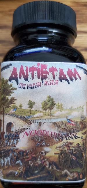
I first got hooked on their ink with “Antietam” ink. As an armchair Civil War historian, I knew Antietam was this single bloodiest day of fighting in all of America’s wars. There were nearly 23,000 casualties at that battle. I got a macabre kick out of the Antietam ink looking like fresh blood when wet and dried blood when dry. It remains my red ink of choice. The ink has never clogged my pens or created any problems.

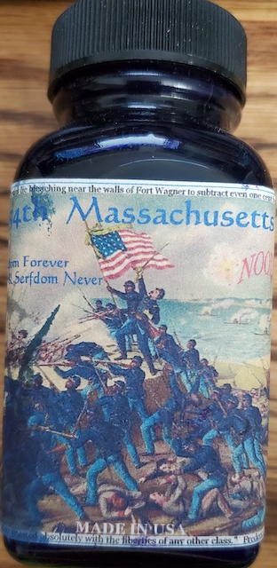
However, my favorite of their ink names is “54th Massachusetts.” As a regiment, it is the most famous African-American regiment of the Civil War. If you’ve seen the movie “Glory,” with Morgan Freeman, Denzel Washington and Matthew Broderick, it is that regiment. The American uniforms in the Civil War were blue. The men of this regiment were black. The ink color is blue-black. A clever ink pun. Unfortunately, as beautiful as the ink is, it clogs the hell out of my pens.

As a matter of fact, virtually every other Noodler’s Ink I have ever written with clogs my pens. As such, the only ink I use is Antietam, and I don’t recommend any other Noodler’s to anyone, unless they are only writing or drawing with dip pens.

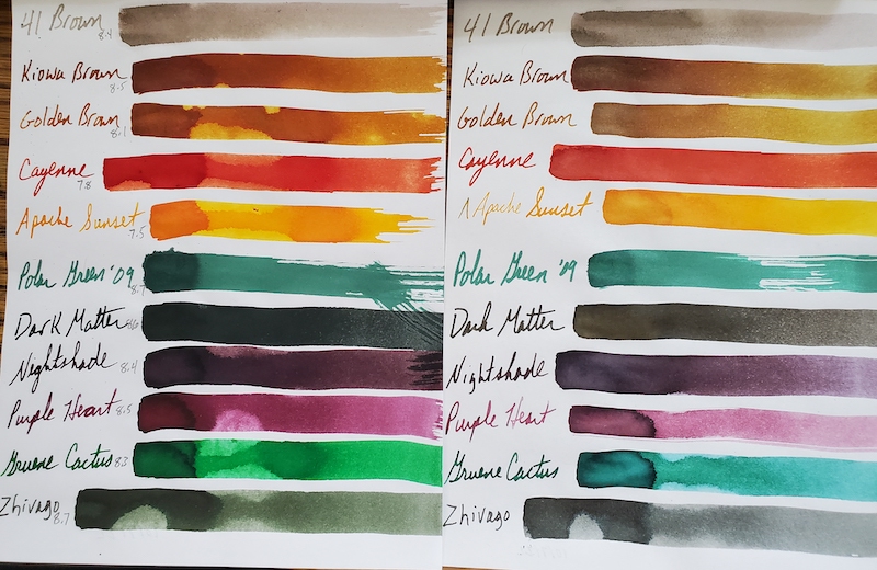
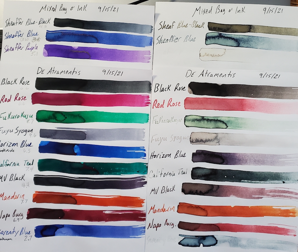
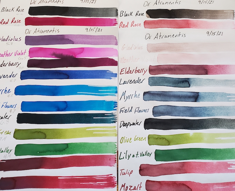
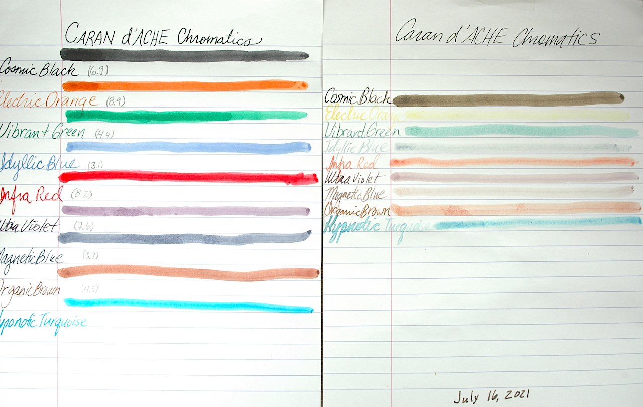
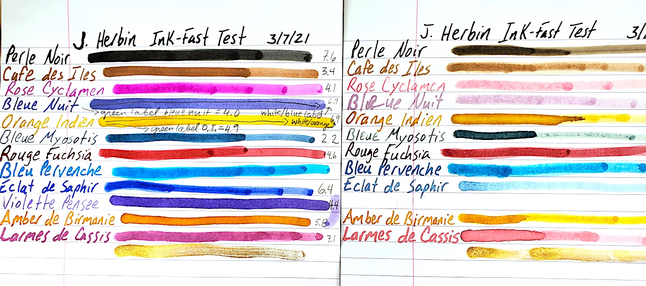
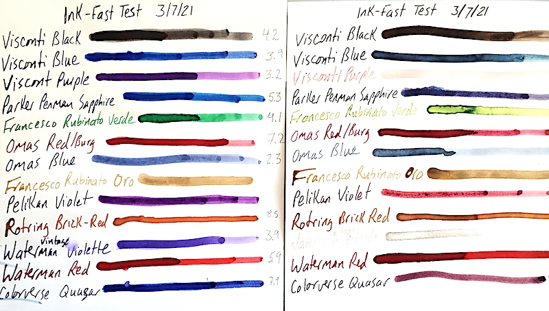
Here are 11 swatches of Noodler’s Ink. The samples on the left were the control samples. The inks on the right were in the sun for 9 months.

Nevertheless, when I bought a large collection of ink several years ago, it came with a large selection of Noodler’s. As such, Dawn and I thought we’d put it to the test. Today’s selection remained in my sunniest window for 9 months. We also pH tested the ink to see how potentially corrosive it might be. As a quick refresher the scale between acid and base runs from 0 through 14, with 7 being neutral, such as pure distilled water. As always, we calibrated our testing equipment before testing the inks.

We were absolutely stunned by how light-fast these colors were. At worst, they lost a little of their luster and vibrancy after 9 months of sunlight. Most didn’t lose anything! Very impressive.

Noodler’s Ink also claims its is pH Neutral. We did not find that to be the case in these 11 inks sampled. However, they were much better regarding pH neutrality than many other brands. The important thing to keep in mind is that just because an ink is pH neutral doesn’t mean it doesn’t have ingredients that will still corrode your rubber ink sacs, diaphragms and seals. We did not test these inks in rubber ink sacs. The pH results below are simply raw data points.

Noodler’s Ink Name     pH

41 Brown                     8.4
Kiowa Brown              8.5
Golden Brown            8.1
Cayenne                      7.8
Apache Sunset           7.5
Polar Green ’09          8.7
Dark Matter                8.6
Nightshade                 8.4
Purple Heart               8.5
Gruene Cactus           8.3
Zhivago                        8.7

In conclusion, these 11 Noodler’s Ink were amazing for their color-fast testing. The pH is a little on the base or alkali side but no where near as far off the mark as many other ink brands.

Loose Ends Ink Test

While wrapping up our ink tests in 2021, we had a bunch of loose bottles of ink that we tested on the same pieces of Rhodia paper to save paper and space. I left these test samples in the window for six months, and Dawn and I calibrated and tested the pH on these samples at 75.6-degrees Fahrenheit and 50% humidity.

Check out how UV light effected our hodge-podge selection of ink by Sheaffer, DeAtramentis, Iroshizuku, Monteverde and Waterman

As always, we found the results interesting. However, these results are simply raw data. How the chemistry of the inks reacts to the chemistry of a pen’s ink sac or converter is not necessarily dictated by the pH level of the ink. For example: You’ll see below that Waterman Serenity Blue is very acidic with a pH at 2.7, but we’ve used it in vintage pens for years without it doing anything other than standard wear on ink sacs over 5 to 10 or more years. Many dealers other than myself find Waterman inks to be a gold standard of safety for use in vintage pens.

You can see in the photo that most of the ink fared poorly in the light-fast UV test. The Sheaffer inks were the Czech Republic-made variety in blue-black, blue and purple. Their colors are quite pretty when freshly dried. UV light makes the blue-black a faded black and grey. Blue fades badly to a blue-black, and the purple almost complete disappears!

De Atramentis Black Rose holds up reasonably well, though it fades a little. Red Rose fades by about 50%.

We had 2 leftover Iroshizuku inks. The green Fukurokuju is a lovely Irish mint of a color, but it fades really badly in UV light. I’m also a fan of the medium-grey Fuyu Syogun, which has hints of purple and blue. Unfortunately, it fades to almost invisible.

Up next were our first looks at bottled Monteverde ink. Blue Horizon and California Teal are both gorgeous. If you lay it down too wet, it has some nice sheening. Yet, the blue faded to purple and the teal turned grey! Monteverde Black faded heavily to a reddish-grey. Amazingly, Mandarin orange held its color really well. Napa Burgundy faded a bit but generally held its color better than most of the other Monteverde inks.

Last but not least was Waterman’s Serenity Blue. Just about every expert I know insists it is the same formula as Waterman’s Florida Blue, but I swear I see a change. Unfortunately, it behaves much like the old Florida Blue by fading pretty drastically in the sun.

Please look below for the pH readings on all of our inks tested. As a quick refresher, 0 to 6.9 is on the acid side of the scale, with 0 being the extremely corrosive end of the scale. 7 is pH neutral, like pure water. 7.1 to 14 is alkali or base, with 14 being the extremely corrosive side of that half of the scale. Again, our pH results don’t guarantee that the ink is corrosive in your pen, as the chemistry of the ink might mix differently with the chemistry of your ink sac or converters.

SHEAFFER:
Blue-Black                    4.5
Blue                                3.6
Purple                            5.1

IROSHIZUKU
Fukurokuju                   8.7
Fuyu Syogun                 9.6

MONTEVERDE
Horizon Blue                6.5
California Teal              7.4
Black                               4.4
Mandarin                       7.7
Napa Burgundy            6.9

WATERMAN
Serenity Blue                 2.7

De Atramentis Starts Rich and Fades

Happy New Year! Let’s start the year right with a fresh look at some lesser known inks.

De Atramentis is the Latin word for ink. The company is based in Germany. It specializes in a series of specialty inks, including perfumed inks. We obtained 13 colors from a collection and decided to test them with 6 months of UV light. We also tested their pH level.

Here are the results of our UV light testing of De Atramentis inks. The left side is unexposed to UV light. The right side was in a sunny window for about 6 months.

The inks we tested were Black Rose, Red Rose, Gladiolus, Heather Violet, Elderberry, Lavender, Myrrhe, Field Flowers, Deepwater, Olive Green, Lily of the Valley, Tulip and Mozart.

Straight out of the bottle, I love the rich, vibrant, saturated colors of the inks. A blue-ink addict, I especially love the Myrrhe and Field Flowers. Lavender is lovely but it is a deep blue, not purple, as I would expect. Deepwater is a blue-black. Lily of the Valley stands out as a very pretty green, to me. Red Rose shades from reddish purple to a nice pinky-purple, fuchsia, maybe.

Click the photo for a close-up look at the DeAtramentis inks.

After spending most of autumn and winter in my sunniest window, the results surprised me. You can see the results in the photo, but there was a unique unevenness to how the colors handled the UV light. Most of them lost their special vibrant saturation. It always surprises me when black inks such as Black Rose fade a bit. Red rose took a hit but didn’t completely fade out the way Gladiolus and Heather Violet did. The deep, rich purple of Elderberry faded substantially but still held on. Lavendar, Myrrhe and Field Flowers faded heavily to what basically is the same color! Deepwater lost its blue to become more of a black. Yet Olive Green and Lily of the Valley didn’t lose much of their color or vibrancy at all! Tulip and Mozart seemed to have lost about half of their original color.

Vibrant and saturated colors often fare poorly on pH tests, as they are usually quite acidic or base/alkali. In our testing, the results were fairly pH neutral for these inks. As a brief reminder, pH neutral is 7 on the scale of 0 to 14. Pure distilled water is a 7. O is acidic and 14 is alkali or base. In theory, we want our inks as close to 7 as we can get them. BUT, it is important to note that we have no idea how the ingredients in these inks will interact with the rubber ink sacs, celluloid and elements of your converters. A 7 pH with ingredients that might cause some sort of chemical reaction with a rubber ink sac might be disastrous for a pen. Therefore, this is simply raw data that I hope you find interesting.

Black Rose………………….6.6
Red Rose…………………….6.6
Gladiolus…………………….5.8
Heather Violet…………….6.5
Elderberry…………………..7.0
Lavender…………………….4.7
Myrrhe……………………….4.5
Field Flowers………………4.7
Deepwater………………….6.8
Olive Green…………………7.4
Lily of the Valley…………4.4
Tulip………………………….6.0
Mozart……………………….5.4

Caran D’Ache Chromatics Face the UV-pH Challenge

Swiss pen maker Caran D’Ache is most famous for its precision engineering on its line of ballpoint pens. They make nice fountain pens, too, but it is the company’s ballpoints that the world knows best. Yet, as so many pen makers now do, it also decided to enter the lucrative fountain pen ink market.

Here is a side-by-side comparison of Caran D’Ache Chromatic inks before and after undergoing 3 months of UV sunlight testing.

Caran D’Ache Chromatic Inks are a daring entry, indeed. From their hexagonal bottles that tip to fill to the last drop to their bright and cheery colors, Chromatics made an instant splash on the scene.

Naturally, we wanted to know how well these inks hold up to UV light from the sun and where they register on the scale of a pH test. We placed this sample in our sunniest window for 3 months. We also used our pH meter, which was calibrated to the heat and temperature of our testing station before testing the inks.

The results of our test were surprising. I falsely suspected that there might be some heavier pigmentation in the “Chromatic” inks that would make them shine and dazzle a bit on the page. However, virtually all of the ink colors lost seemingly 85 to 90% of their color, fading heavily from view. “Electric Orange” all but disappeared. Even a stalwart color such as “Cosmic Black” faded to a medium brown, and it had the most staying power.

The pH test results ranged all over the map. As a quick refresher on chemistry, a pH number of 7 is pH neutral like pure water. The closer to 0 something becomes the more acidic it is. The closer to 14 it goes, the more alkali or base something is. In theory, you want an ink that is pH neutral, BUT we have no idea how the chemicals in each ink will react to the chemicals of the ink sacs, converters, inkfeeds and the like. We have found some “neutral” inks to eat through ink sacs rapidly, while some seemingly alkali or acidic inks don’t bother a pen’s parts at all. The following is simply raw data for you to do with as you please.

COLOR:                              pH Score:
Cosmic Black                      6.9
Electric Orange                  8.9
Vibrant Green                     4.4
Idyllic Blue                          3.1
Infra Red                             8.2
Ultra Violet                         7.6
Magnetic Blue                    3.7
Organic Brown                   4.5
Hypnotic Turquoise         N/A

A few of the things that stand out to us are that Cosmic Black is almost perfectly neutral. Aligning with more of our past experiments, the blues were fairly acidic. Yet, playing against stereotype, the red and purple were closer to neutral. Green remains quite acidic, which is expected, but the brown also was acidic, which wasn’t expected.

As always, I hope you found this snippet of ink data helpful to your quest for the perfect ink for you.

J. Herbin Ink Goes Under the Sun

French inks haven’t previously undergone our rigorous testing, and we were excited to give them a UV light-fast test and pH test. We purchased a small collection of a dozen different colors of J. Herbin.

We started this test on March 7, 2021, by placing a sample of 13 inks in our sunniest window.

We test these J. Herbin inks to see how well they can withstand UV light and to see where they rank on the ol’ pH meter.

Believe it or not, this was our first time writing with J. Herbin ink. What really struck us was the vibrancy of the dry ink on the page. Of the colors I liked best, Rose Cyclamen really pops with a purple-pink splendor. Dawn’s favorite color is the electric turquoise blue of Bleu Pervenche. Eclat de Saphir is a solid daily blue. And my new permanent addition to my daily writing is the Amber de Birmanie. It is an incredible orangy brown.

Unfortunately, 3 months of direct sunlight does not treat these inks well. All of the colors except the gold metallic ink bleach substantially in UV light. You can see the damage in the photo. Some of the really drastic changes include Rose Cyclamen turning bright, light bubble-gum pink; the blue-black Bleu Nuit turns a pale, faded purple and Violette Pensee disappears almost completely! Larmes de Cassis turns from purple to pink.

The following show the pH results for each ink. We actually had three different bottles of the Bleue Nuit, Orange Indien and Bleu Pervenche. The labels on the outside of the bottle were different, so we list these two inks by their label results, too. As a quick refresher in chemistry, a pH number of 0 is as acidic as a chemical can be. 7 is neutral, like pure water. And 14 is the maximum extreme of alkali/base.

Perle Noir                          7.6
Cafe des Iles                     3.4
Rose Cyclamen                4.1
Bleue Nuit                         4.0 (Green Label)
Bleue Nuit                         6.9 (White & Blue Label)
Orange Indien                  4.9 (Green Label)
Orange Indien                  6.9 (White & Blue Label)
Bleue Myosotis                 2.2
Rouge Fuchsia                 4.6
Bleu Pervenche                7.0 (White & Blue Label)
Bleu Pervenche                6.2 (Green Label)
Eclat de Saphir                 6.4
Violette Pensee                 4.4
Amber de Birmanie         5.8
Larmes de Cassis              7.1

A Potpourri of Ink Tests

As we have been conducting our ink tests, we ran into a grouping of mostly orphaned bottles that wouldn’t make for a very big story individually. So we tested them together and got them all on one page.

The ink proof sheet is on the left and the UV tested inks are on the right. Click the image above to get a better look at the ink tests.

This batch of inks was given a UV light fast test in our sunniest window from March 7, 2021, to June 7, 2021. We also tested the pH levels of the inks to see just how neutral they are. The following is all raw data that we thought you might find interesting. As we do not know the chemical composition of each ink or ink sac/converter it might go into, a pH neutral ink does not guarantee it won’t have a bad chemical reaction inside your pen. We have a professional pH tester, which we calibrated just before testing these inks. As a quick chemistry refresher, a pH of 7 is neutral like distilled water. The closer you get to 0, the more acidic the ink is. The closer you get to 14, the more alkali/base the ink is.

Surprises are the most enjoyable parts of these tests. Blues remain entirely unpredictable. One of my all-time favorite blues is Parker Penman Sapphire. Instead of fading out like most blues, it turned purple! Visconti blue fades out when thinly applied, but the thicker lines create a majestic blue-black that is even prettier than the original blue. Colorverse Quasar turned from a rich blue to a light red-purple. Omas blue did what most blues do and faded heavily. Acidity didn’t seem to effect which brands faded and didn’t. Omas was the most acidic blue at 2.3, and Colorverse was the most neutral at 7.9. Both underwent dramatic changes.

There were subtle changes in some of the inks. Visconti’s black turned a dark brown in the sunlight.

Purples fared poorly. Visconti Purple turned a pale pink. Vintage 1960s’ Waterman’s Violet almost completely disappeared. Pelikan Violet held on kinda, turning a deep reddish pink.

Waterman’s Red and Omas’ Red/Burgundy held up best. Neither seemed very effected by the sun. Also interesting was that Omas’ ink was also almost pH neutral at 7.2. We are often warned red can be the most dangerous color to put in a fountain pen. If it is pH neutral, I wonder what chemical reactions happen when it is inside a pen.

We had never previously heard of Francesco Rubinato inks before, but we loved the “Verde” green ink that was somewhere between “Shamrock Shake” and “Kelly Green.” Unfortunately, it turns into a bile-like yellow green with UV exposure.

An OLD bottle of Rotring Red was a very curious color. It was more of a brick red with a hint of orange. Was that because it was already discolored and UV exposed or was Rotring red really like that? Either way, UV didn’t effect the dry ink on the page.

The only color not yet mentioned is the Francesco Rubinato Oro (gold). This is a goupy, heavily sedimented ink filled with gold-glitter. We DO NOT recommend it for fountain pens. It is ONLY GOOD for DIP PENS. Anyhow, UV light didn’t effect it at all, and because we didn’t want to ruin our pH tester, we didn’t check its pH level, either.

Here is the table of our pH results:

Visconti Black…………………………..4.2
Visconti Blue……………………………3.9
Visconti Purple…………………………3.2
Parker Penman Sapphire…………..5.3
Francesco Rubinato Verde…………4.1
Omas Red/Burg………………………..7.2
Omas Blue……………………………….2.3
Rotring Brick Red…………………….8.5
Waterman (1960s) Violet………….3.9
Waterman Red………………………..5.9
Colorverse Quasar…………………….7.9

Pelikan Edelstein Inks Go Under the Sun

I feel that the harsh news must be tempered.

I LOVE Pelikan pens. It is my favorite modern pen brand. I LOVE Pelikan’s Edelstein inks. They are so vibrant and beautiful. I had extremely high hopes for testing them and having far better results than standard Pelikan inks. (I wrote a travel journal at 17 when visiting Germany and bought my first bottle of Pelikan Konigsblau Tinte—King’s Blue Ink, or Royal Blue by regular English naming conventions. I can barely read it, the ink is so faded after nearly 30 years.)

Look how vibrant and beautiful Pelikan Edelstein inks look when fresh on the page. Do you see what happens to them after 3 months in direct sunlight?

As fate would have it, I bought out an ink collection this past winter. There were more than 270 bottles of ink. Among the bottles were 12 different colors of Edelstein ink and 3 bottles of standard Pelikan inks, which I had not previously tested. Also included in this test are two non-Pelikan related inks.

Assisting me in this endeavor was my ever-more talented fiancé Dawn. You can immediately tell which test sheet is her’s by it being so much easier to see and read.

Pelikan inks were first started by German chemist Carl Hornemann in 1838, making Pelikan one of the oldest and most successful continuously operating ink companies in history. Yet, the company wasn’t really known as Pelikan until chemist Günther Wagner took over the company in 1871 and started using the Pelikan logo. The gemstone-inspired Edelstein inks were first launched with great success in 2011.

Our ink-fast test methodology remains simple. Put one sample in a sunny window for three months and one sample in a dark, cool place and check out the differences.

WOW!

Pelikan regular inks fare badly in three months of UV light. However, No. 5 Aonibi does very well.

None of the Pelikan inks withstood 3 months of UV light from the sun very well at all.  The beautiful Amethyst turned from purple to a faded brown. Blue-grey Tanzanite also turned colors to a faded brownish. My favorite Sapphire almost completely disappeared. So did Jade, Ruby and Topaz. When applied very thickly, Aquamarine, Olivine, Mandarin and Adventurine kinda held out. Only Garnet seemed to survive mostly intact.

Moving on to the standard Pelikan inks, Brilliant Red almost disappeared completely, turning a very faded yellow. Violet and Brilliant Green also lost about 70% to 80% of their color and visibility.

Our two non-Pelikan contestants were No. 5 Aonibi, which is a lovely blue-black when fresh and Organic Studio “N,” which is a stunningly beautiful sheening blue. Although I’ve never heard of No. 5 Aonibi, it held its own quite well in this test. Of the 17 inks sampled, it won the contest of looking the most like it did when it was first put to paper.

Organic Studio “N” could easily win the contest to be my new favorite blue ink, but it inexplicably turned black in the sun. That is way better than fading to near invisibility, but I really wish it held its true color when fresh on paper.

Bic Cristal Inks Get Testing

We tested these 8 Bic Cristal pens to see how ballpoint ink holds up to 6 months of sunlight. Blue, Pink, Green, Black, Grass-Stain Green, Purple, Turquoise and Red.

During my last visit with Ink-Fast Donn at the D.C. Pen Show in 2019, he said he was starting to test ballpoint inks to see how well they hold up to UV light.

Last summer, I discovered a collection of the famous and commonly used Bic Cristal ballpoints in my fencing gear. I taught a wonderful group of teens and tweens advanced competition maneuvers and strategy, and to help them remember their lessons and opponents, I insisted they keep “Diaries of Doom” and “Tomes of Terror.” To help personalize it more, I handed out colorful notebooks and pens.

Armed with 8 colors (blue, pink, green, grass-stain green, black, turquoise, purple and red), I created a sample on Rhodia paper and taped it to a sunny window of my home at the end of August. I took it down at the end of February and was surprised by the results.

This photo doesn’t really do full justice to the sample set and proof set. The blue doesn’t look as blue as it does in real life.

Surprise #1 to me was that the black ink faded. With fountain pen inks, you can generally count on black to be the most stable and fade-proof. While it didn’t fade away entirely, it had issues.

Side by side comparisons showcase the effect of 6 months of sunlight on Bic Cristal inks.

Surprise #2: Blue! Blue fountain pen inks fade something fierce under the withering sun. Bic Cristal blue got stronger! It lost some of its blueness and turned blacker, but it held on defiantly under the sun’s gaze.

Surprise #3: Grass-Stain Green didn’t fade as much as I thought it would. It faded a little.

Red and purple faded the most. Green, turquoise and pink faded a little, but survived okay.

Reflecting on this experiment, for some reason, I always assumed oil-based ballpoint inks would be far more permanent than water-based fountain pen inks. Yet, their chemical compositions all have their frailties. Some ballpoint colors react differently than fountain pen inks, but that shouldn’t surprise me as much as it did.

Lamy Crystal Inks Undergo Light-Fast Testing

With four moves in 2 years and a ton of other life changes, we were slow to test the new Lamy Crystal fountain pen inks to see how they would handle ultraviolet light and aging on paper. Luckily, we were able to start our three-month test this July. We actually let the test run about 3 and a half months.

To run our test, we used two sheets of Rhodia paper. Each of the 10 inks was first written on to the margin with a wet-writing glass dip nib. Then a swatch was drawn with a Q-tip with the intention of having a thick patch of ink and a thinned out portion so we could see the effects of UV light. One of the sheets was saved in a cool, dark, dry place. The other sheet  was posted in the sunniest window of our office. The inks tested were called: Obsidian, Azurite, Ruby, Topaz, Amazonite, Beryl, Benitoite, Agate, Peridot and Rhodonite.

For nearly 3 and a half months, we tested the left sheet of paper with 10 Lamy Crystal inks in the direct sunlight to see how much they would or wouldn’t fade.

Here are the results. If you click the photo, you will see a larger version of the photo. It is surprising how much some of the inks change and others do not change.

To the relief of many, the Lamy Crystal Obsidian black ink holds fast. It only fades a little, unlike a suprising number of black inks. Yet, the purplish blue “Azurite” fades heavily to a reddish color that looks like if you dipped your finger in merlot and wiped it on a piece of paper.

Ruby and Topaz both held their red and sepia-brown colors very well during their time in the sun.

Peridot landed right in the middle. If the green was laid down thickly, it held. If it was thin, it faded.

Benitoite might also have a middle grade for its time in the sun. It was the only color that got darker! Benitoite is a blue-black. It lost most of its blue in the transition, but its black got stronger.

Amazonite is an odd color change. To me, it is one of the two most beautiful colors when laid down fresh. It is a very vibrant green-blue. And when set thickly on the page, it remains dark after time in the sun. Yet, the odd part is that the green gets lost in the sun and a faded blue remains. Normally, blue is the color we’ve seen disappear.

Beryl is my other favorite color when fresh. It is a lovely purply pink. Yet, after 3 months of sunlight, it completely changed to a very faded red. Even the thick/dark parts of the ink faded to a red, which itself is a faded color though remained darker.

The two colors that faded the most were Agate and Rhodonite. Rhodonite starts a beautiful reddish-pink and faded to a barely visible pink. The Agate was a light grey that actually turned light brown also fading to nearly invisible.

Hopefully, this information helps you with your ink obsession. Happy writing!

Pen Show Revolution in Chicago

There was something new in the air this year at the 2018 Chicago Pen Show, and I liked it: new blood, innovation, advancements on the writing experience.

This year’s Bootlegger’s Sacrament and last year’s Chicago Blue are great examples of city-themed ink from Papier Plume and KWZ, respectively.

Long-time readers of this blog know there has been a rift between the generations of pen collectors for some time. The past few years in Chicago have attempted to address those issues and bridge that divide. This year seemed to succeed in many ways.

Alcohol helps. Really tasty expensive alcohol helps even more. Building on the success of last year’s scotch and bourbon tasting, this year saw about three times as many pen collectors (and some curious car collectors from a nearby auction) trying out top tier scotches and bourbons. The bottles ran from $50 to $120 or more a piece, but all were welcome to try. Many dealers brought in a bottle, but it was Mario Campa and a friend of his who curated a considerable tasting collection. They even brought in mini GlenCairn Glass snifters for us to use and keep! (Thanks to everybody who shared a bottle!)

With liquor to keep everyone together, the lobby of the hotel was filled with vintage collectors and new pen users rubbing elbows and having a great time sharing stories and pen passions.

If you are a pen show circuit regular, you will have been pleased to see and chat with most of the regular vendors who specialize in vintage pens and preowned luxury pens. However, what impressed me about this show were all the new vendors who seemingly came out of the woodwork. A young man named Ralph Reyes came selling custom-made nibs, the likes of which none of us had ever seen before. His triple-decker music nibs were the hit of the show. Yes, three music nibs stacked one on top of the other! They were easily the smoothest, wettest things I’ve ever written with. He sold out long before I got to him, and nobody on the vintage or modern side of the show had ever heard of him before.

This is the handmade Musubi journal I purchased. The cover is woven and the Tomoe River pages are hand stitched in the binding! That’s also a Pelikan 620 Stockholm pen before it.

Also coming out of seemingly nowhere…although Singapore is hardly nowhere…was a man named Darrell representing a company called Musubi. Musubi makes hand-stitched journals with hand-woven covers. Foregoing the modern use of book-making technology, Musubi uses centuries old bookbinding traditions for what amount to custom-made journals using Tomoe River paper! I had to have one.

Renso, of Papier Plume fame, made two new inks exclusively for this year’s Chicago Pen Show. Those were “Da Blue” (think the deep blue-black of the Bear’s helmets) and “Bootlegger’s Sacrement.” To my great surprise, Renso told me I was the “inspiration” for Bootlegger’s Sacrament. In September, at the Dallas Pen Show, I told him what a kick I got out of 2017’s Chicago-themed inks “Ivy Green” and “Lake Michigan Blue.” I told him there were countless themes and colors for the city, and that I really hoped he’d try for a St. Valentine’s Day Massacre Red. Sure enough, he decided to give it a try. Although he didn’t quite get the blood red that he wanted in time for this year’s show, he did create this beautiful red-wine-colored ink, which became Bootlegger’s Sacrament.

These were just a tiny sampling of the new vendors or more traditional vendors bringing entirely new products to market. It was exciting to walk the show and find all of this great stuff.

Of course the regulars to the show had great hidden gems, too. One friend discovered a Sheaffer Snorkel with an exceedingly rare music nib that most of us snorkel fans would have killed for.

My absolute favorite event of the show was Lisa Vanness’ Cinco de Ink-o party on Saturday night! It was like speed dating for pen geeks. There were 7 or 8 tables set up with an expert at each. The partygoers sat at one table for about 15 minutes learning from the expert. When time ran out, they’d get up and move on to the next expert. Anna of the Well Appointed Desk taught the joy of developing ink color rings, Nick Pang taught the basics of copperplate history, Paul Erano introduced people to vintage pens, Ralph Reyes and the folks from Franklin Christoph each showed off their nibs, Darrell from Musubi taught how to identify and grade paper quality, a Philippino woman whose name escapes me had a beautiful class teaching how to make your journal a work of art instead of just a written record of your life and there were several others who I didn’t get to visit, as I was asked to replace one exhausted teacher with an impromptu class about vintage pen filling systems. The entire event was a great opportunity for all to slow down and get to know each other and learn new aspects of the hobby they never knew before. It was wonderful!

If this is the future of pen shows, I can’t wait for more.